The Problem
Valcor Equities was a genuinely large industrial real estate player, with more than 2,000,000 square feet under management across New York, New Jersey, and Connecticut, but its logo and online presence didn't fit its size.
Its brand fell far short of communicating its strength and scale.
The Challenge
Building an identity credible enough to stand behind an industrial real estate portfolio of that size without it feeling generic or corporate.
Corporate clout and solidity, but with a modern, differentiated feel.



The Magic
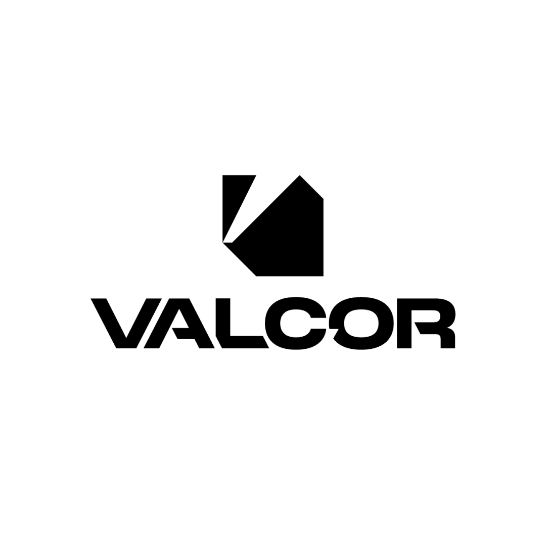
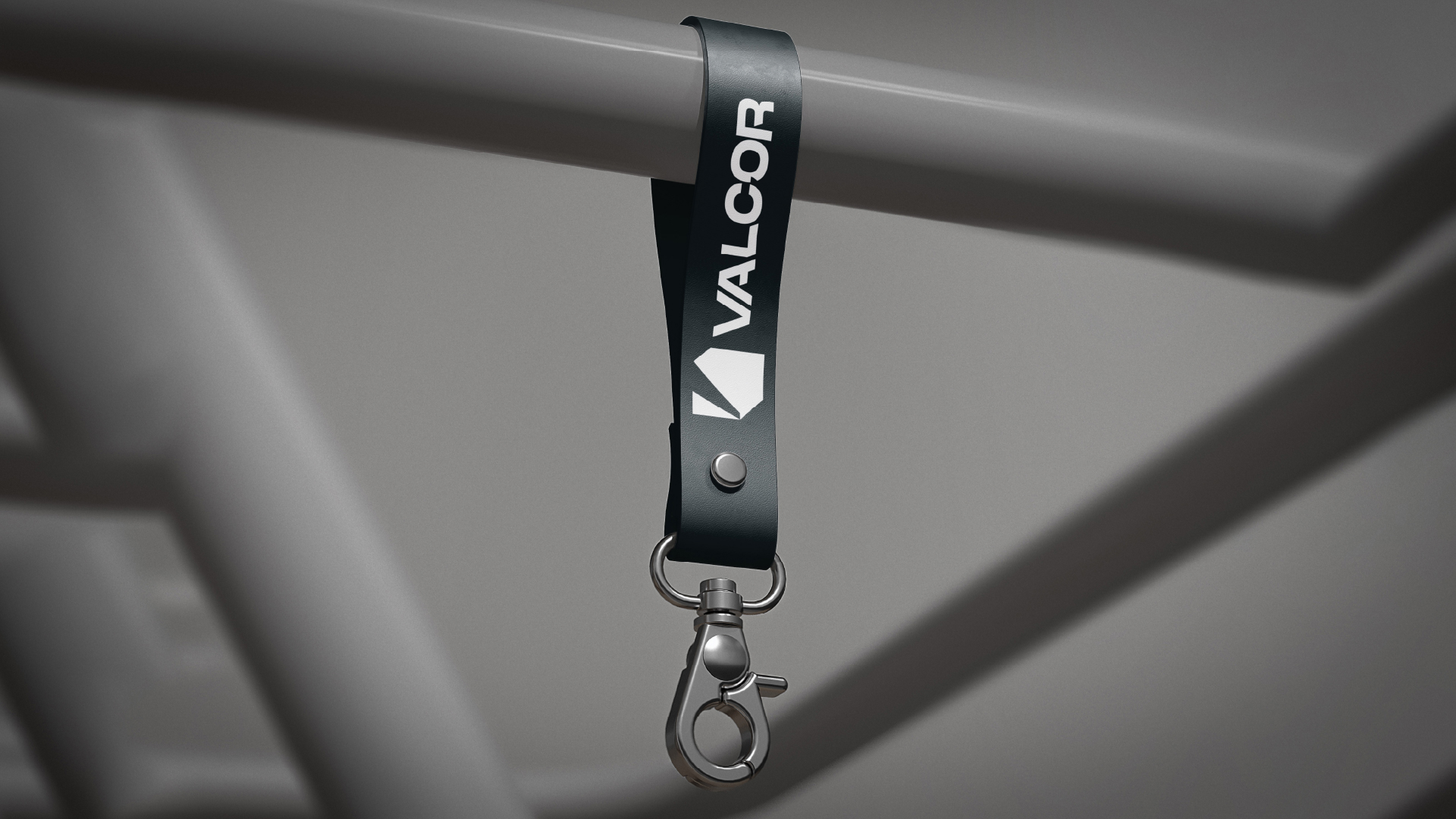
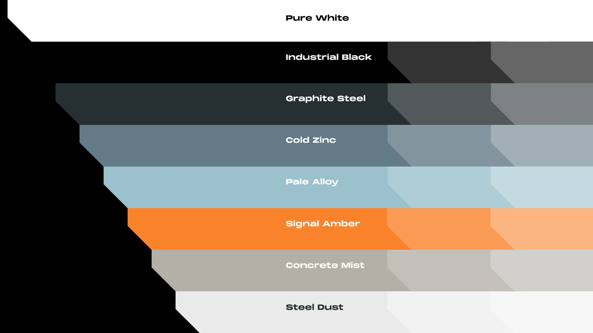
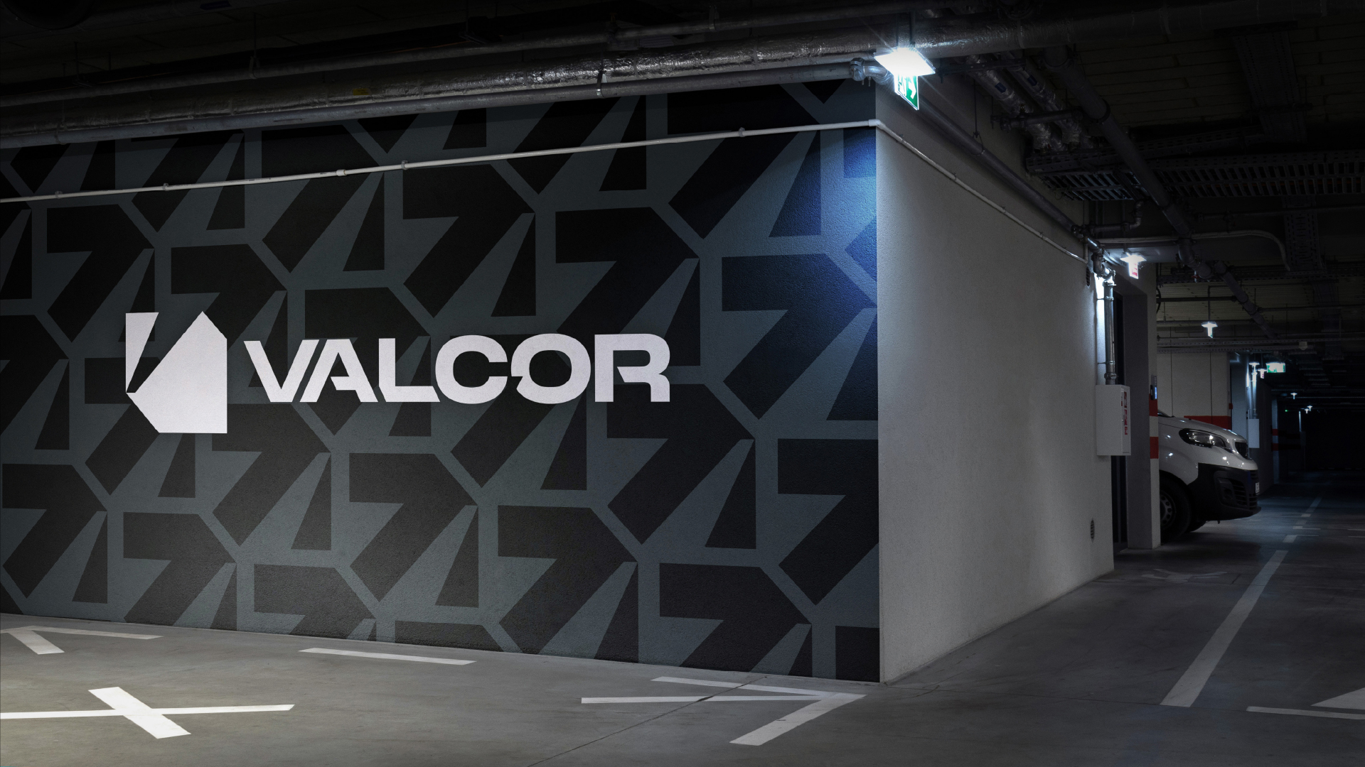
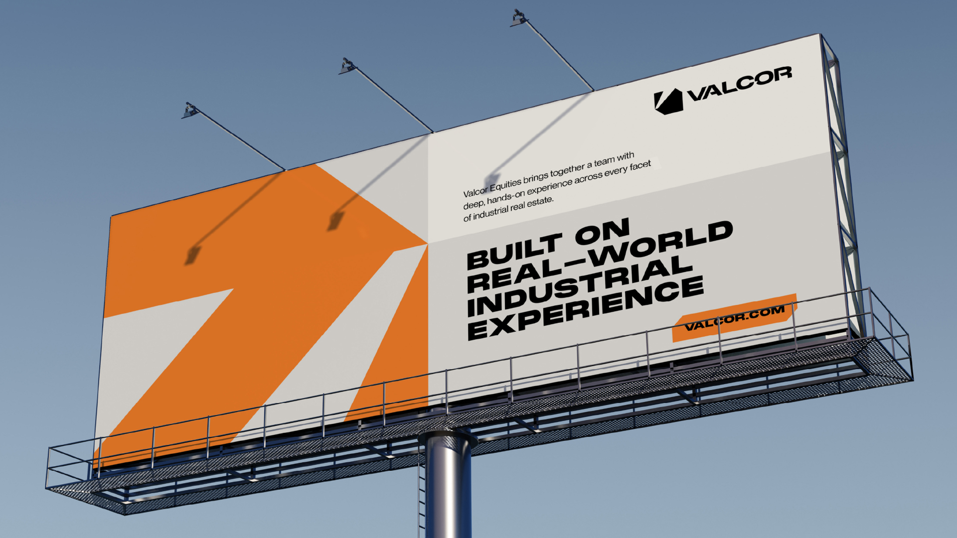
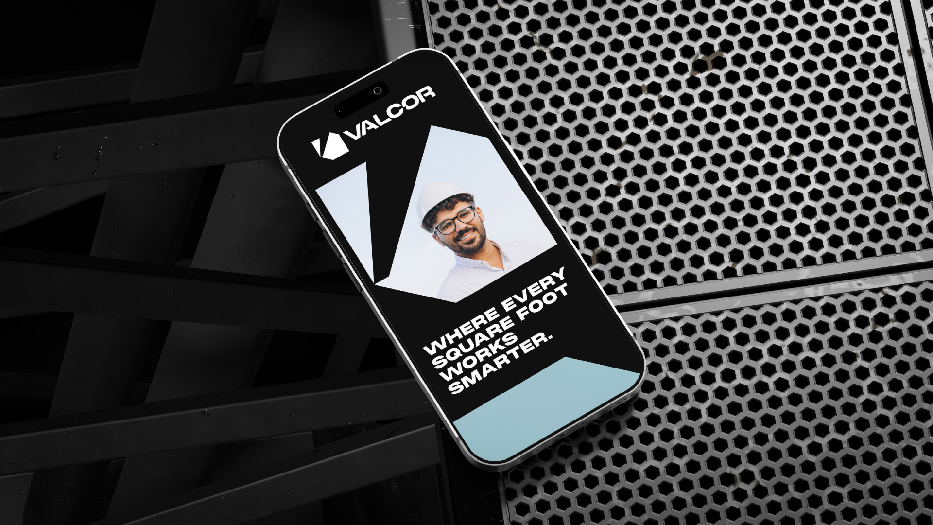
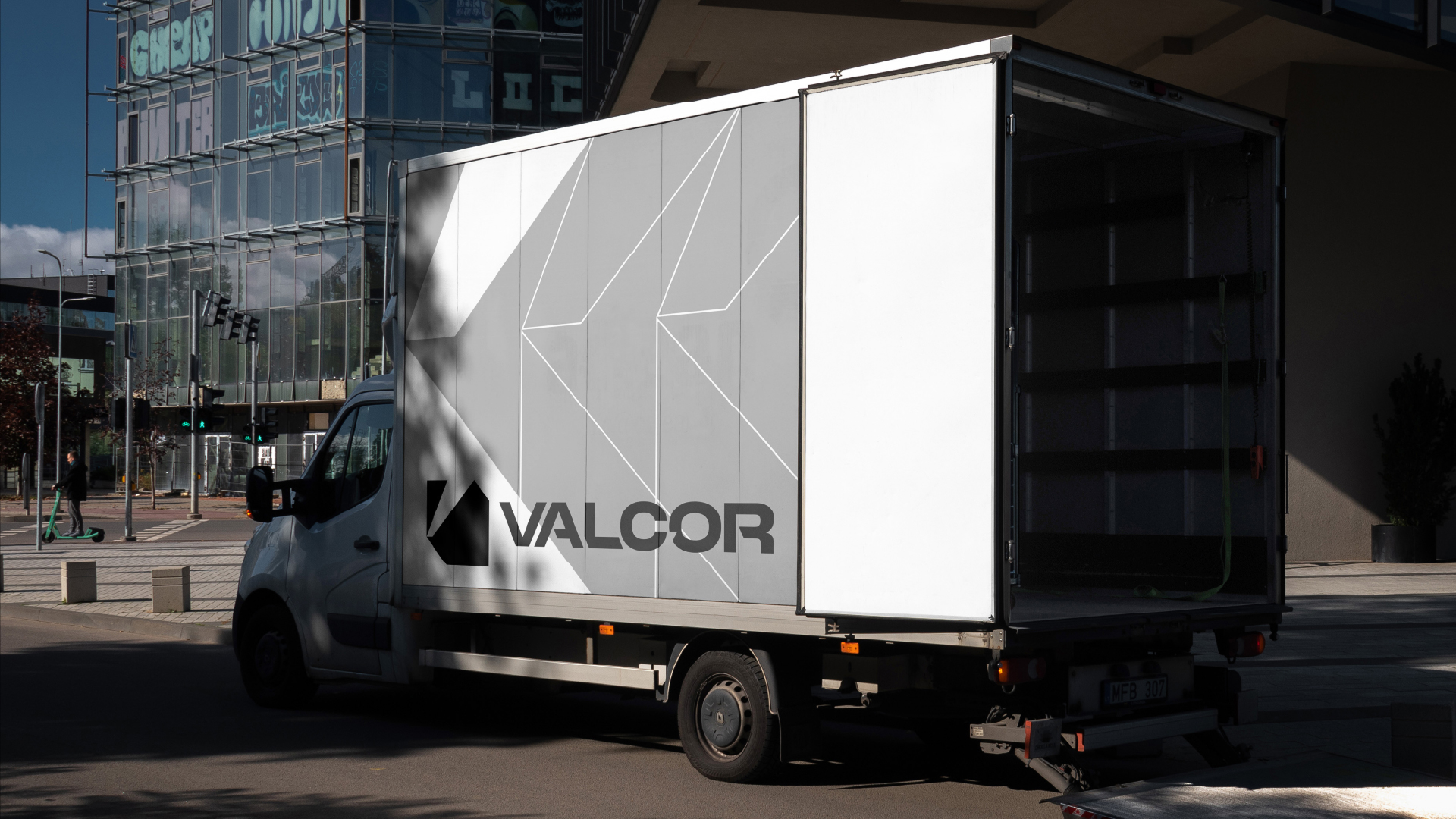
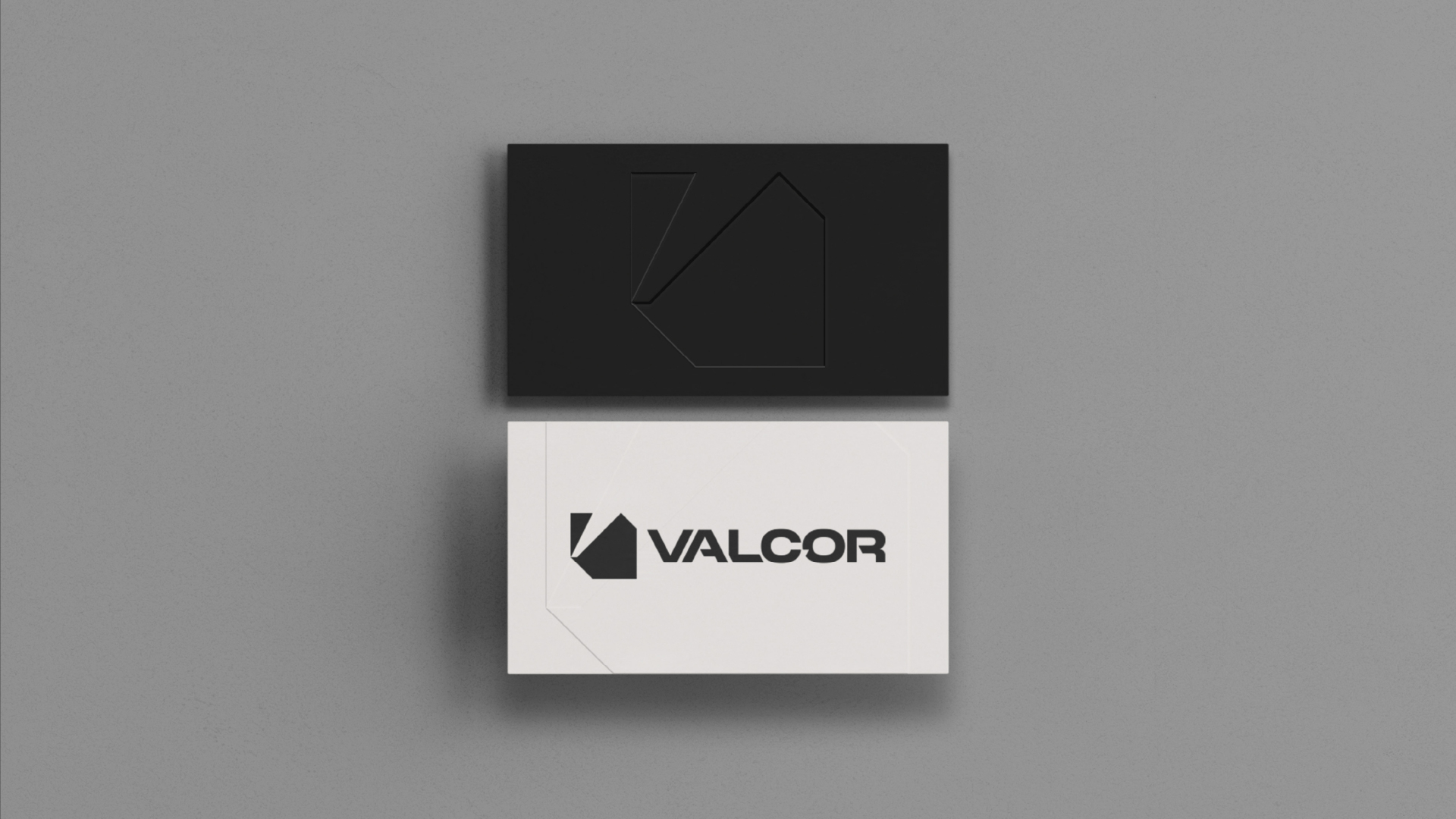
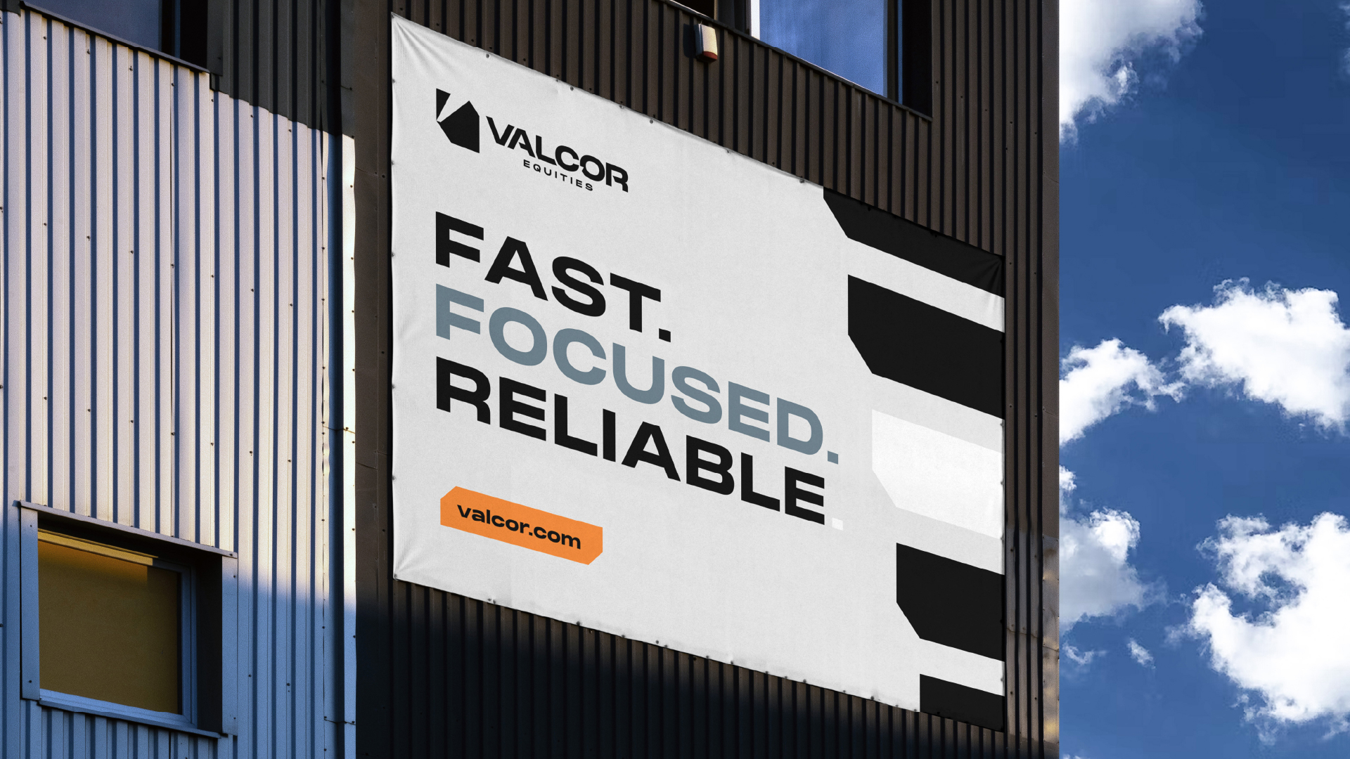
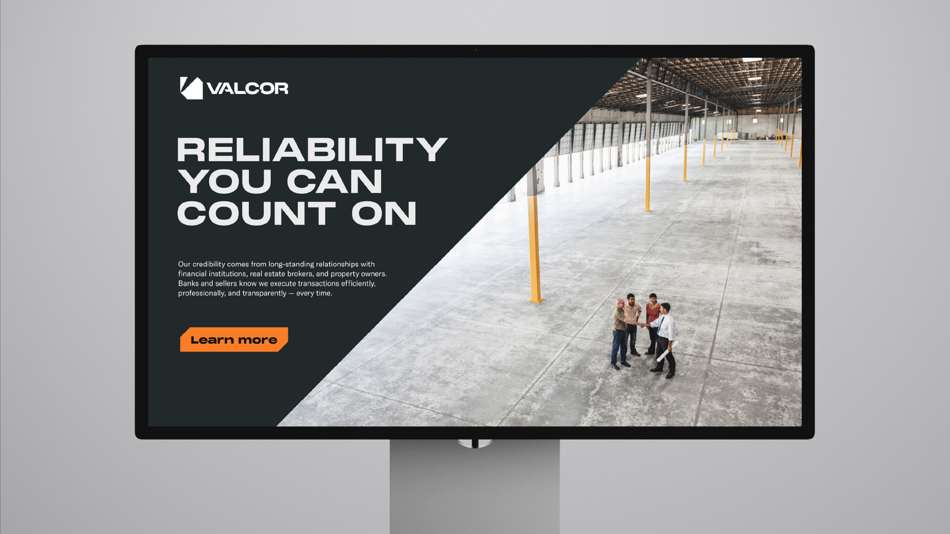
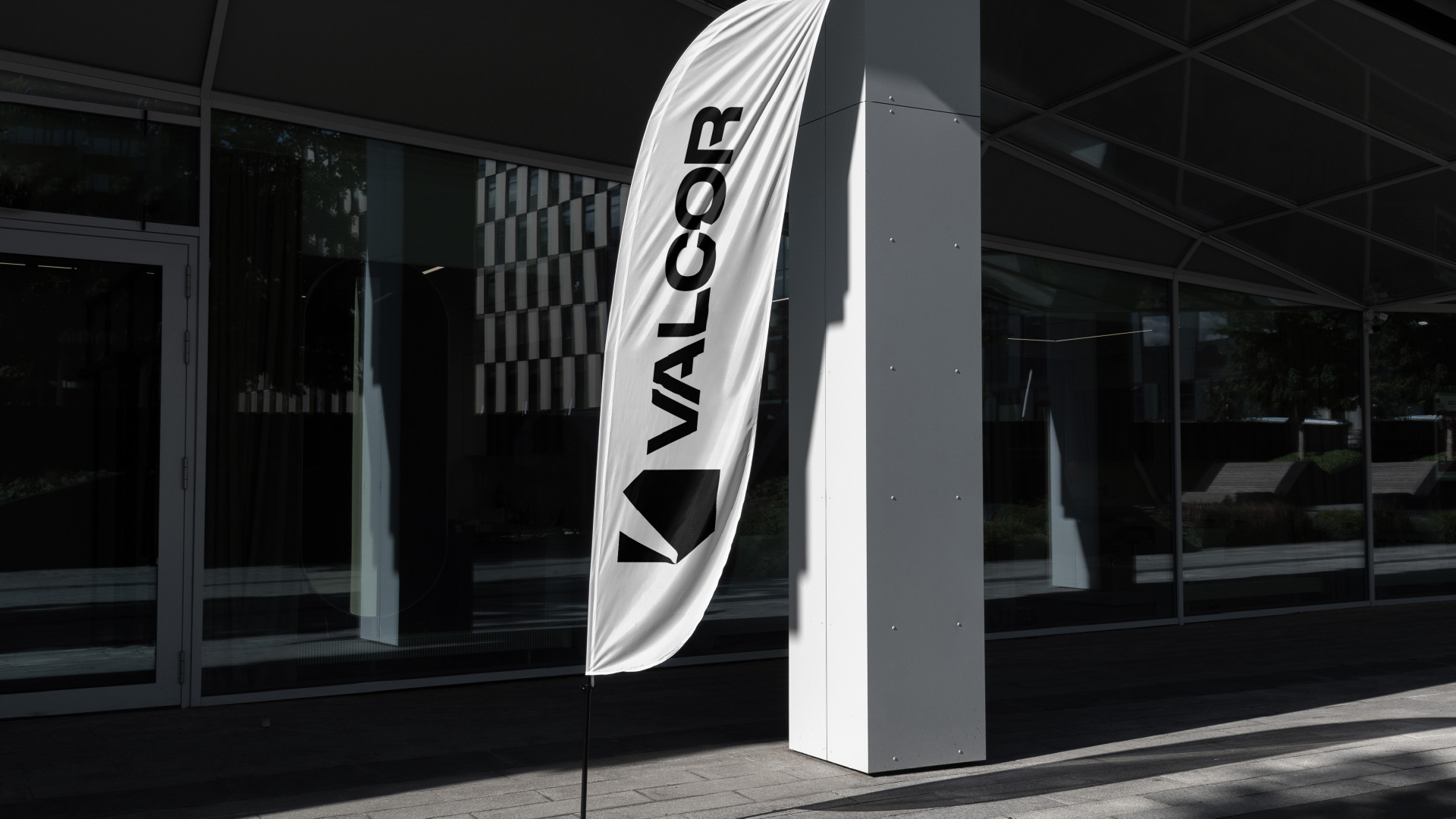
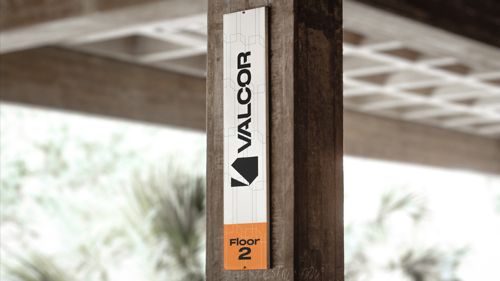
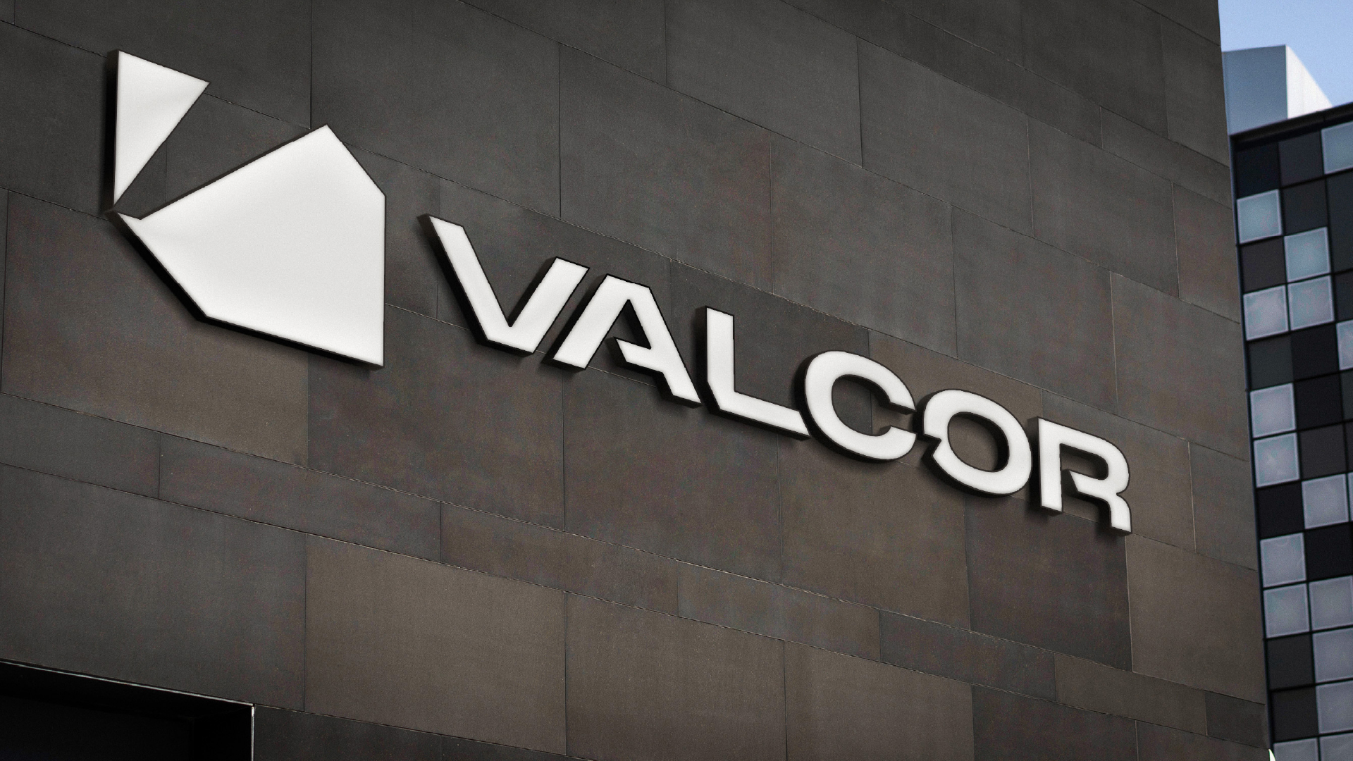
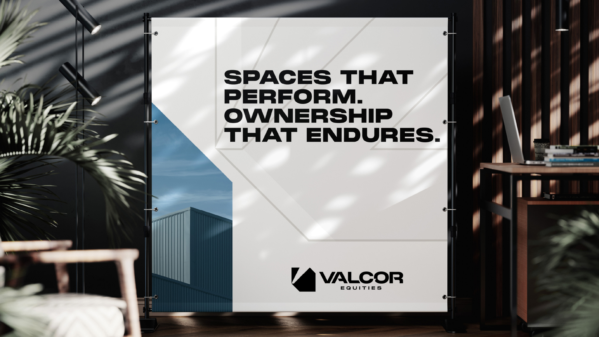
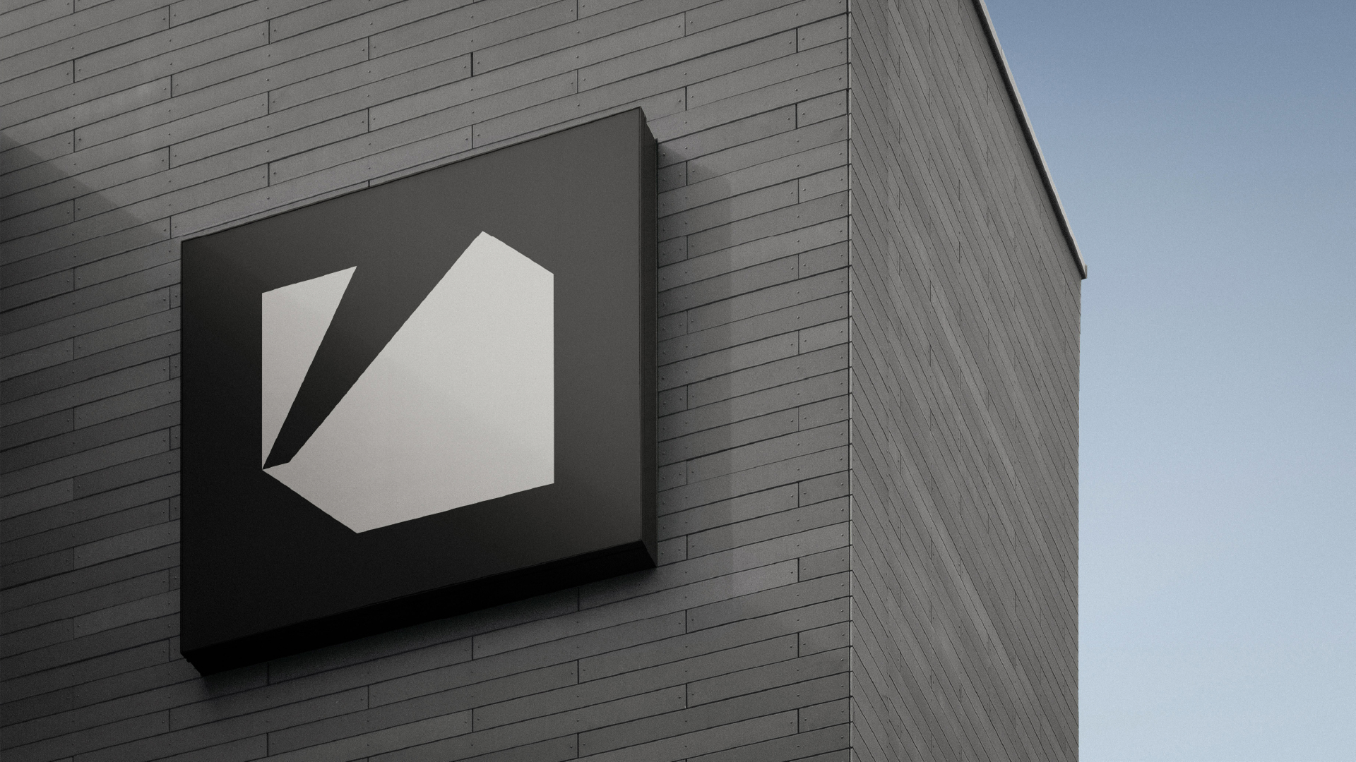
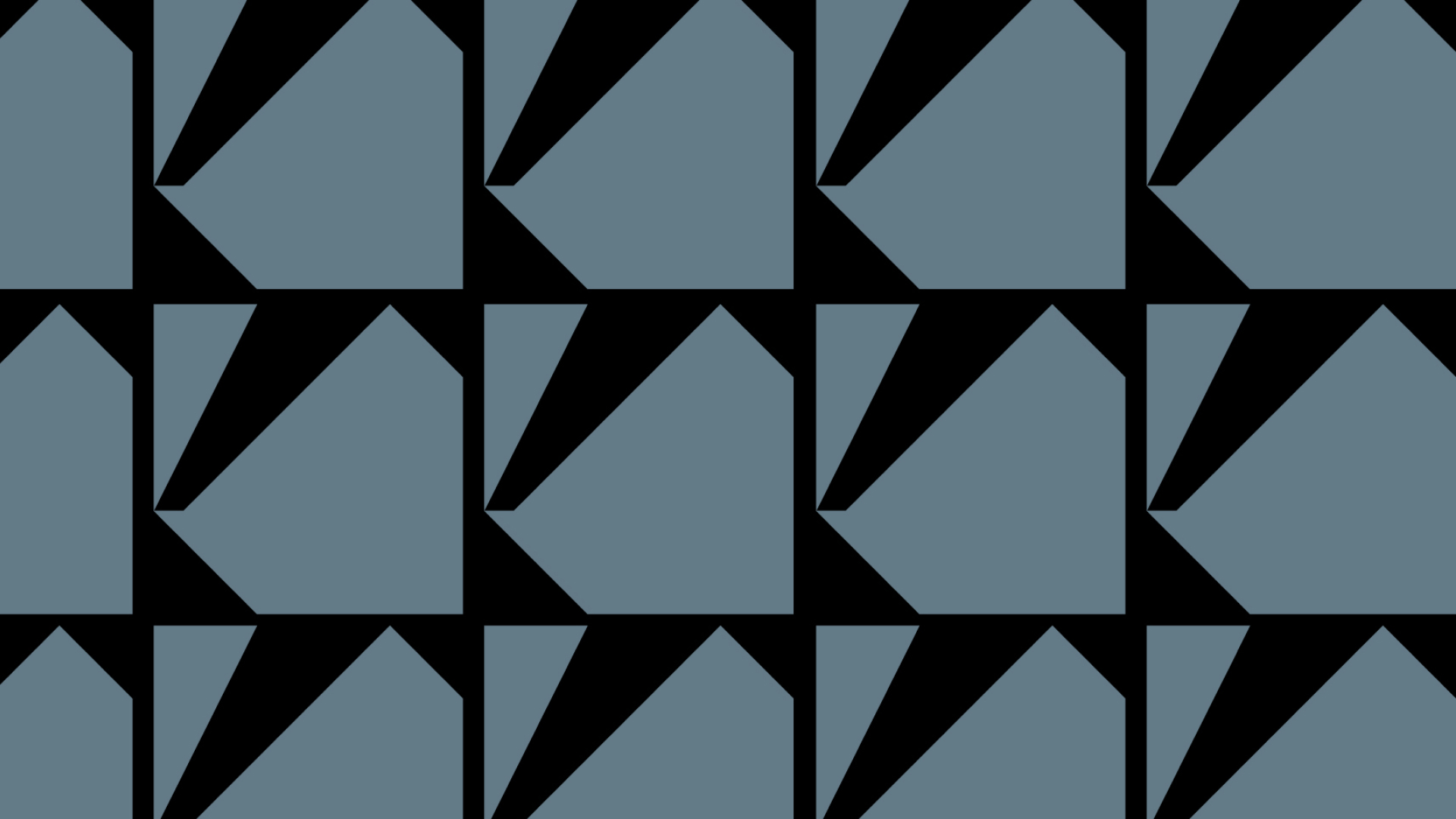
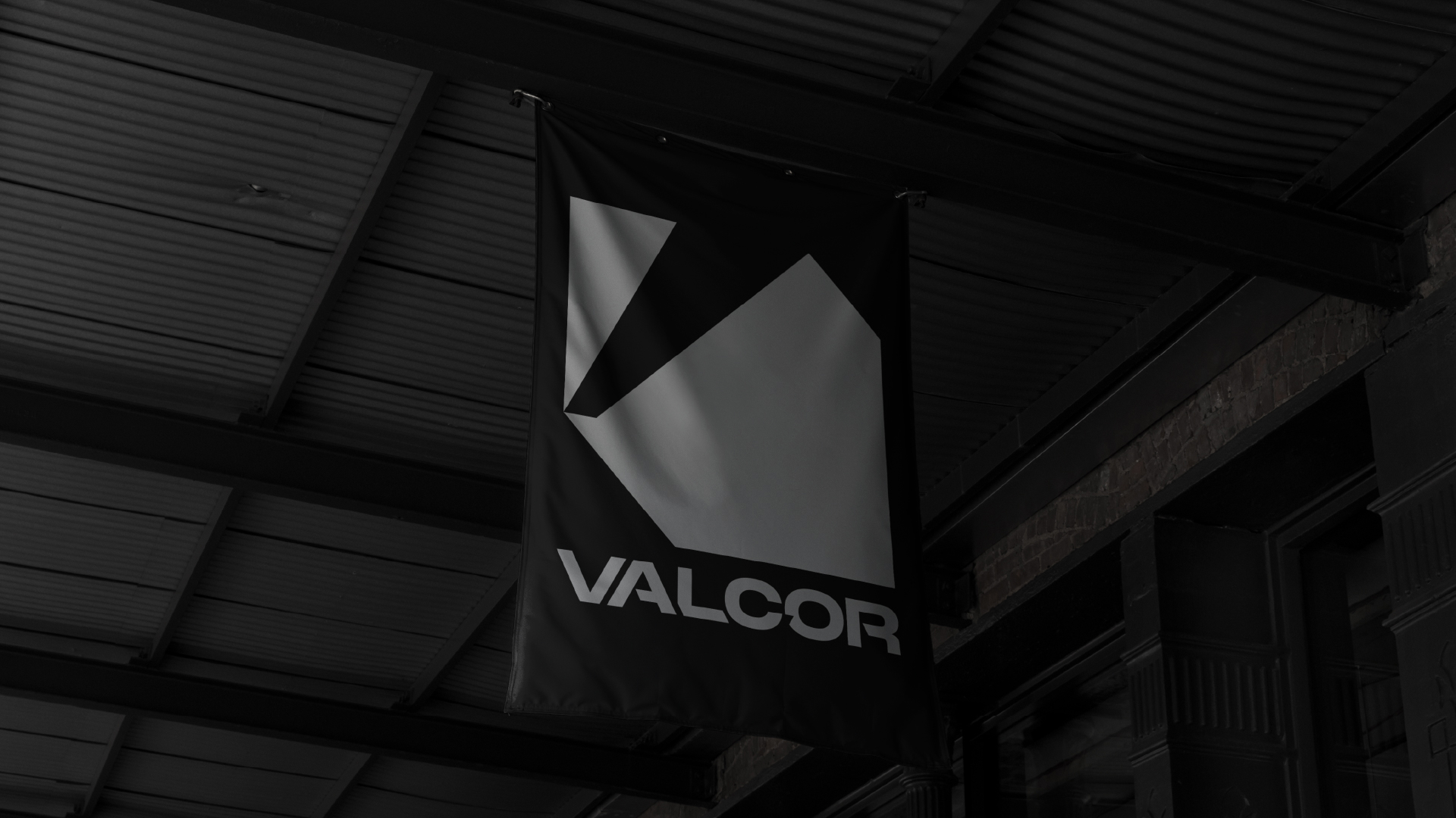
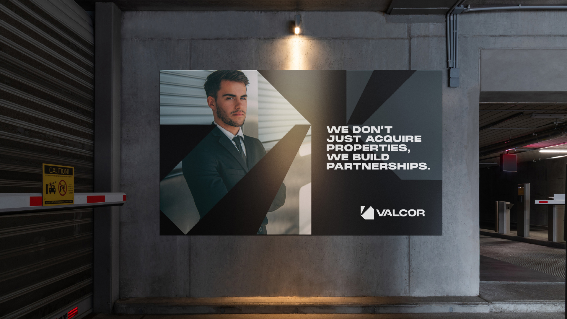
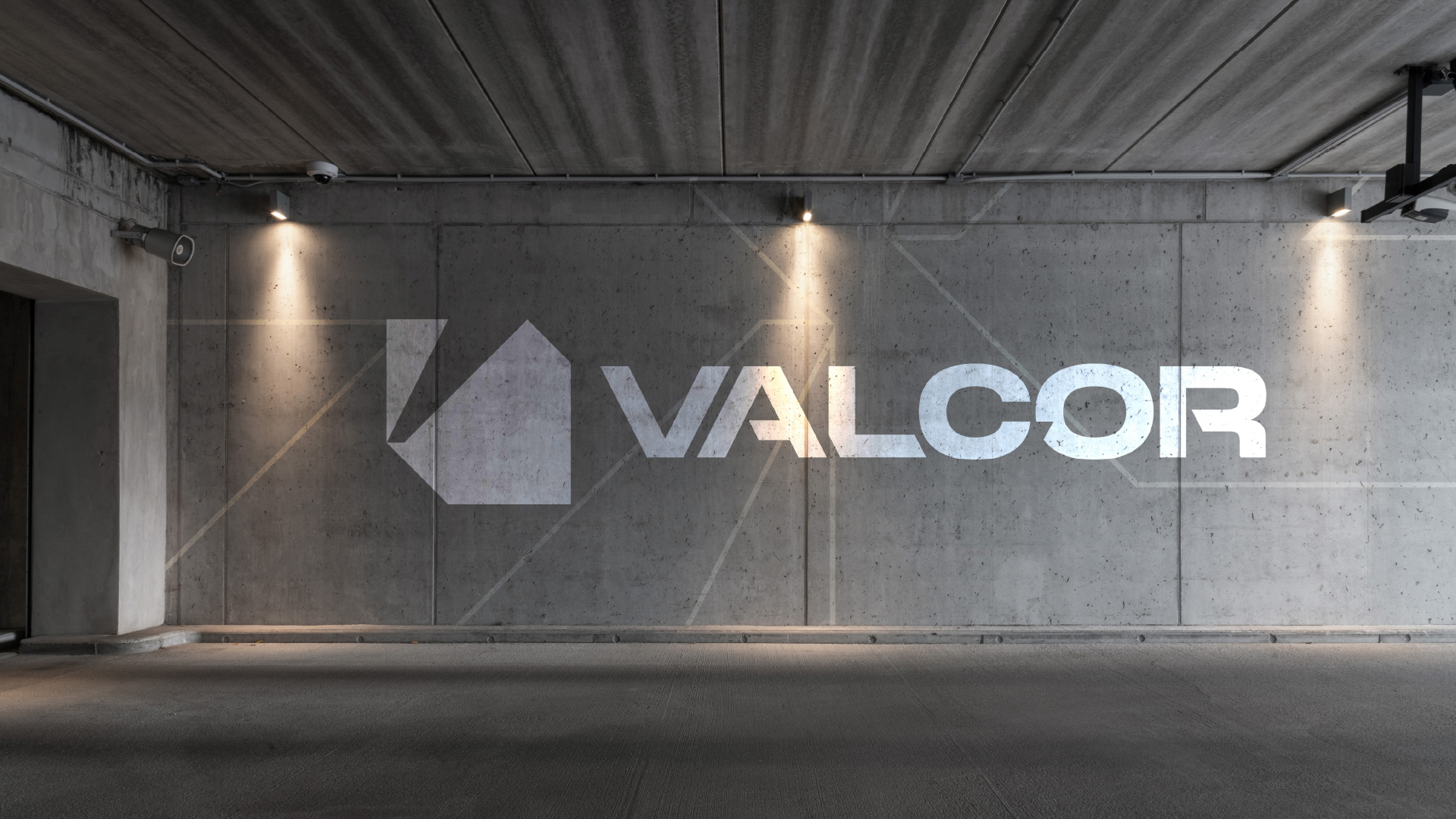
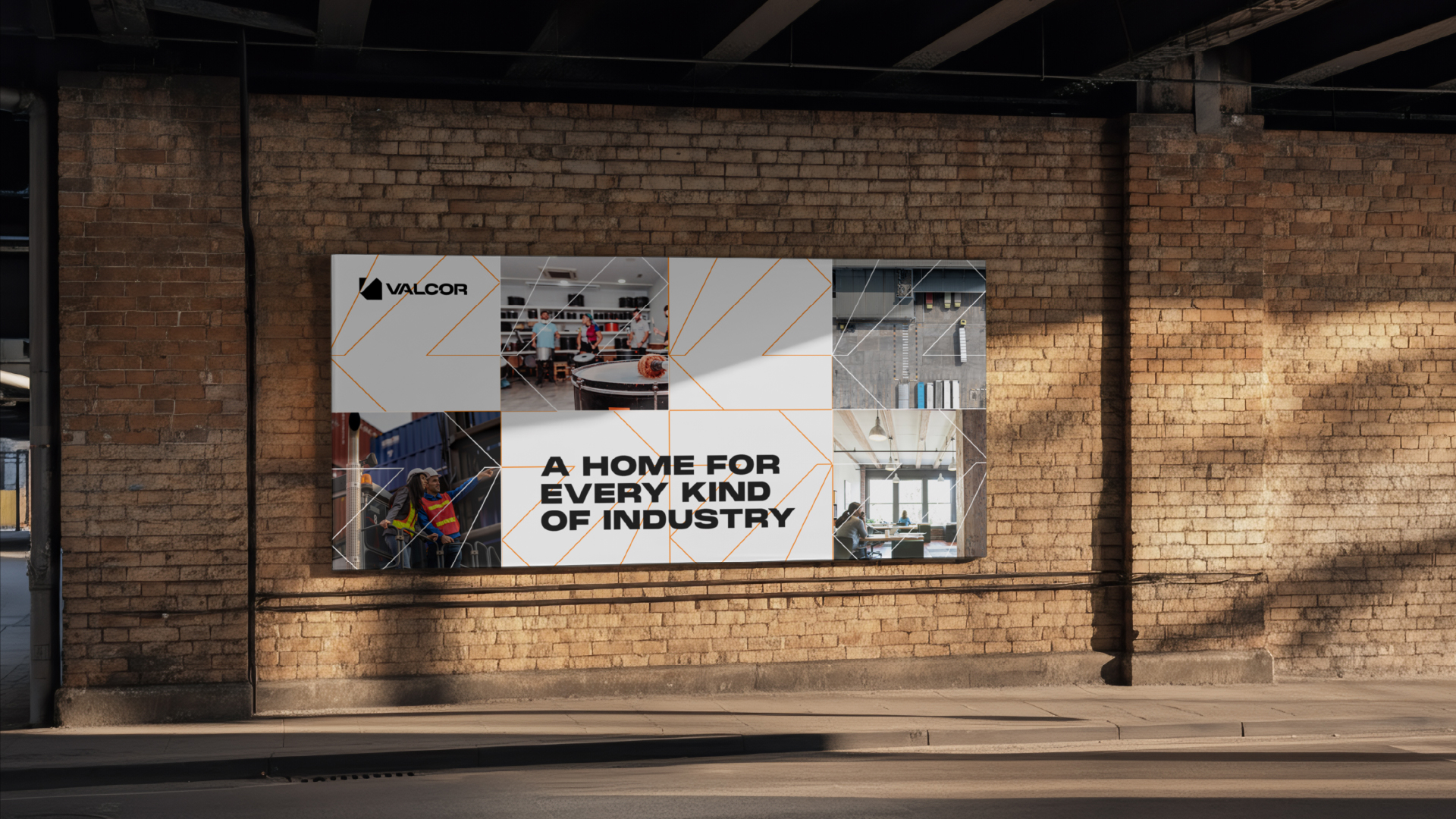
We built Valcor Equities a brand and website anchored in structure and permanence, with custom imagery and a visual identity inspired by industrial architecture, property footprints and the strength of long-term ownership. A custom icon, bold wordmark, and geometric graphic language reinforce stability, precision and forward momentum. A refined industrial palette creates a presence that balances clarity and credibility.
Custom imagery, real credibility.










The Result
The result is a commercial real estate brand that finally looks as good as it should: credible, polished, and landing deals.
It finally matches the size and caliber of its tenants and its services.