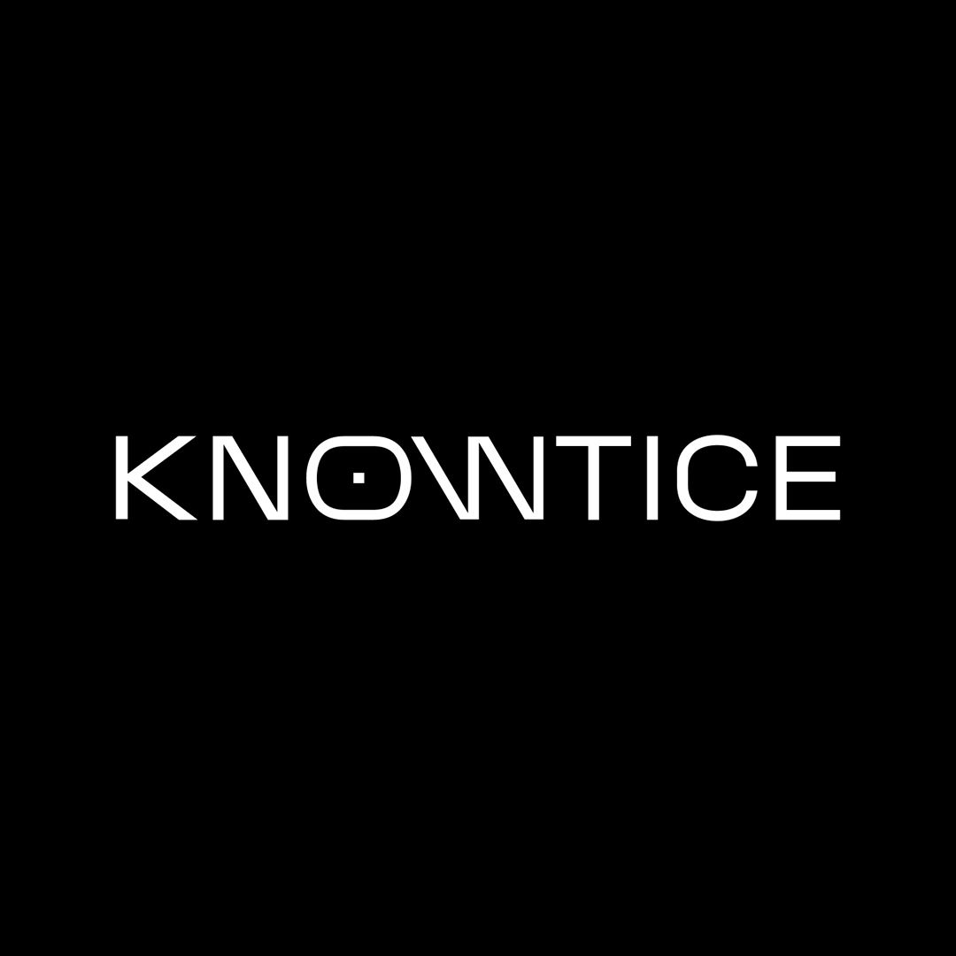
Knowtice Analytics
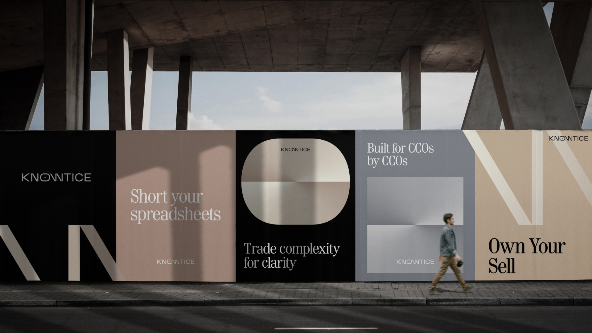
Trade complexity for clarity™
Client:
Eli Wishnivetski
Project type:
Project Scope
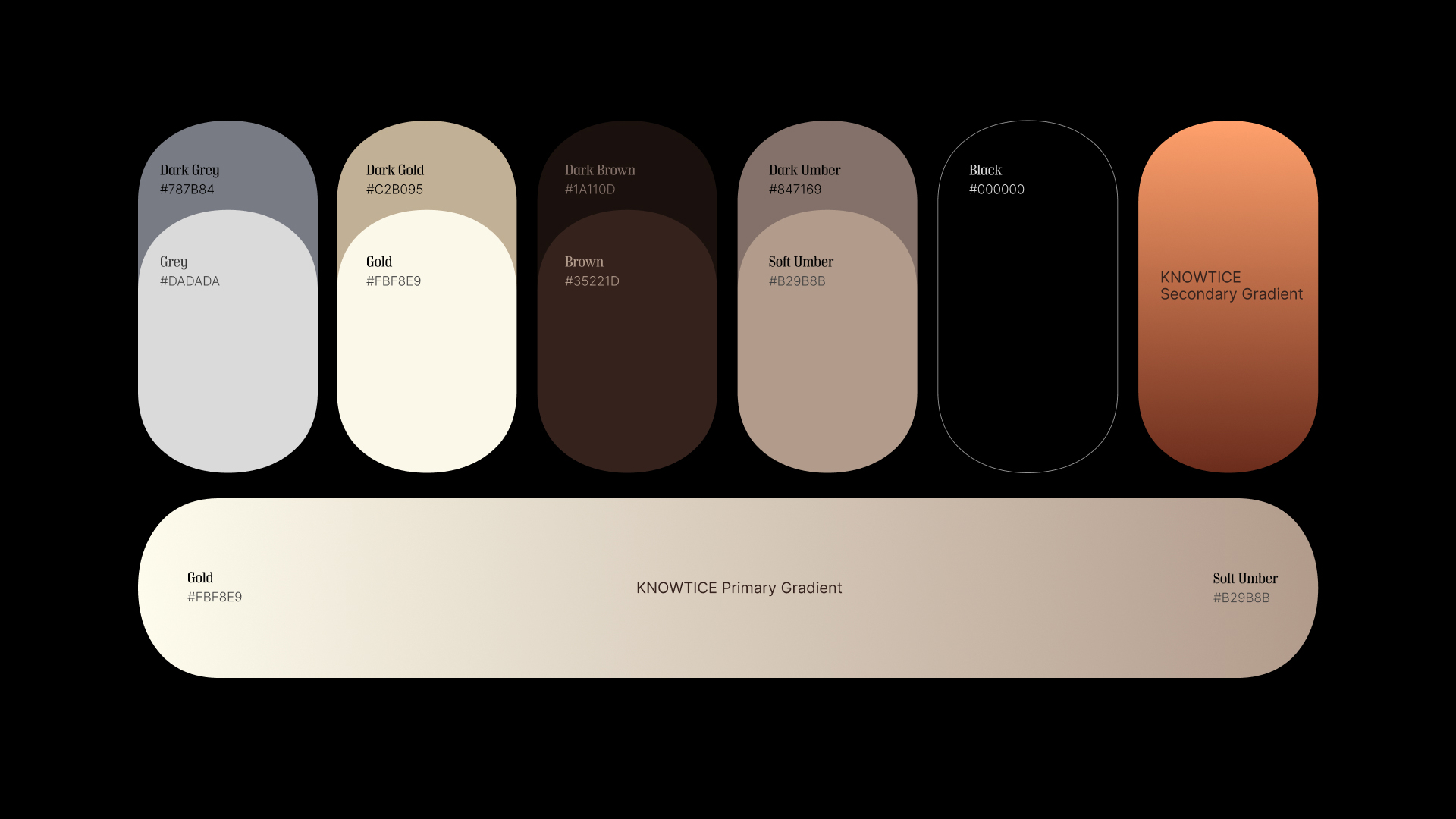
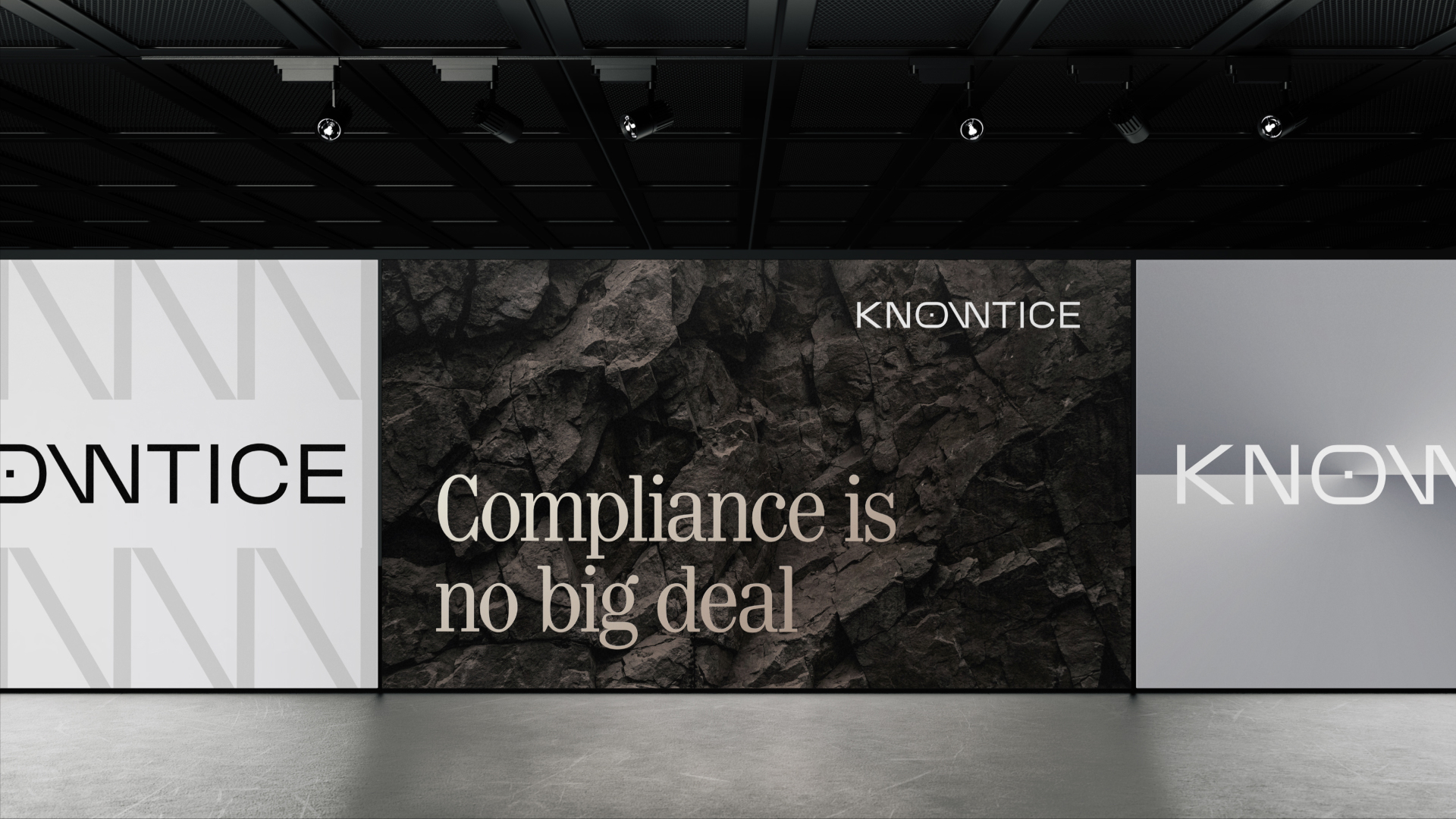
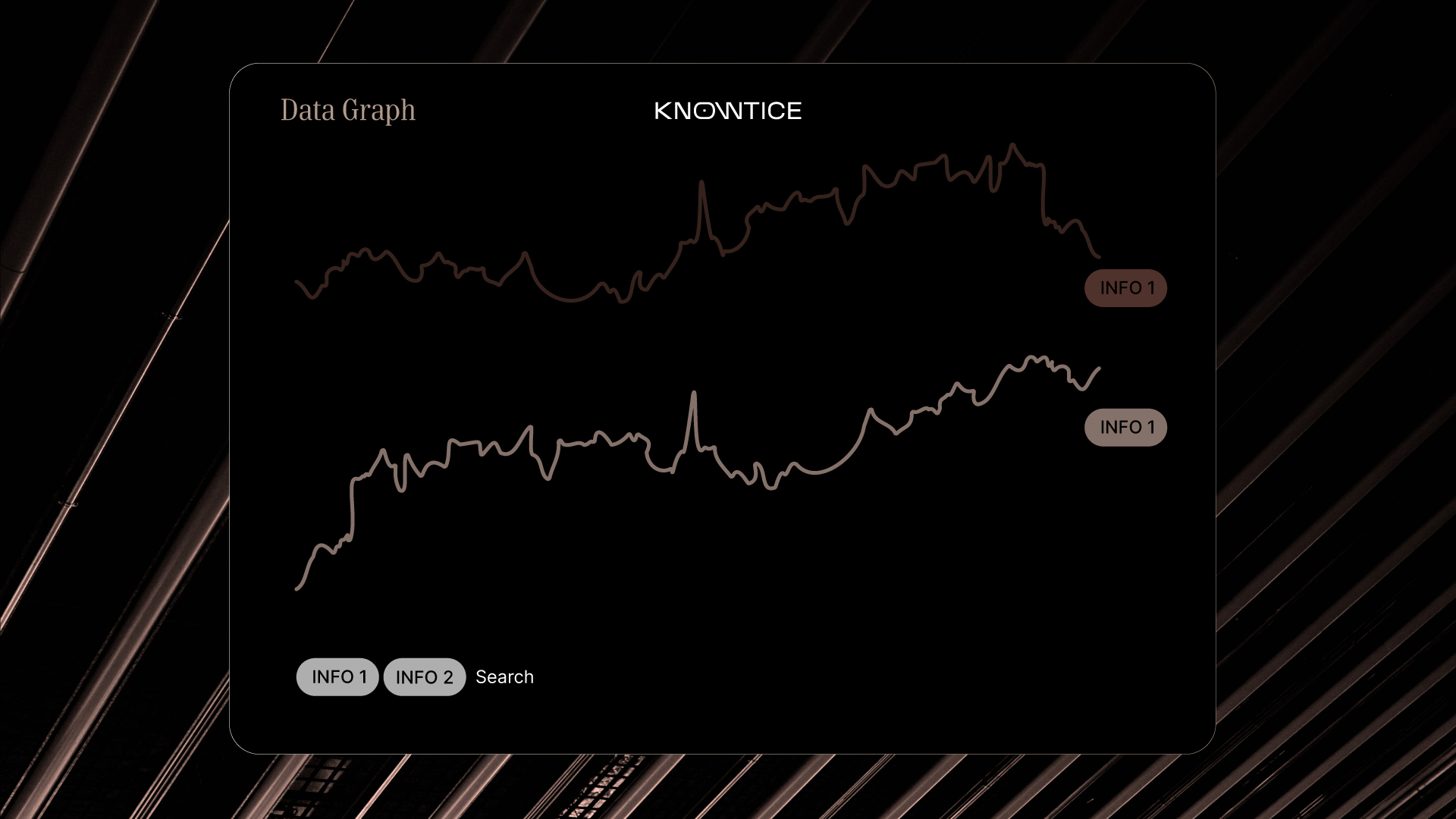
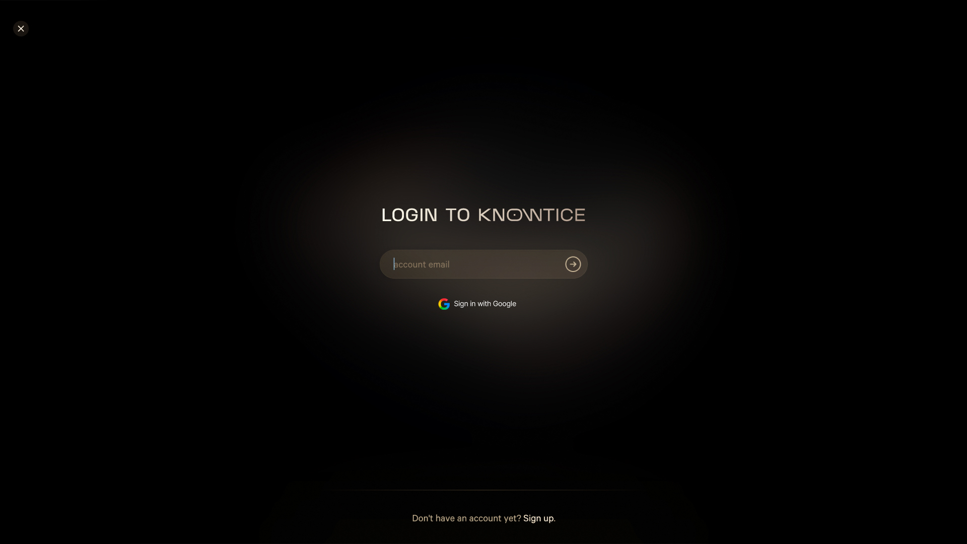
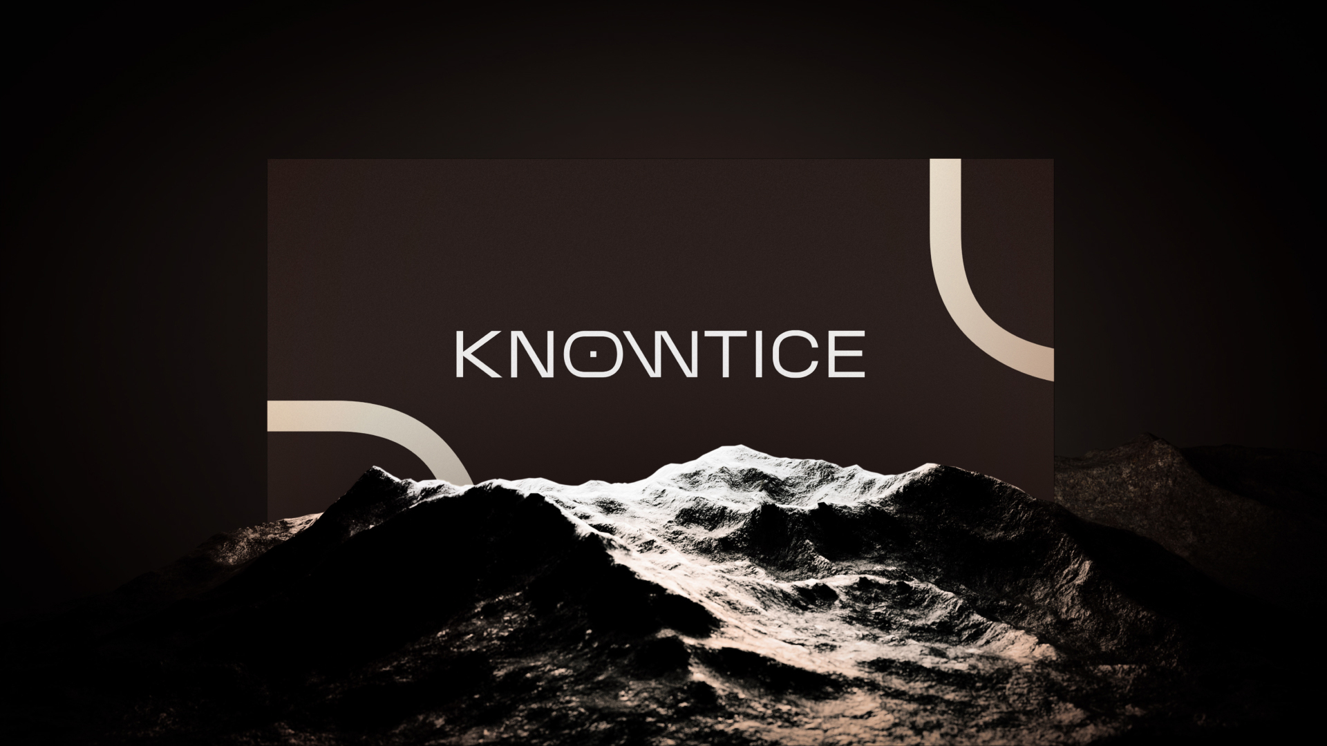
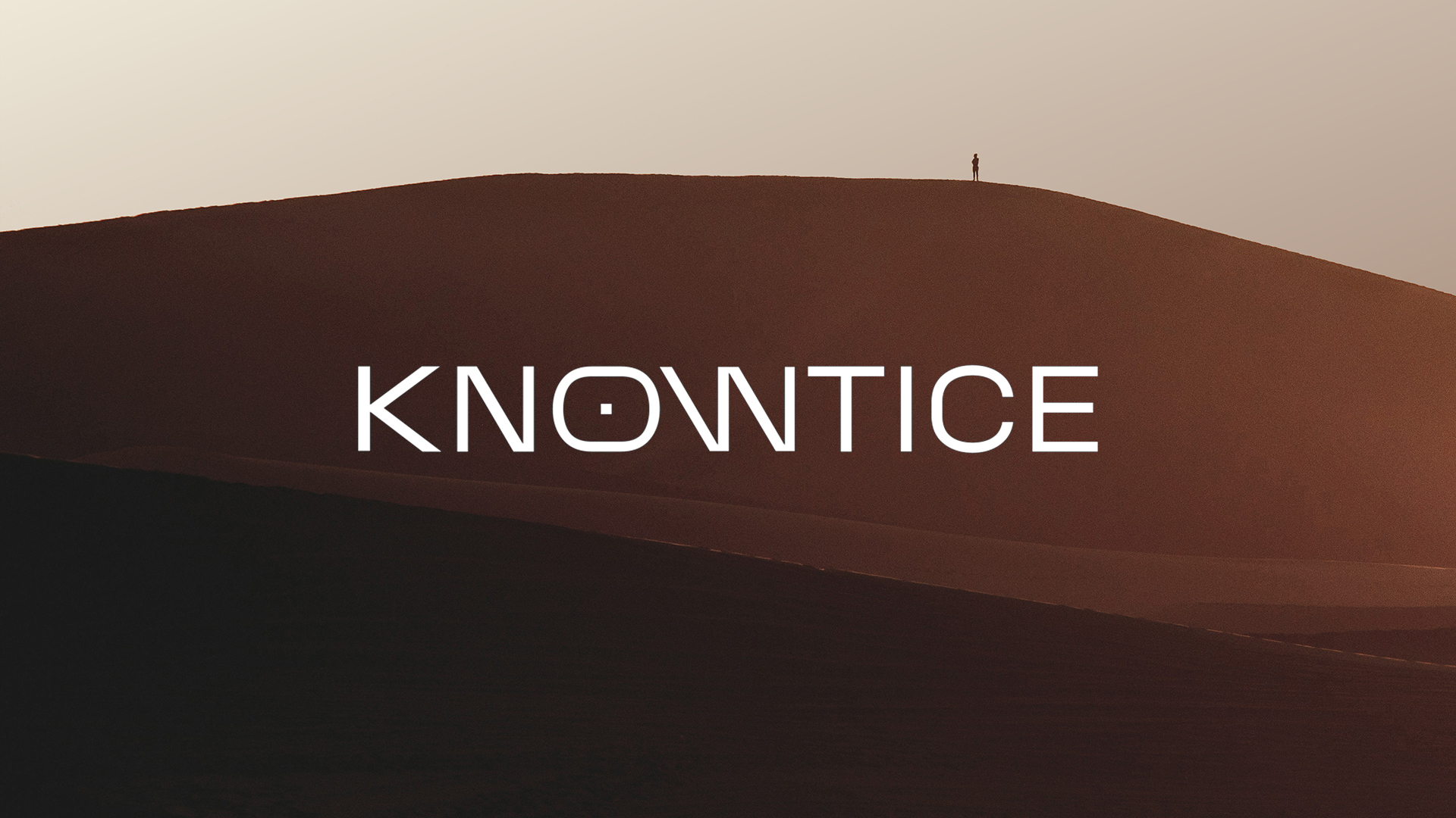
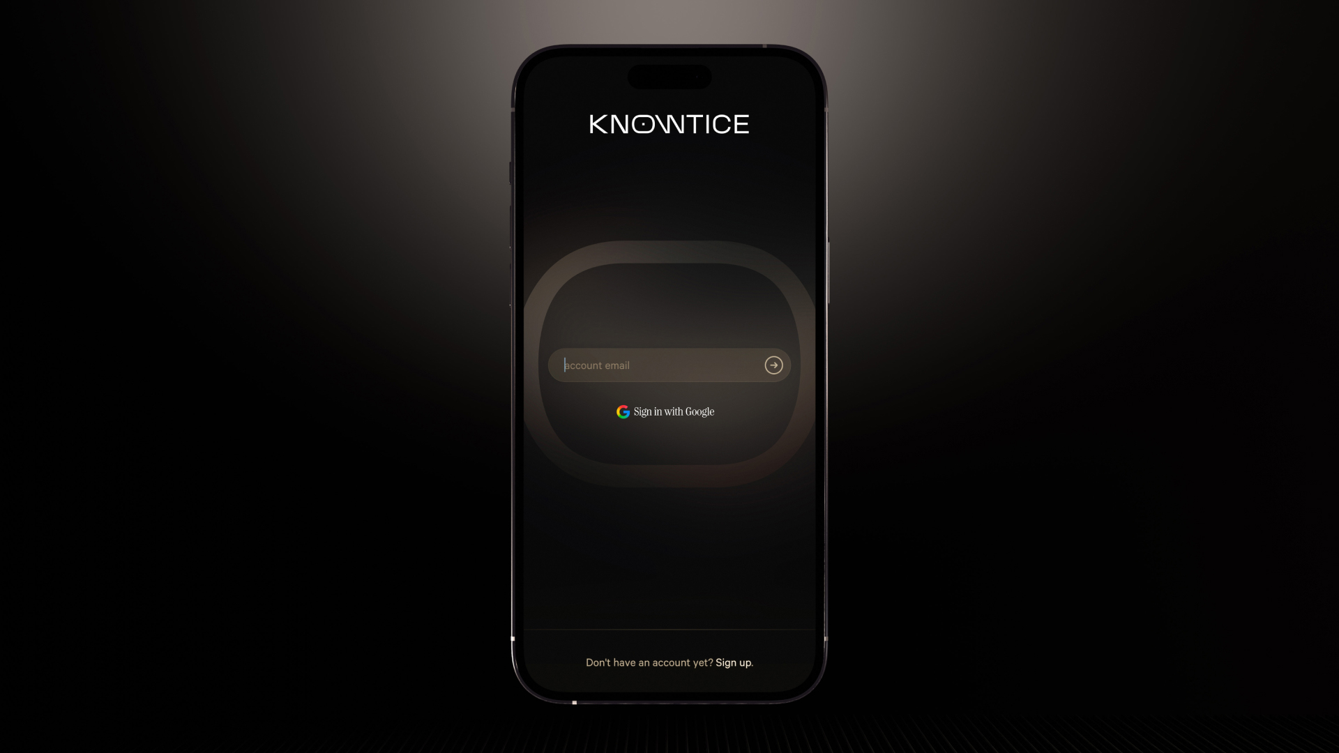
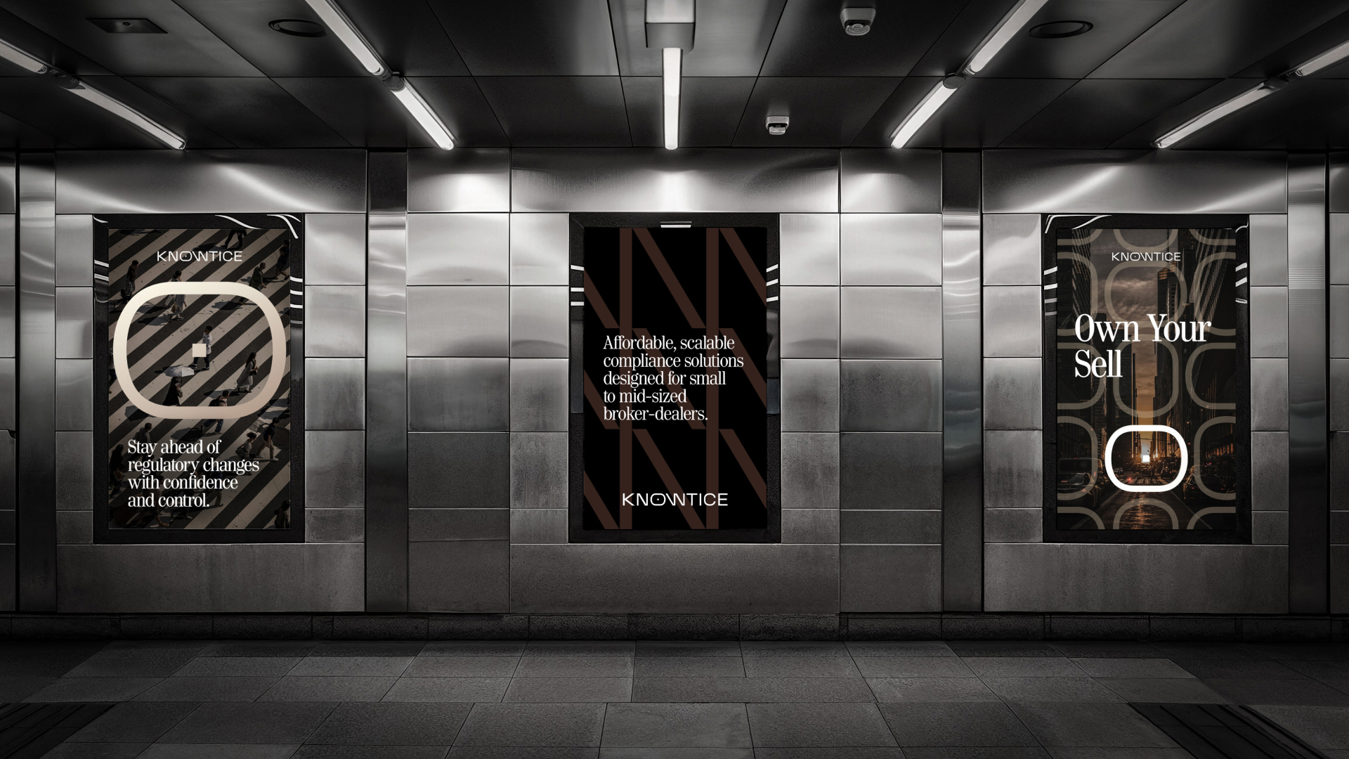
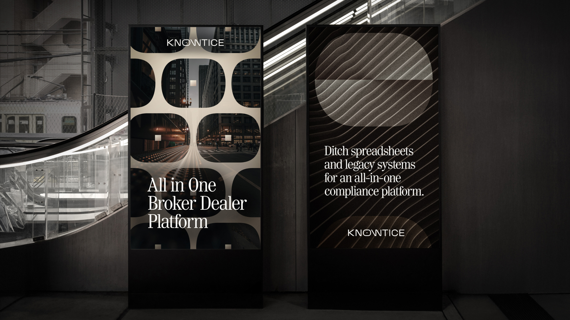
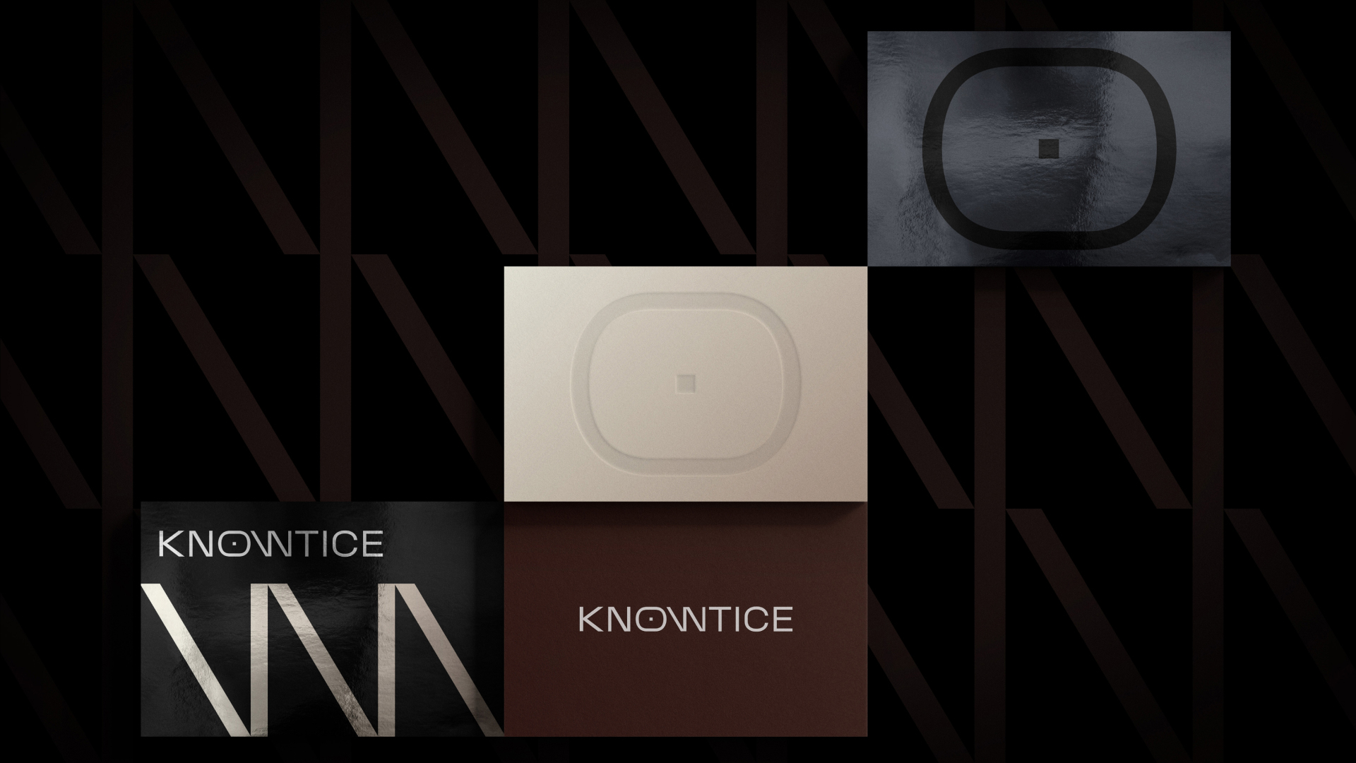
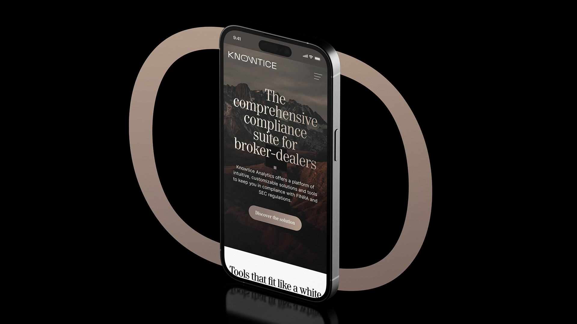
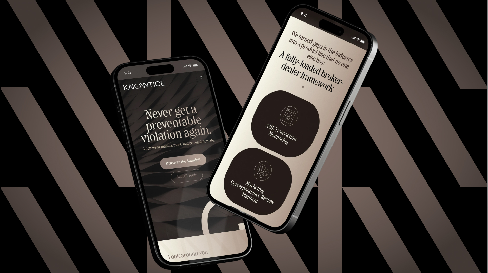
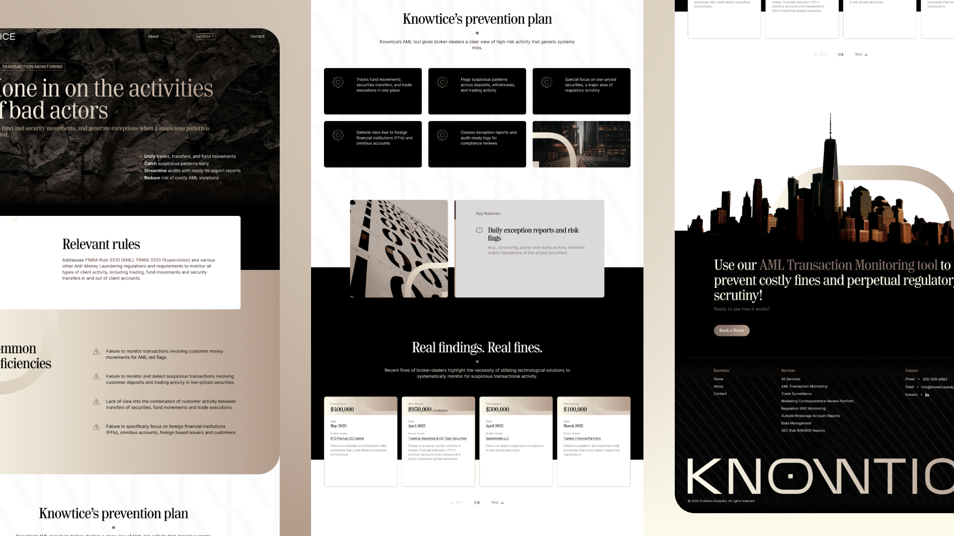
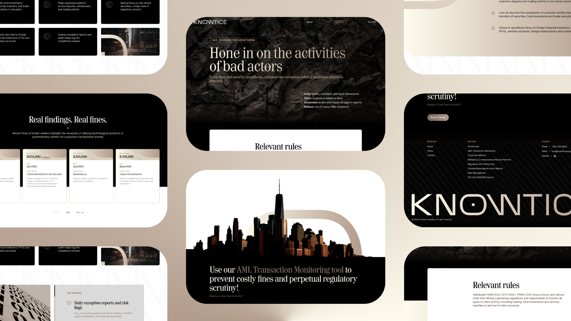
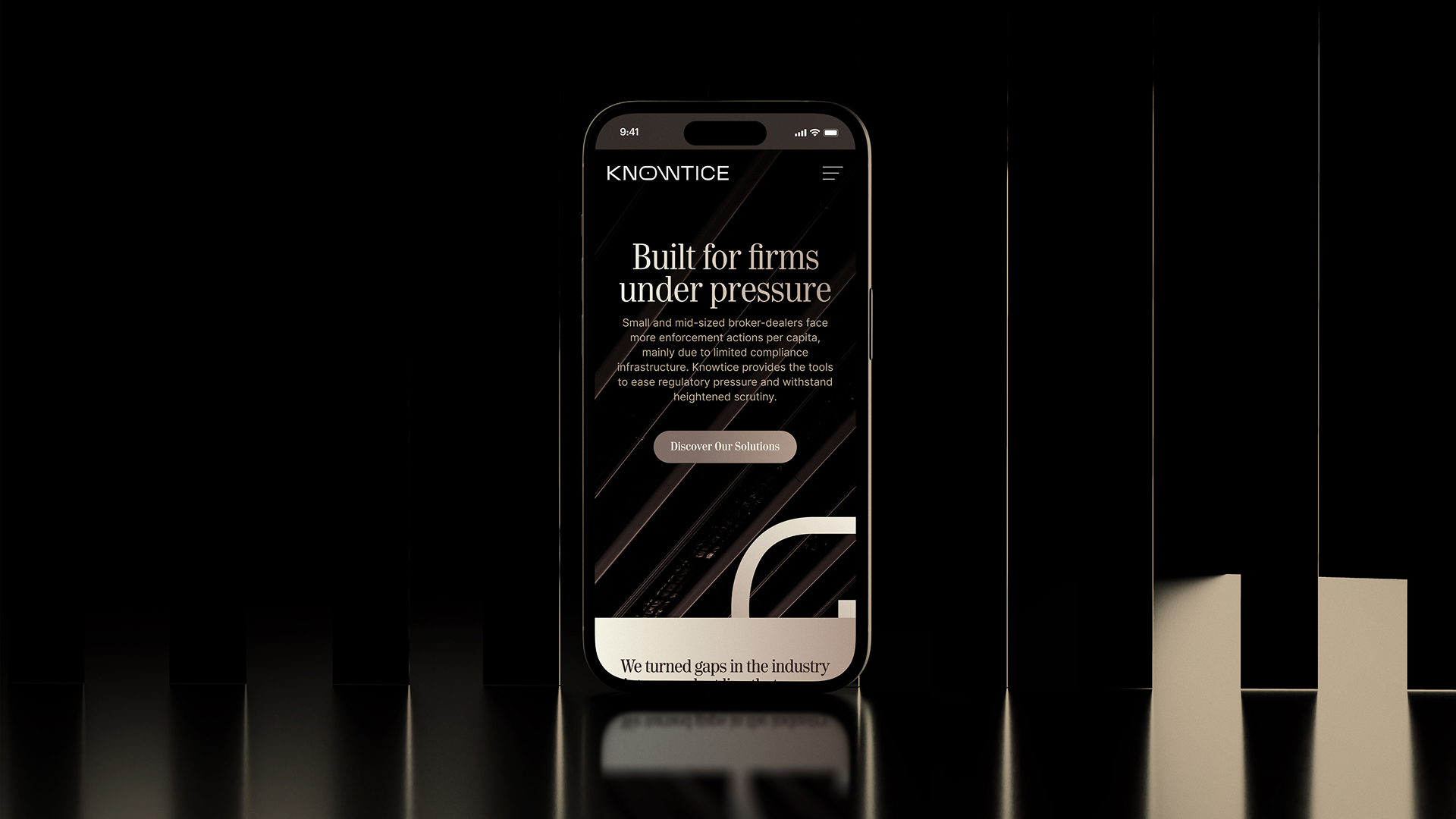
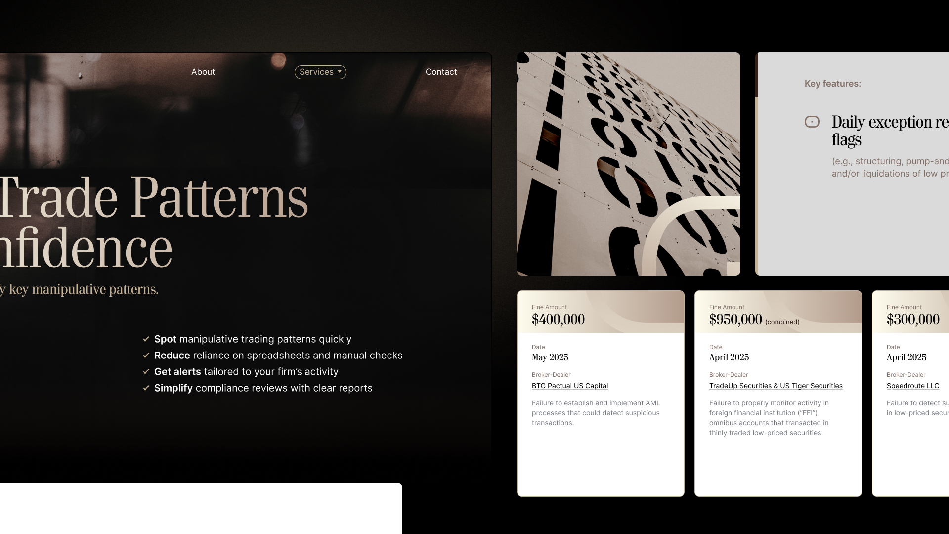
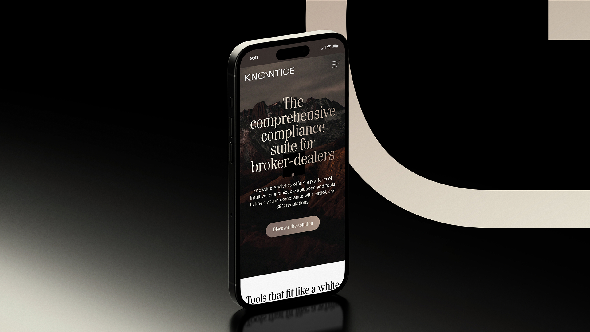
In a crowded fintech and SaaS landscape, Knowtice needed a brand that conveyed authority and clarity without blending into the familiar. The goal was to build an identity that reflects expertise and trust while standing apart from typical digital-first brands. The design centers on a rich palette of copper, gold, and deep browns. These tones create warmth and substance, evoking stability and control while signaling confidence in a complex regulatory space. Subtle gold accents add refinement, projecting a premium yet composed presence. At its core is the Knowtice icon, drawn from the letter O and shaped to suggest an eye. This symbol of awareness and insight is paired with a precise, geometric wordmark that communicates strength with restraint. The result is a brand identity that feels modern and timeless, quietly powerful, and built to inspire trust.
Brand Colors