Avalon ABA Group
A brand and website successfully balancing the opposing desires of wary sellers and serious investors, with a professional yet human visual identity bridging both worlds.
SERVICES

The Problem
Many independent ABA owners who are ready to sell are highly distrustful of big capital. Avalon is something different: former clinic operators who acquire practices and help them grow. But with capital behind them and acquisitions on the agenda, they risked being lumped in with the very buyers sellers try to avoid. They needed a brand that clearly set them apart from those buyers, in a way finance-focused investors would still respect.
Sellers saw just another risky buyer.
The Challenge
Two opposing audiences, one resonant voice.
Avalon speaks to two audiences who want different things. Clinic owners need to know their life’s work is in good hands. Investors need a model that makes financial sense. In words and visuals alike, the brand had to stay warm and human without misrepresenting what Avalon is. It also had to look financially serious without sending the wrong signals to sellers.







The Magic
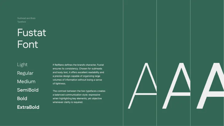
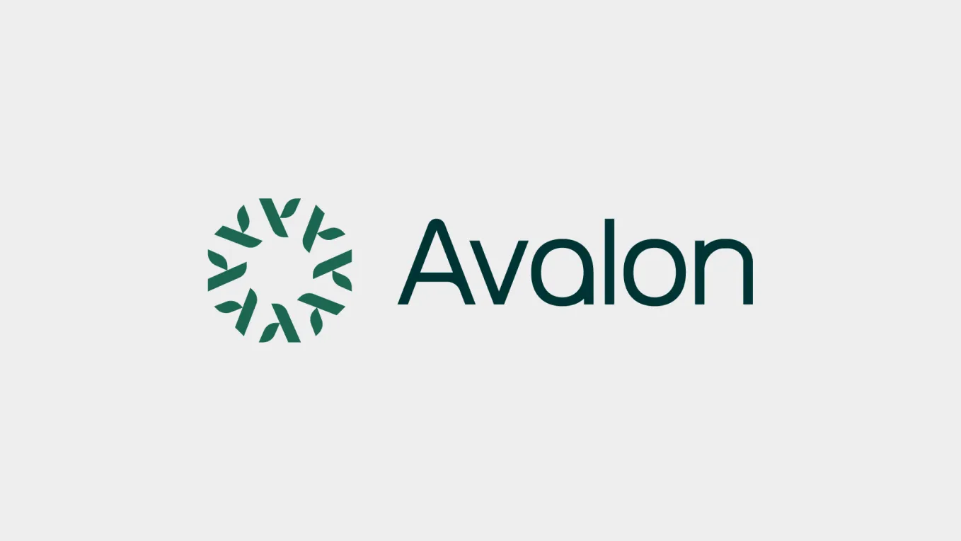
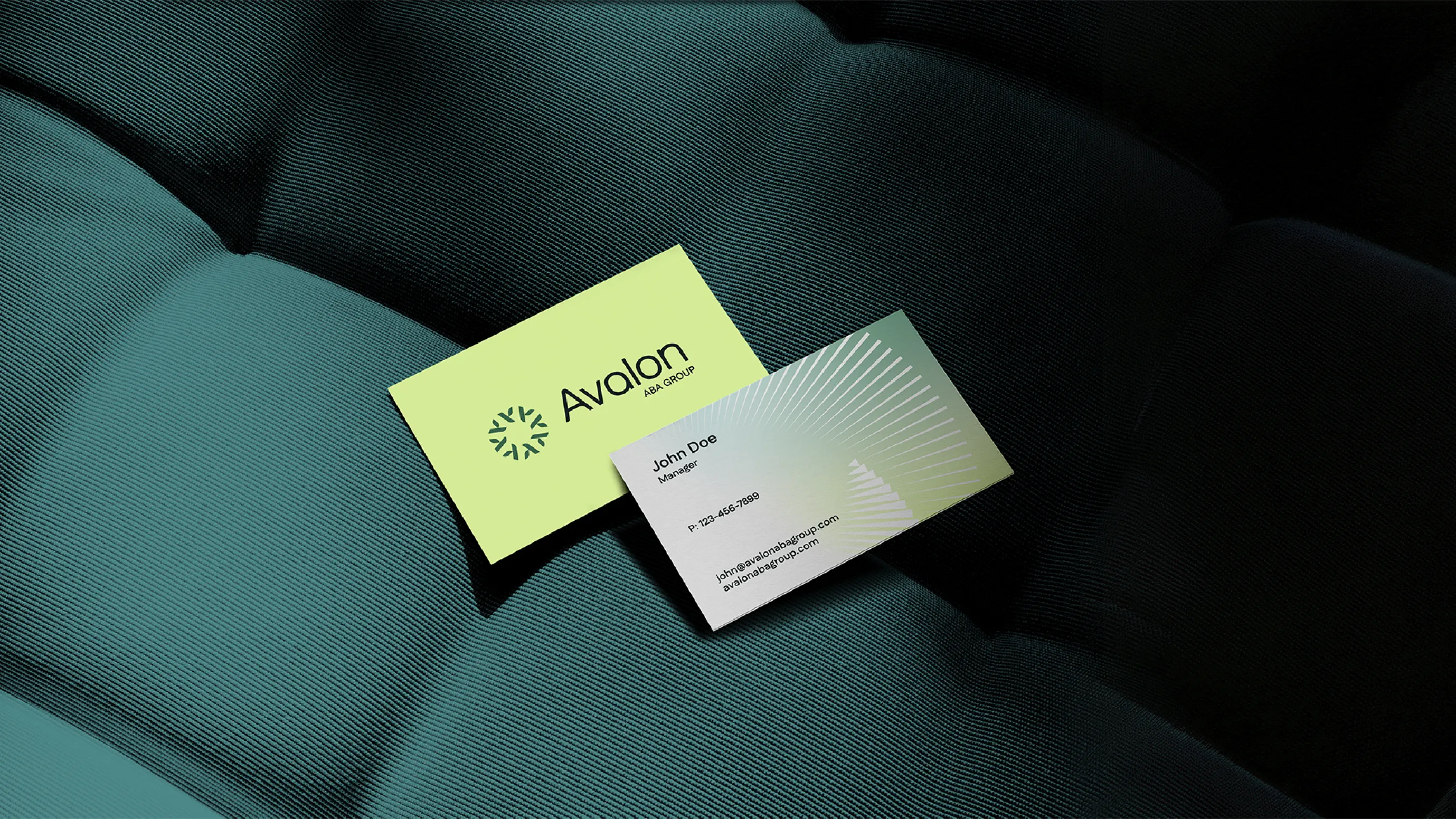
We dug deep into the psychology of both audiences and found the one true message that would resonate with each: quality care and lasting value go hand in hand. A clinic is only as valuable as the care and culture inside it, so Avalon grows the business by strengthening both. That idea gives sellers a reason to trust and investors a reason to buy in, and it shaped one of the brand’s strongest messages: “We’re not private equity. We’re personally invested.” The visual identity strikes the same balance. Deep forest green and modern editorial type give it financial seriousness, while fresh lime accents and warm, real-life photography keep it human. The icon, a ring of leaf-like strokes, carries the ideas of growth and nurture that matter on the clinic side, but keeps them clean, polished and professional.
“A delicate balance, successfully struck.”



























The Result
Avalon is now positioned to lead a new category in ABA: a buyer independent owners can trust and investors can confidently back. Its brand holds up in a boardroom, yet feels approachable to a BCBA weighing their next chapter.
Positioned to win both sides.