The Problem
Bintiva had built a standout line of inclusive, developmentally driven products for sensory-sensitive children. But as the company had expanded from sensory toys into workout equipment and school furniture, the brand hadn't kept pace.
The company wanted to pursue bigger opportunities, but knew they couldn’t do it with an image that didn't reflect their excellence or properly express their value.
The Challenge
We needed our rebrand to successfully span three distinct product lines and audiences.
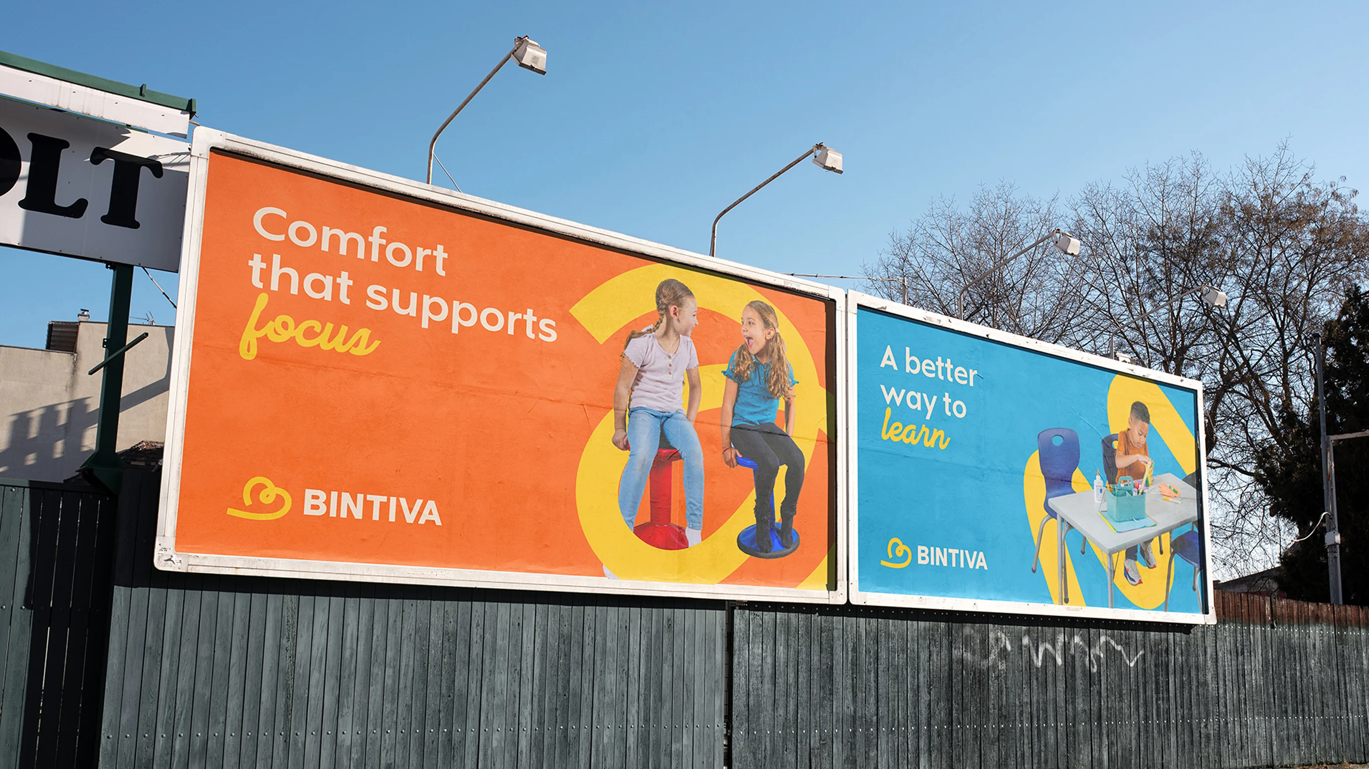
And to craft a cohesive visual system that could feel soft and parent-friendly enough to fly off the shelves at Target, but grounded and confident enough to service schools and clinical settings.




The Magic
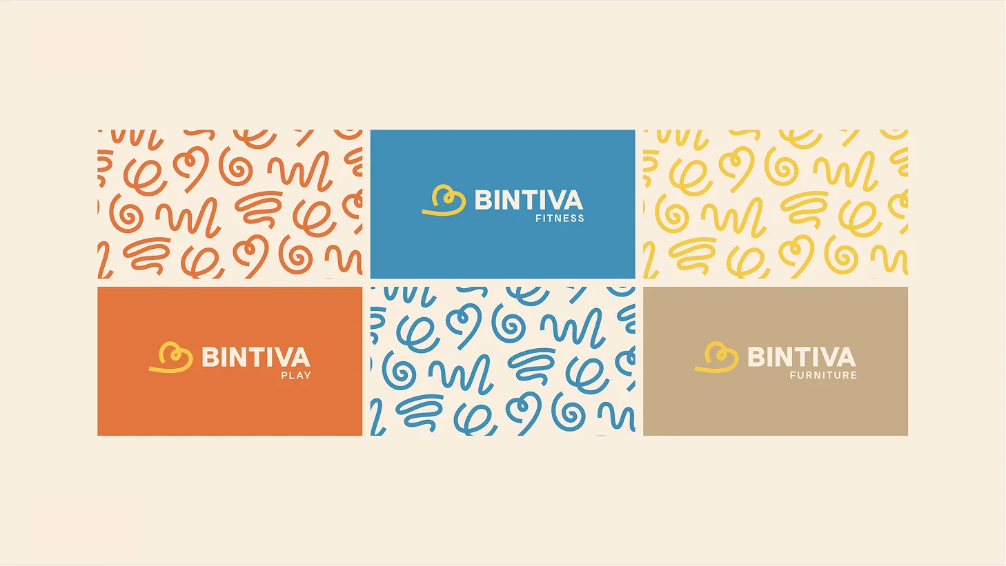
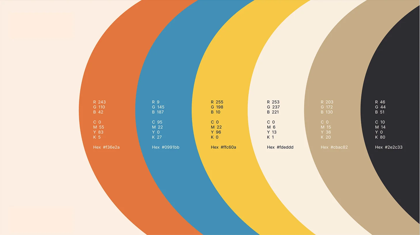
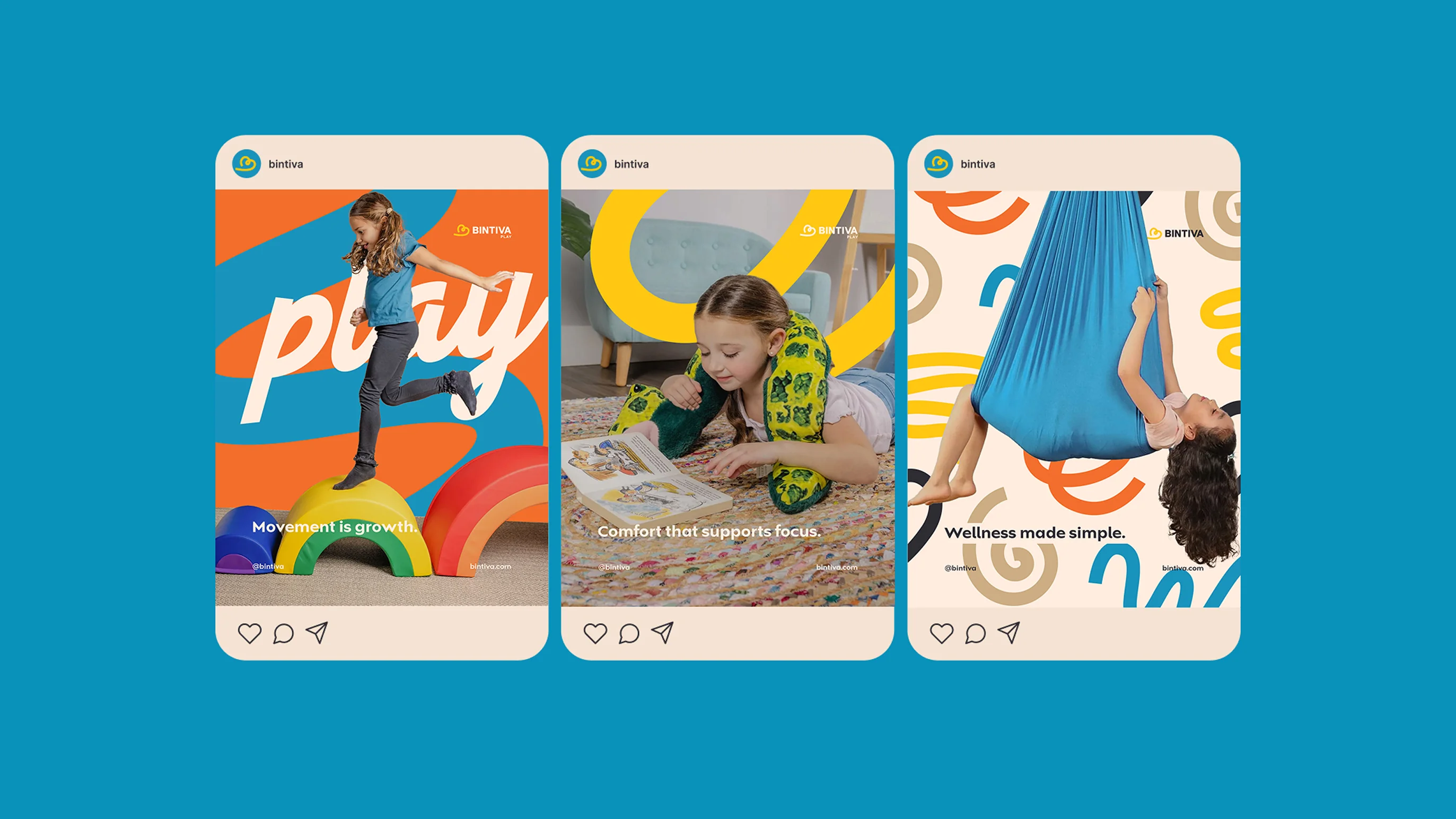
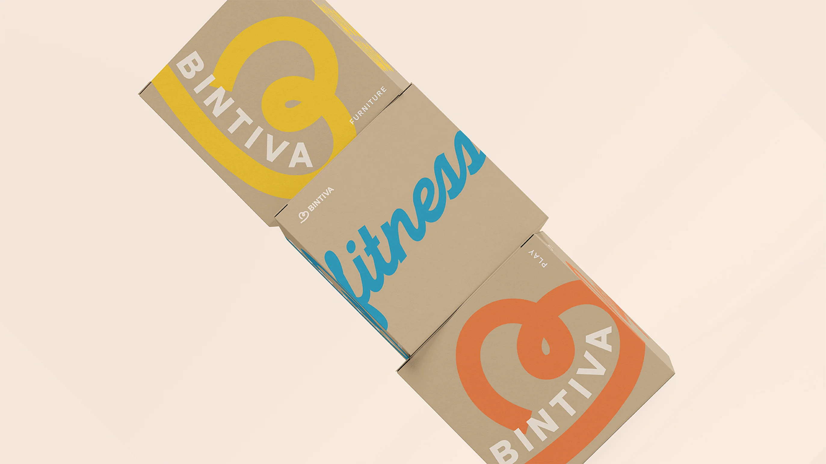
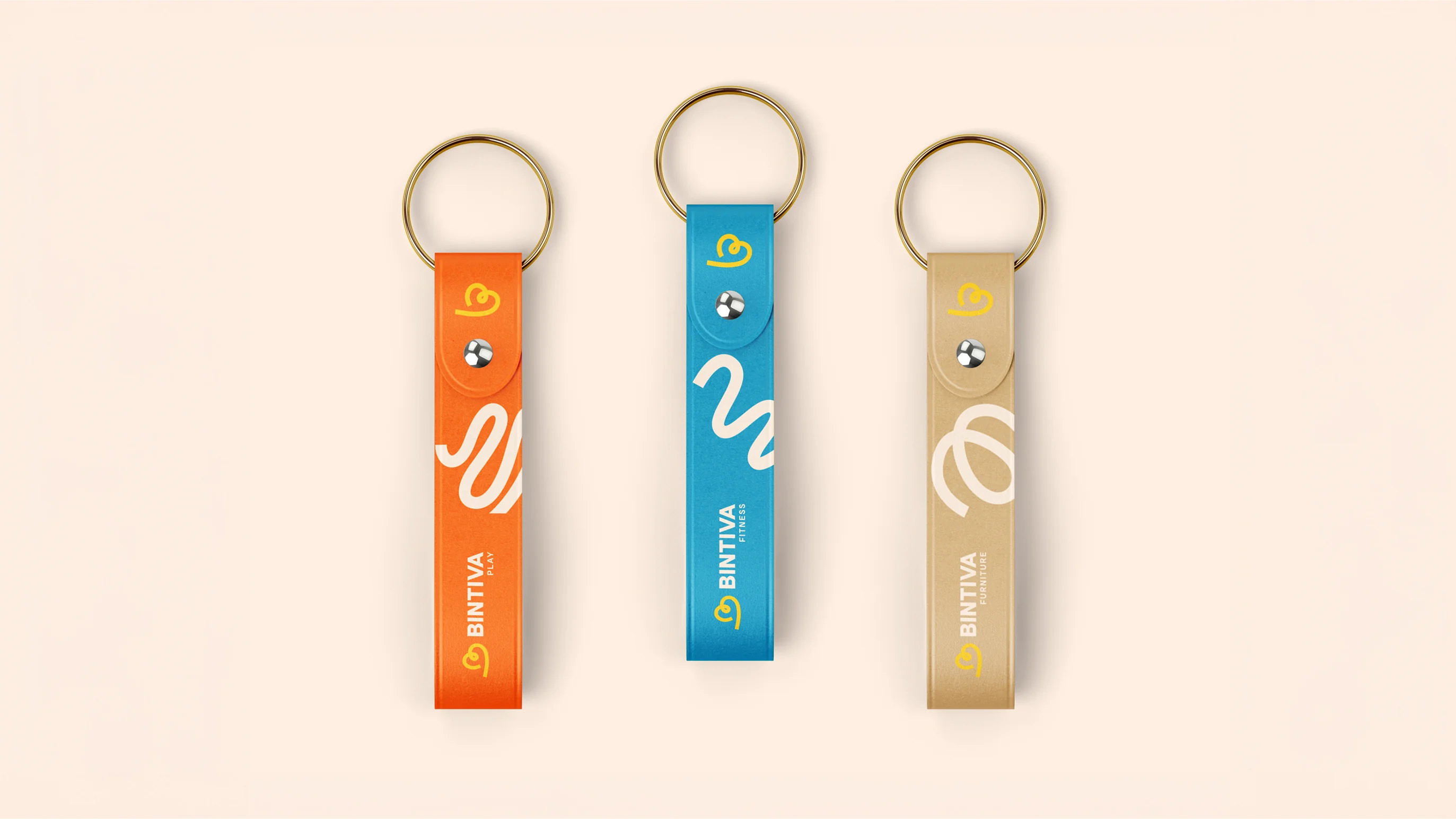
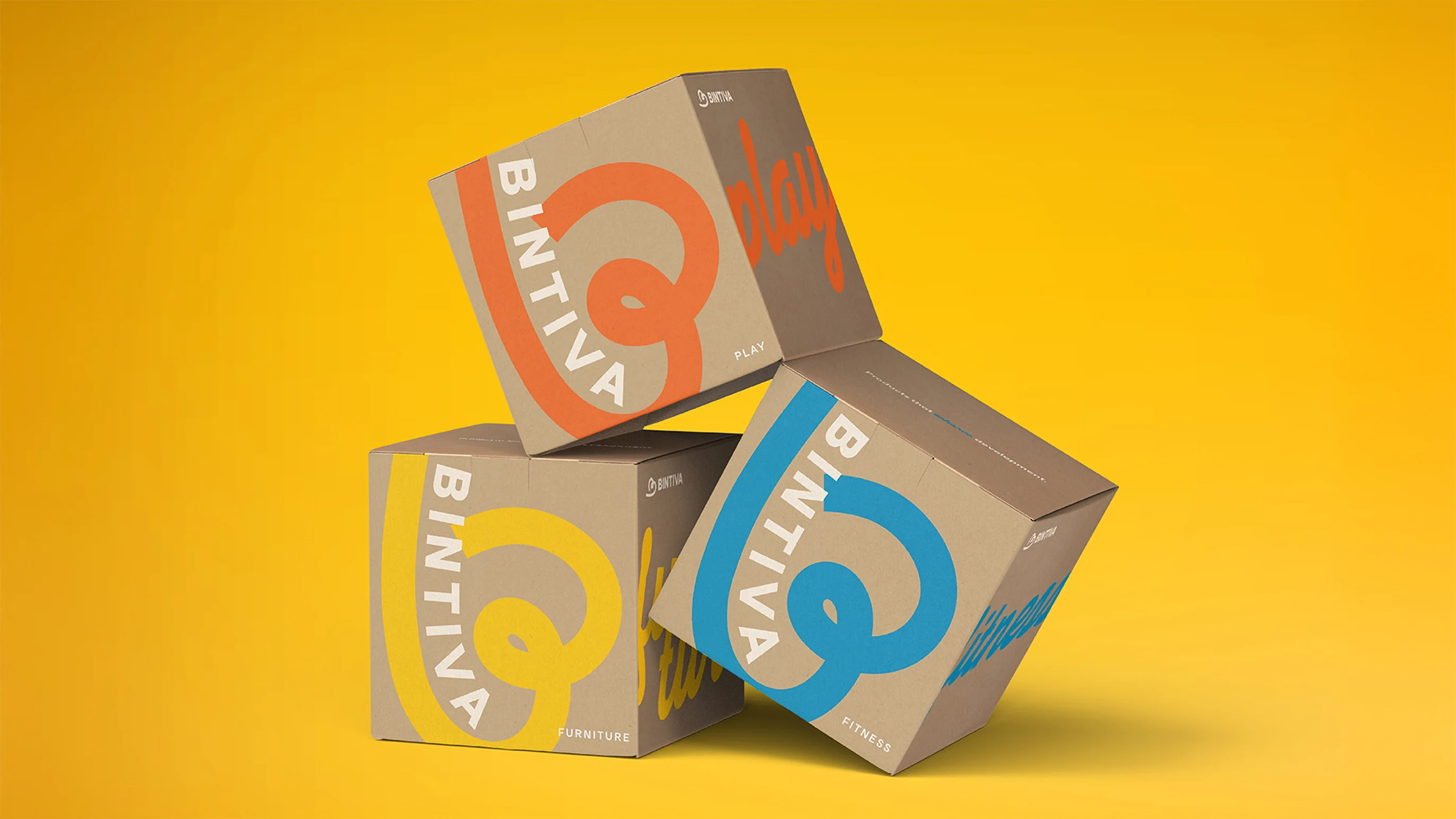
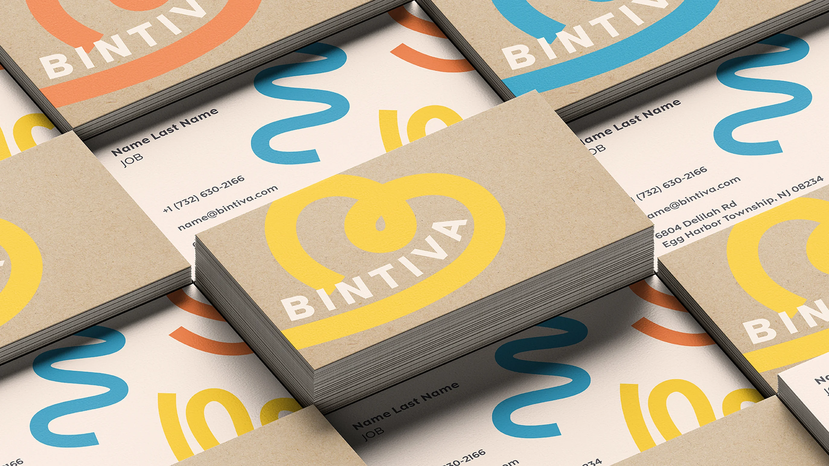
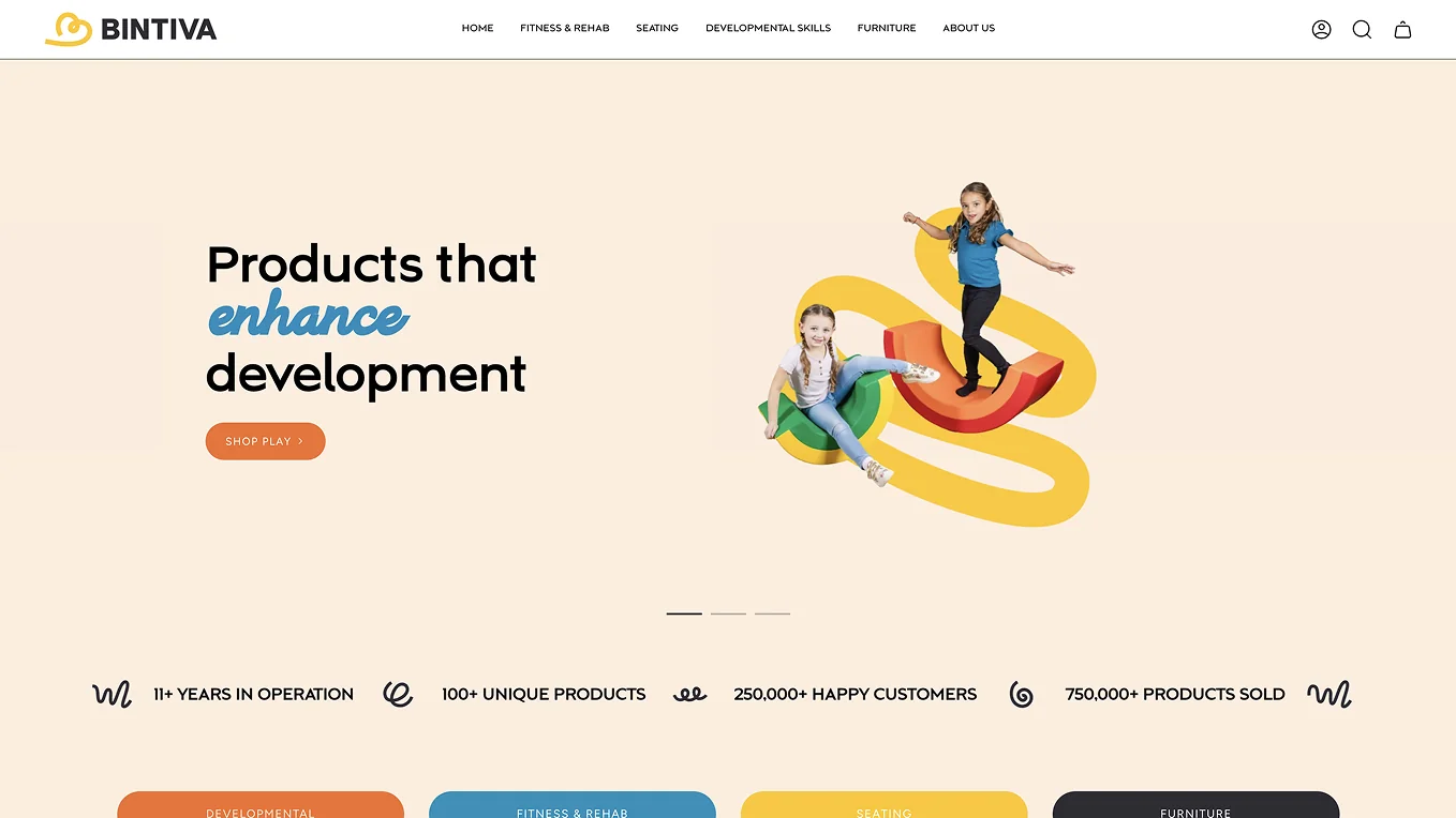
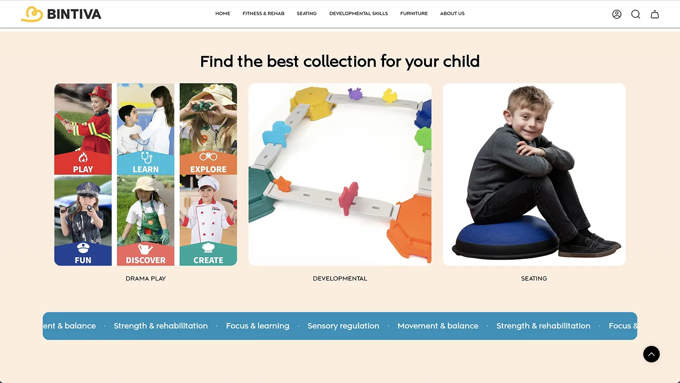
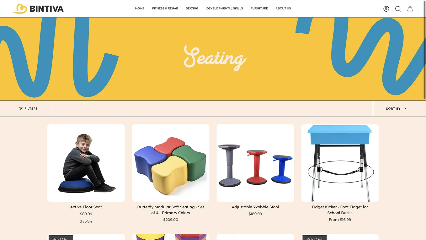
We started by bringing clarity to the brand architecture, dividing the company into three distinct lines: Bintiva Play, Furniture, and Fitness. Each line got its own specialty-crafted color palette geared toward its target customer.
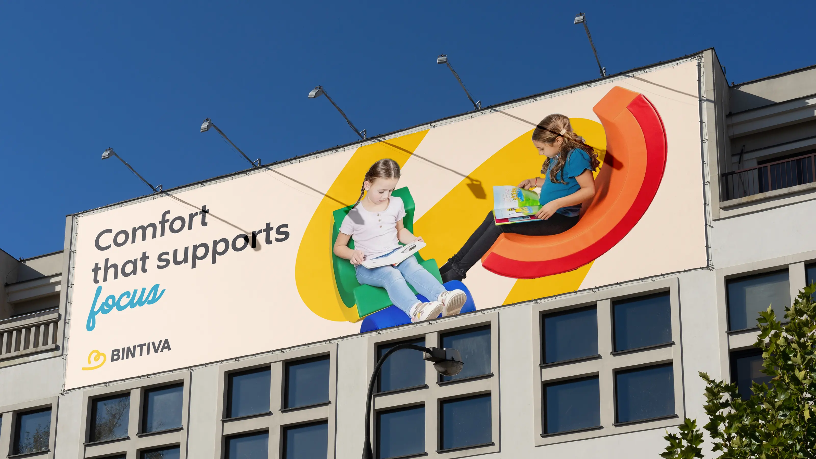
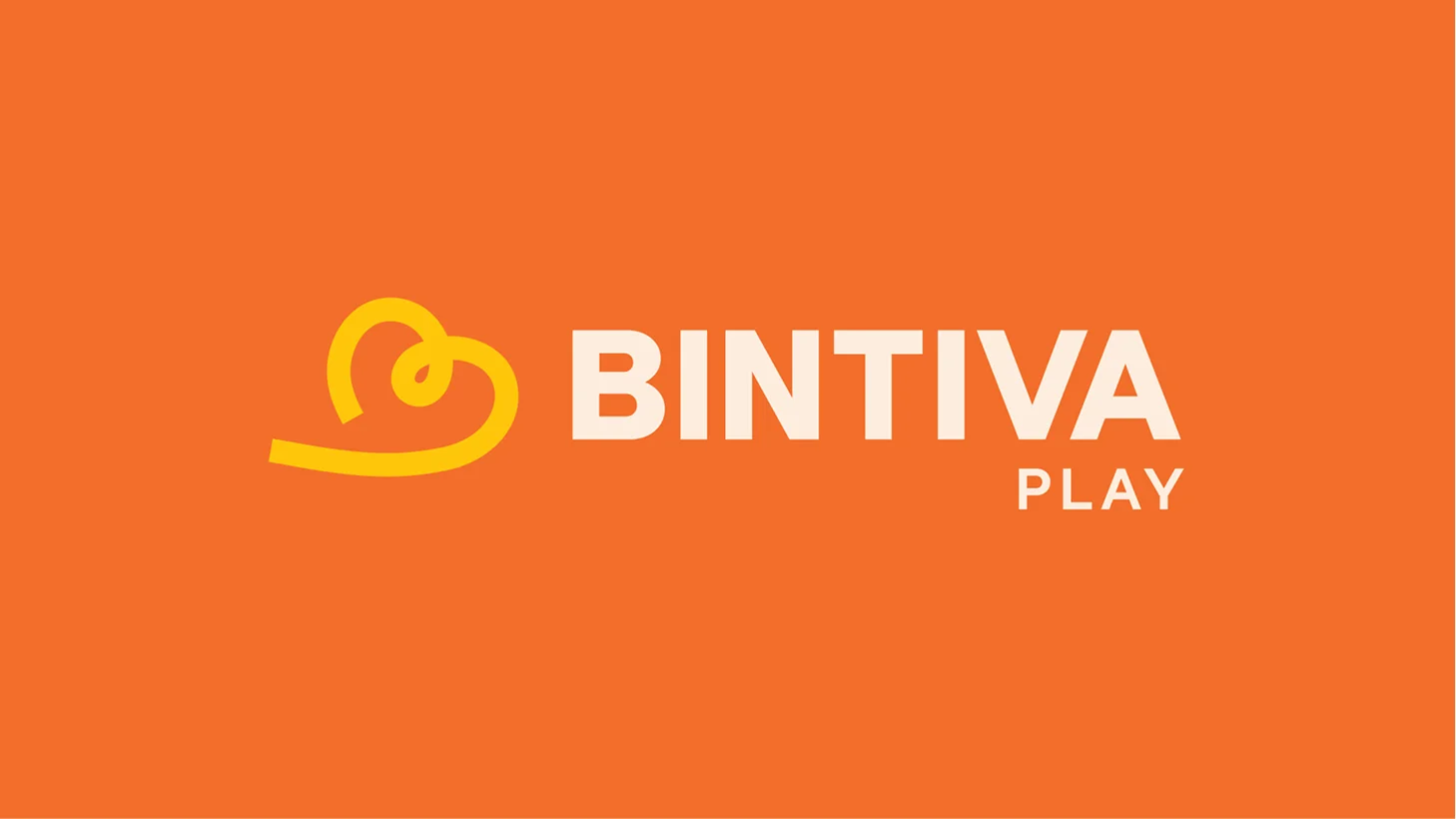
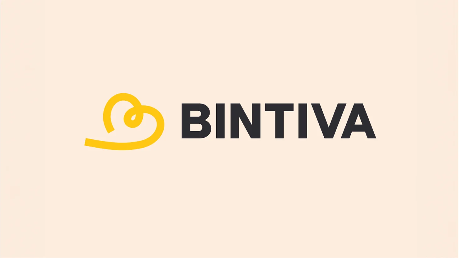
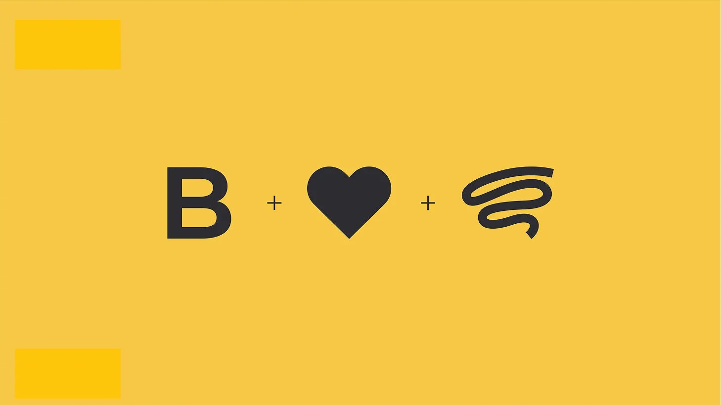
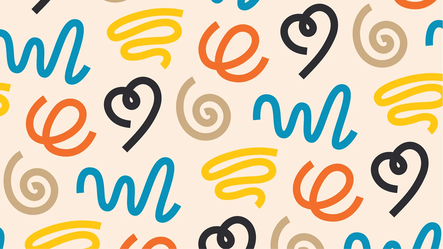
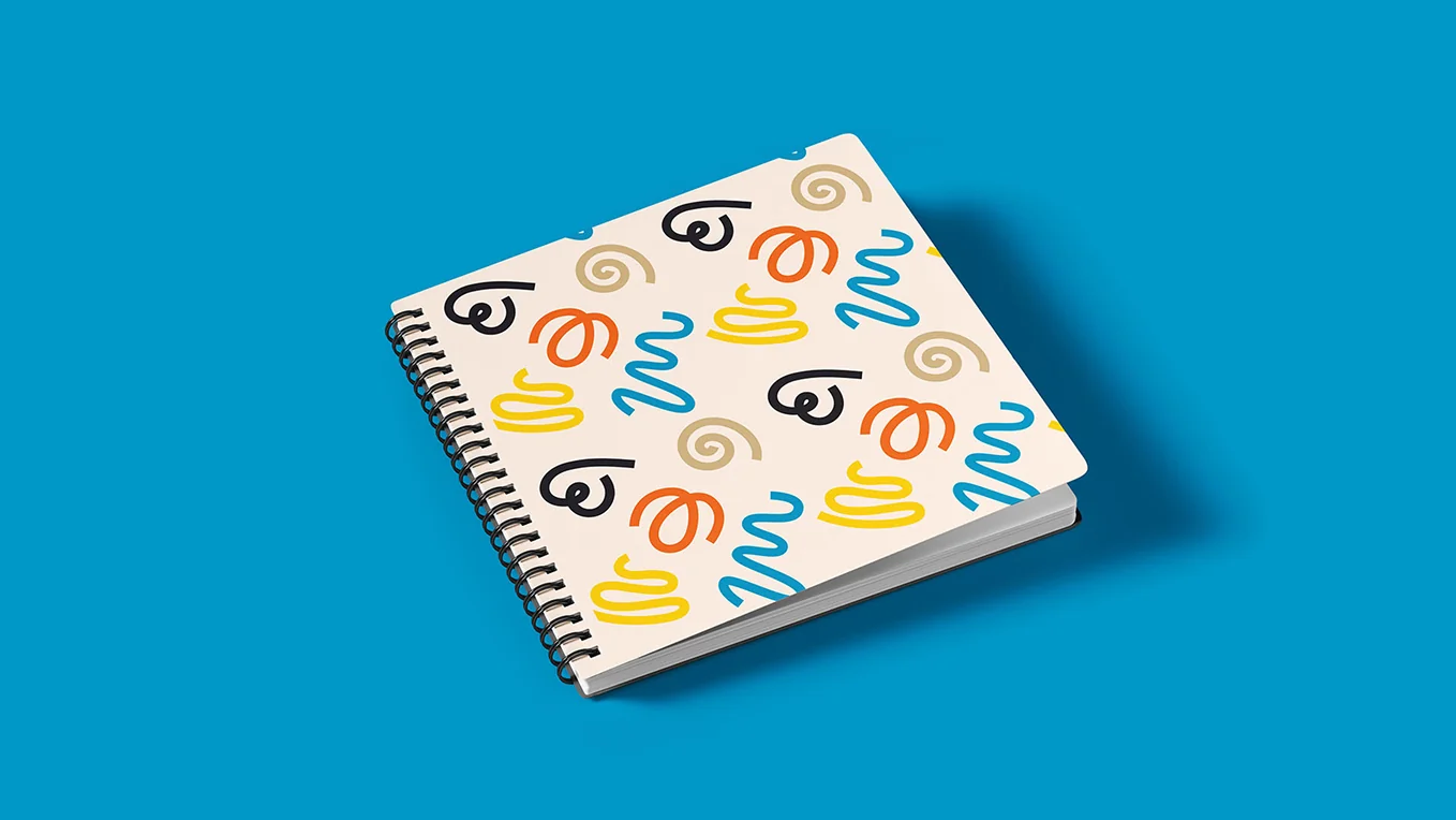
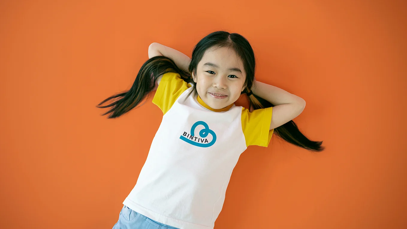
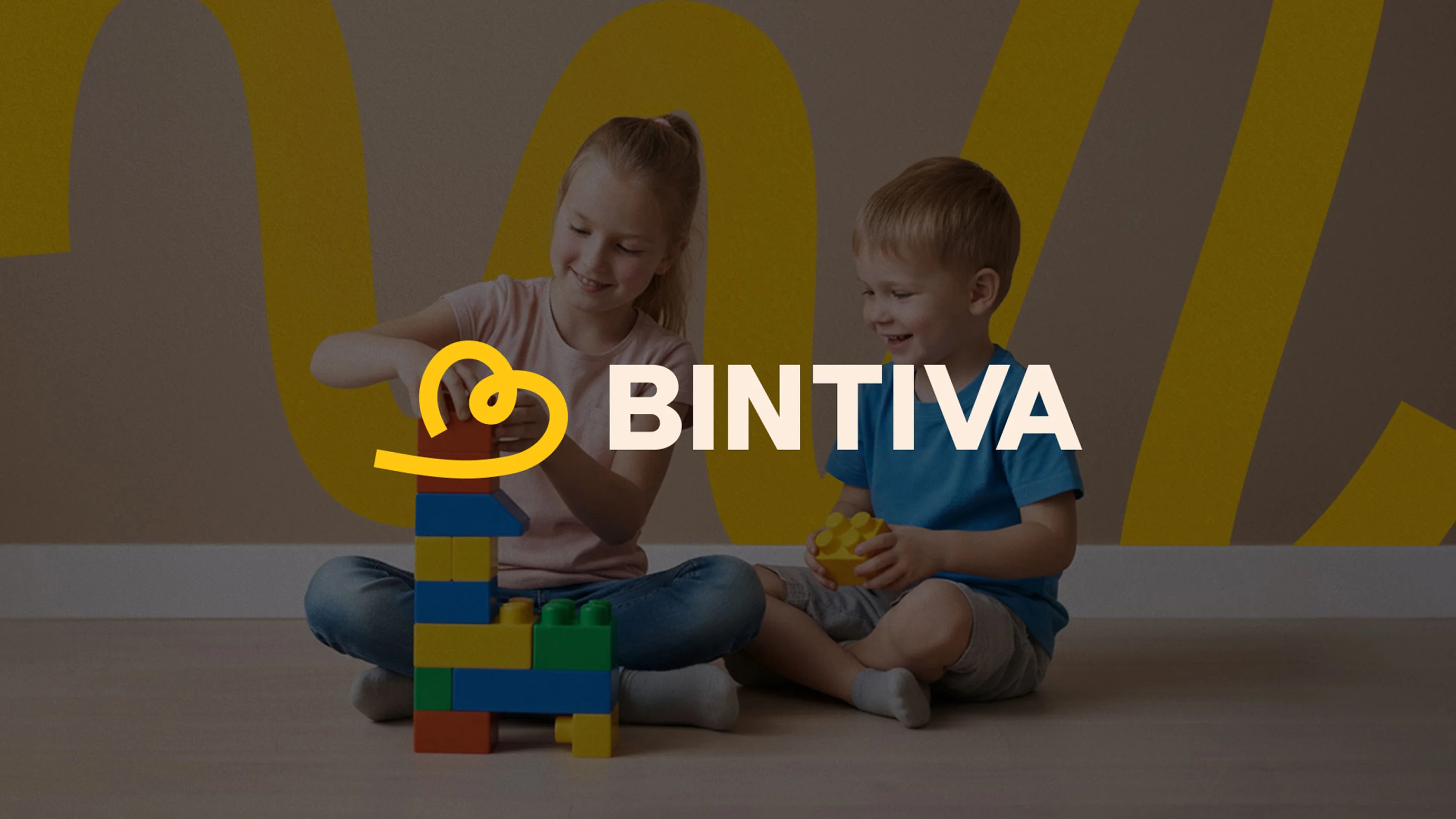
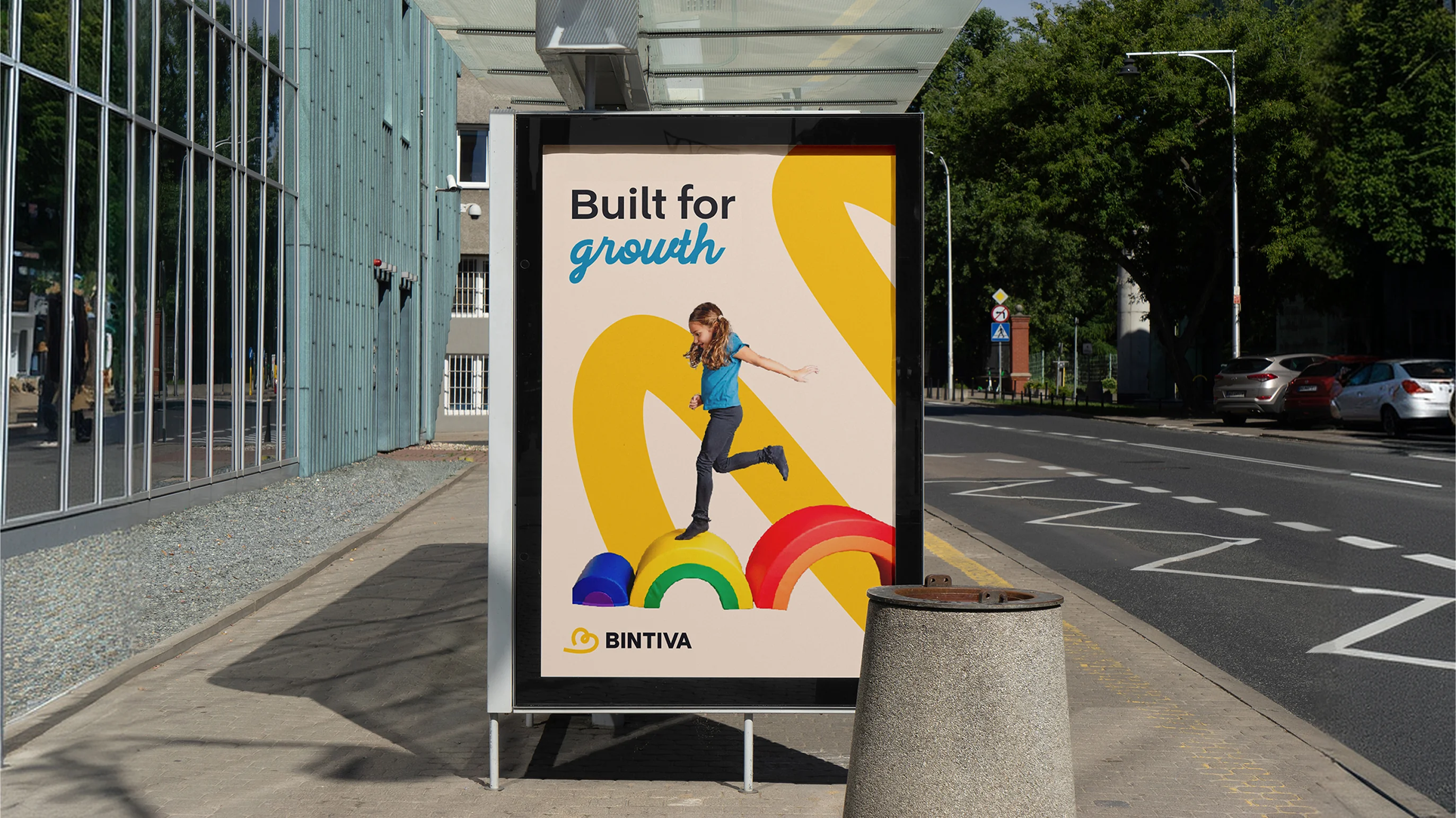
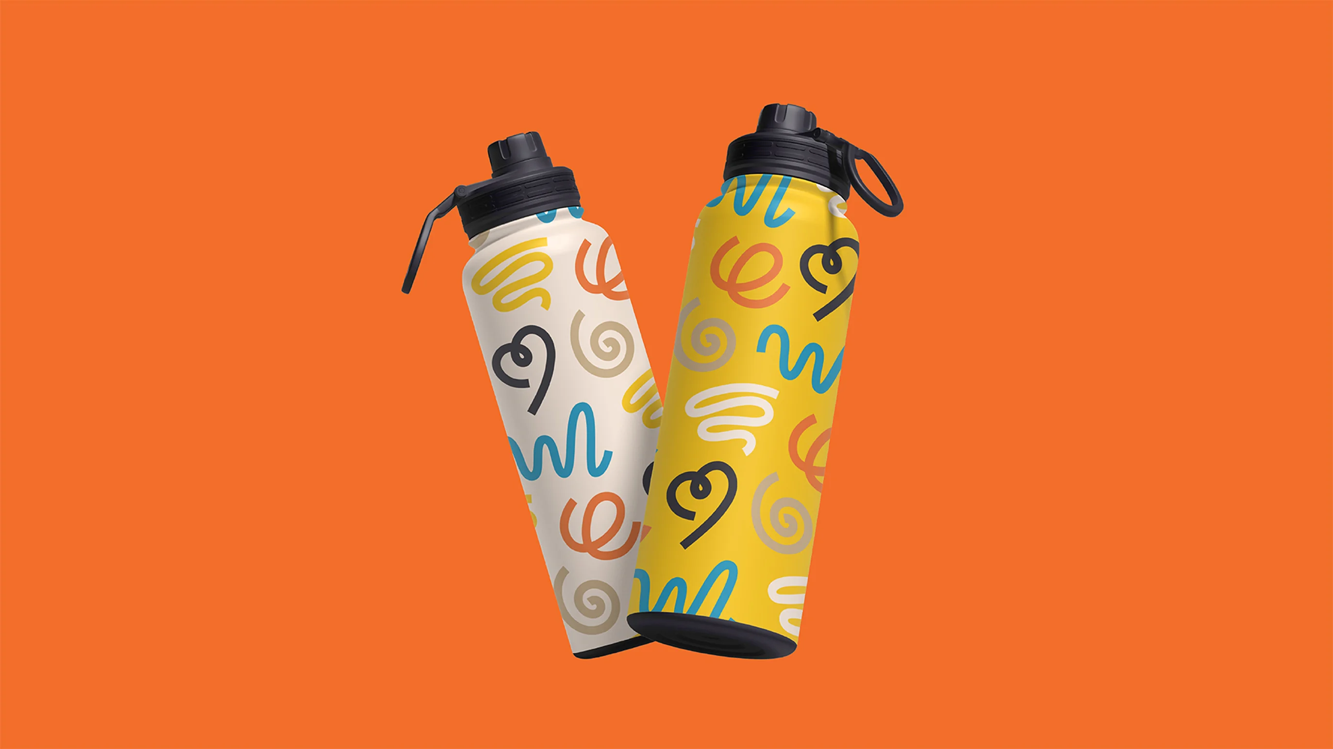
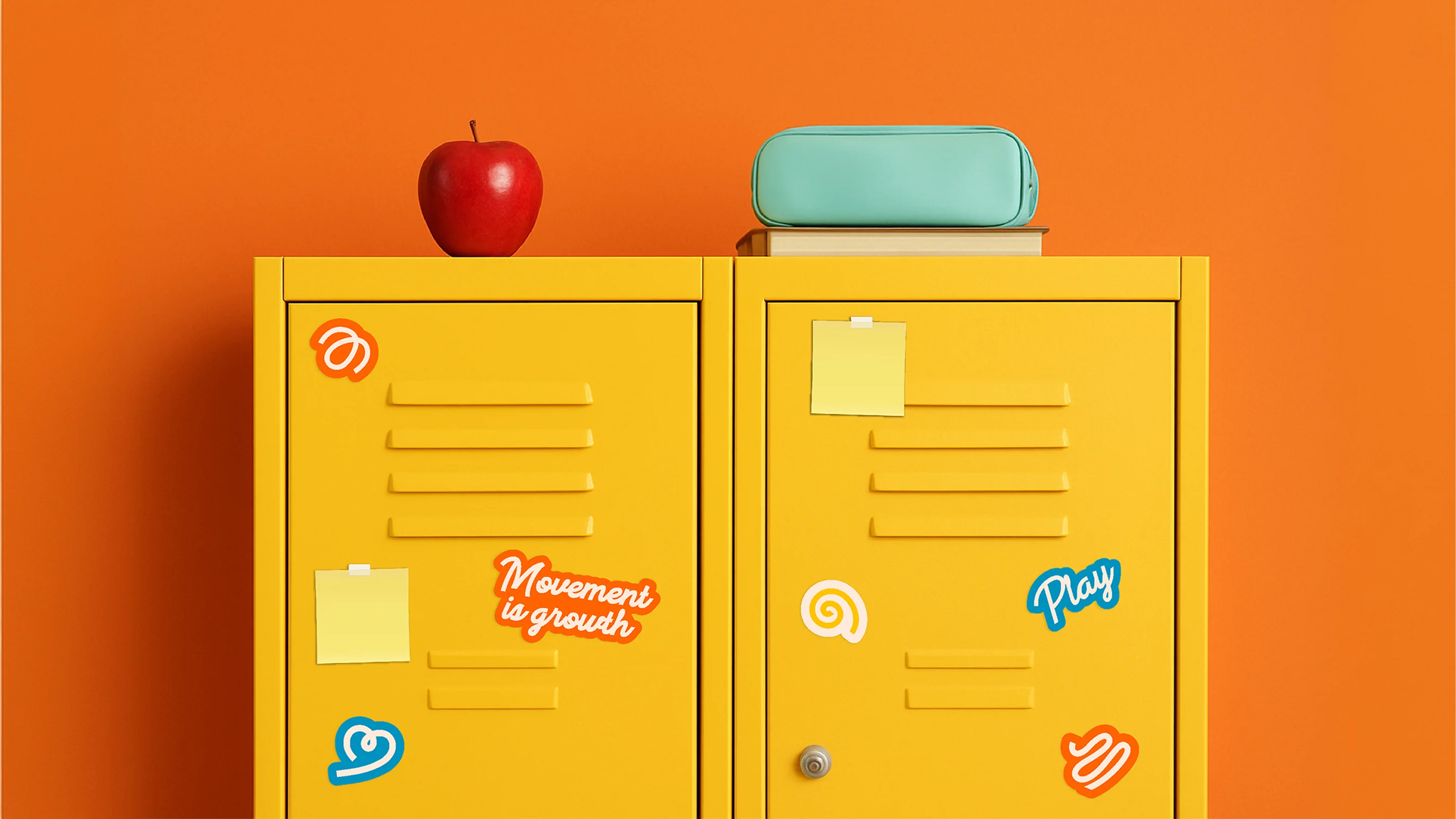
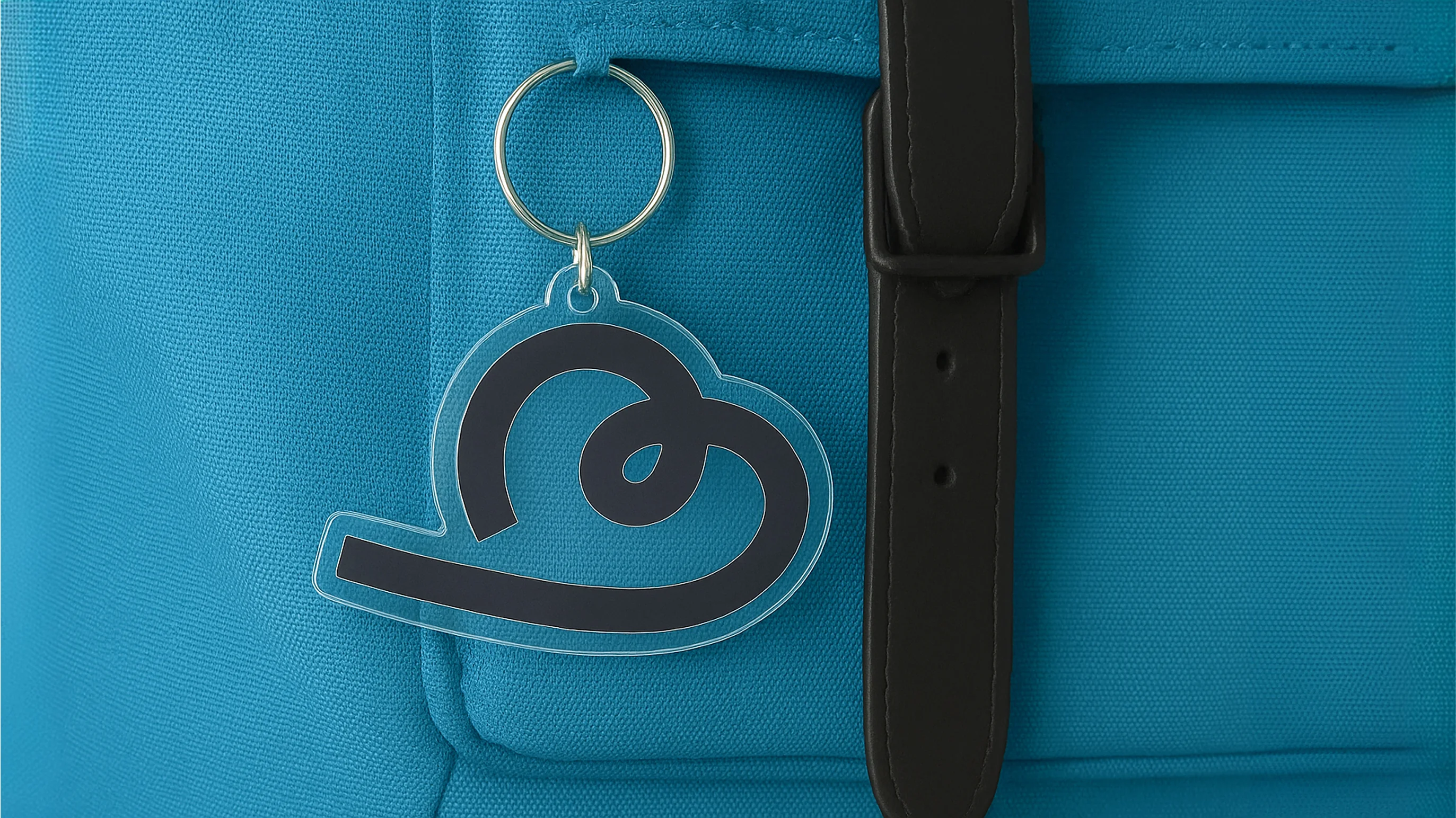
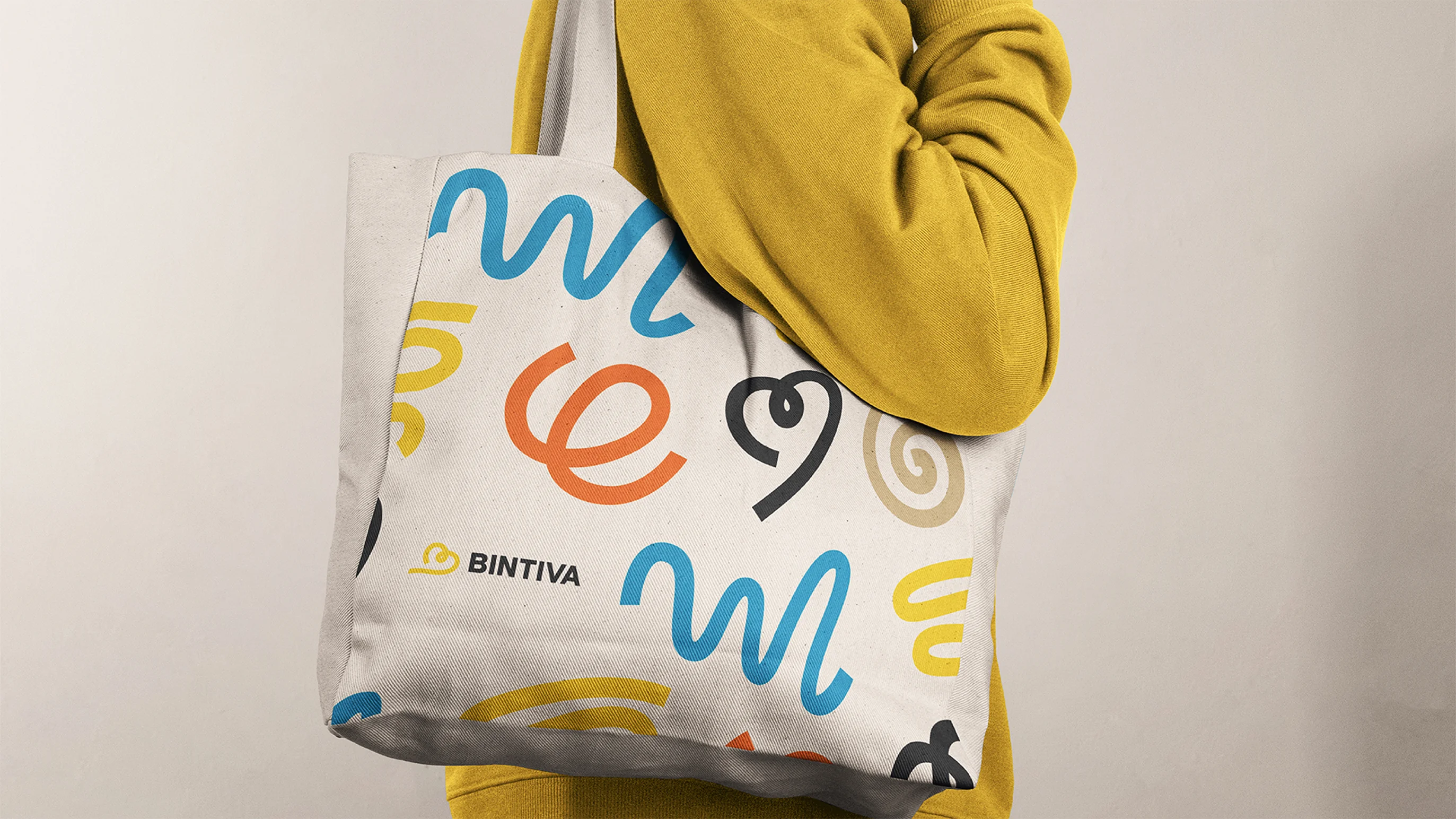
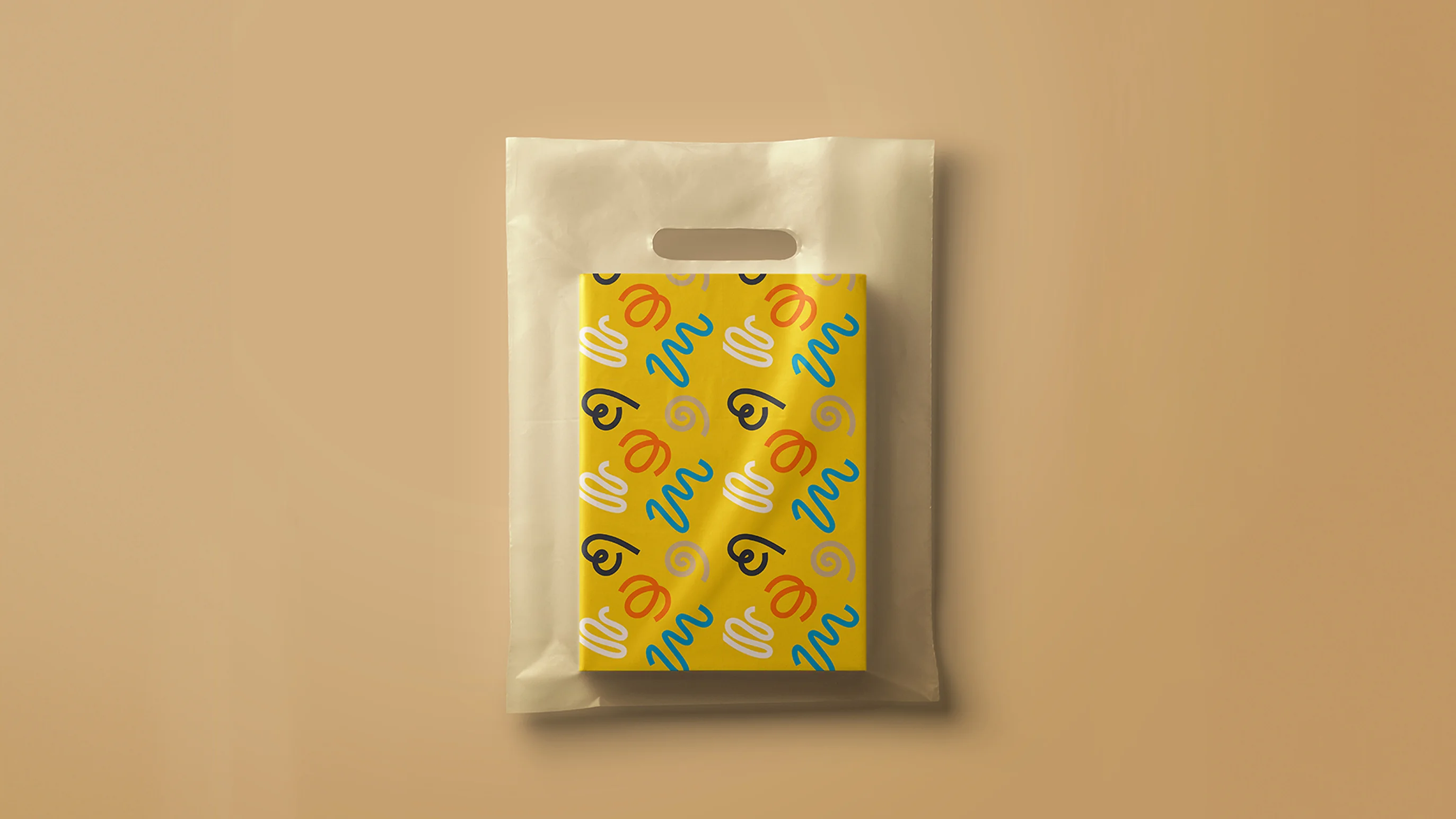
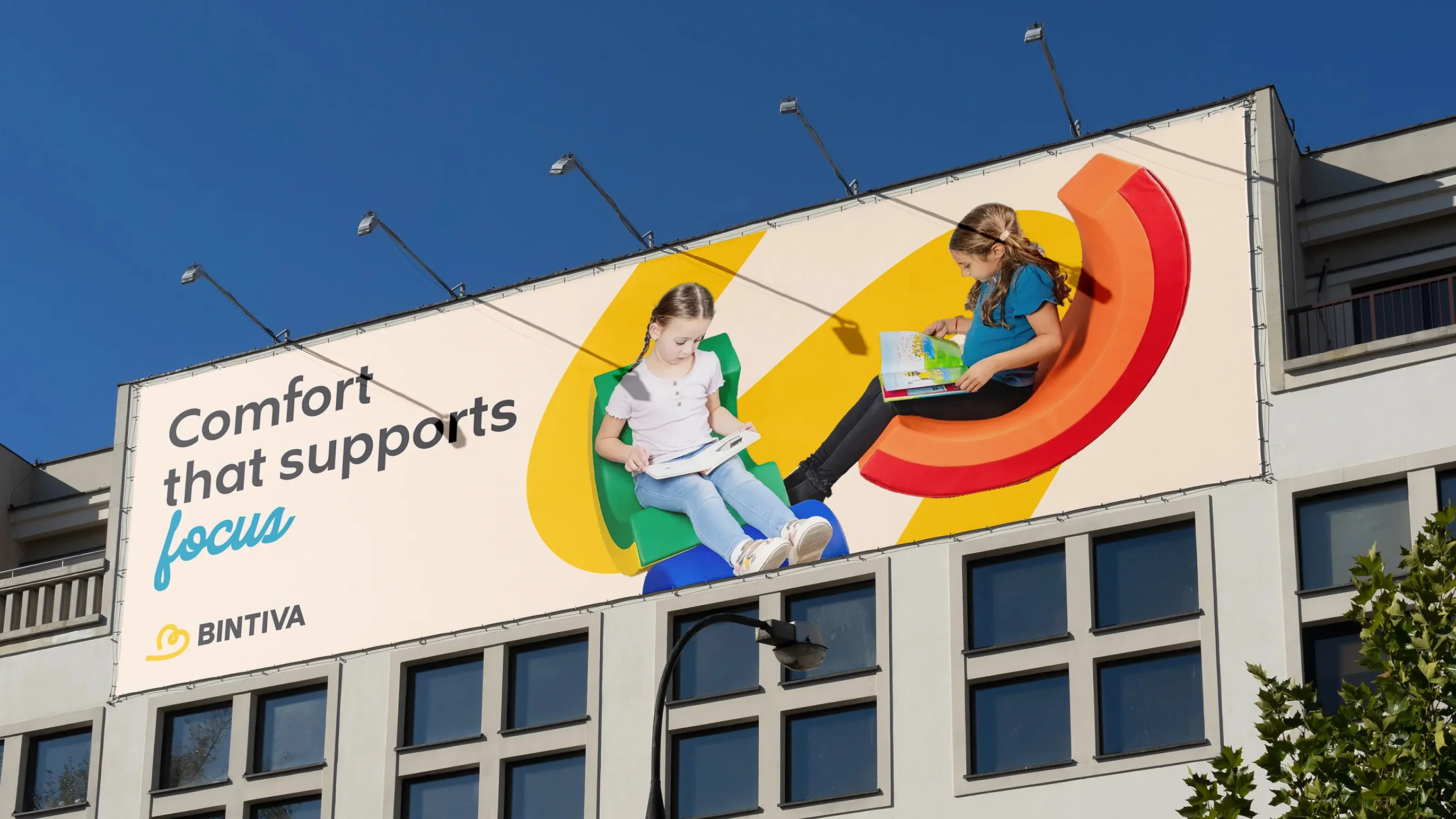
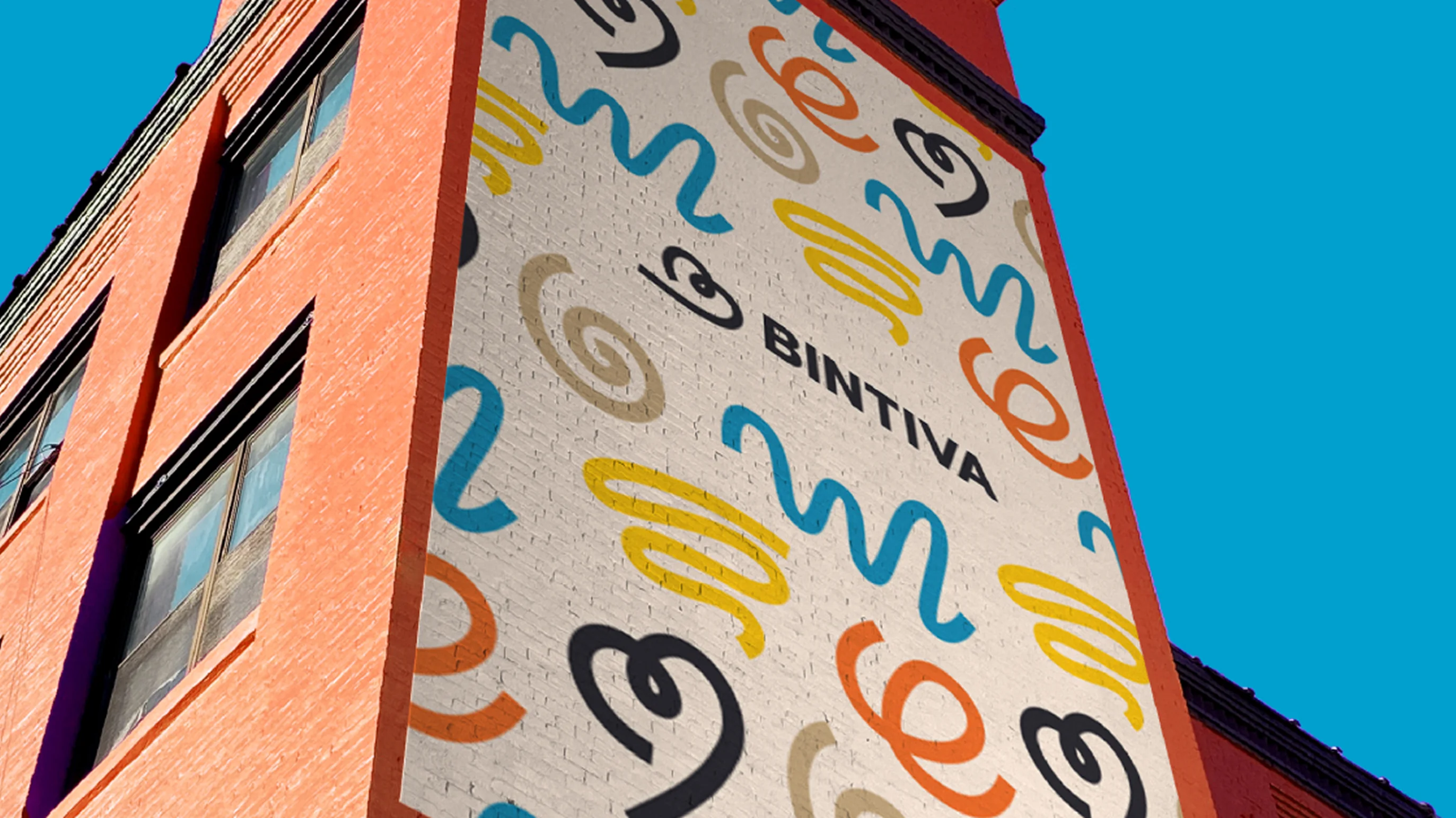
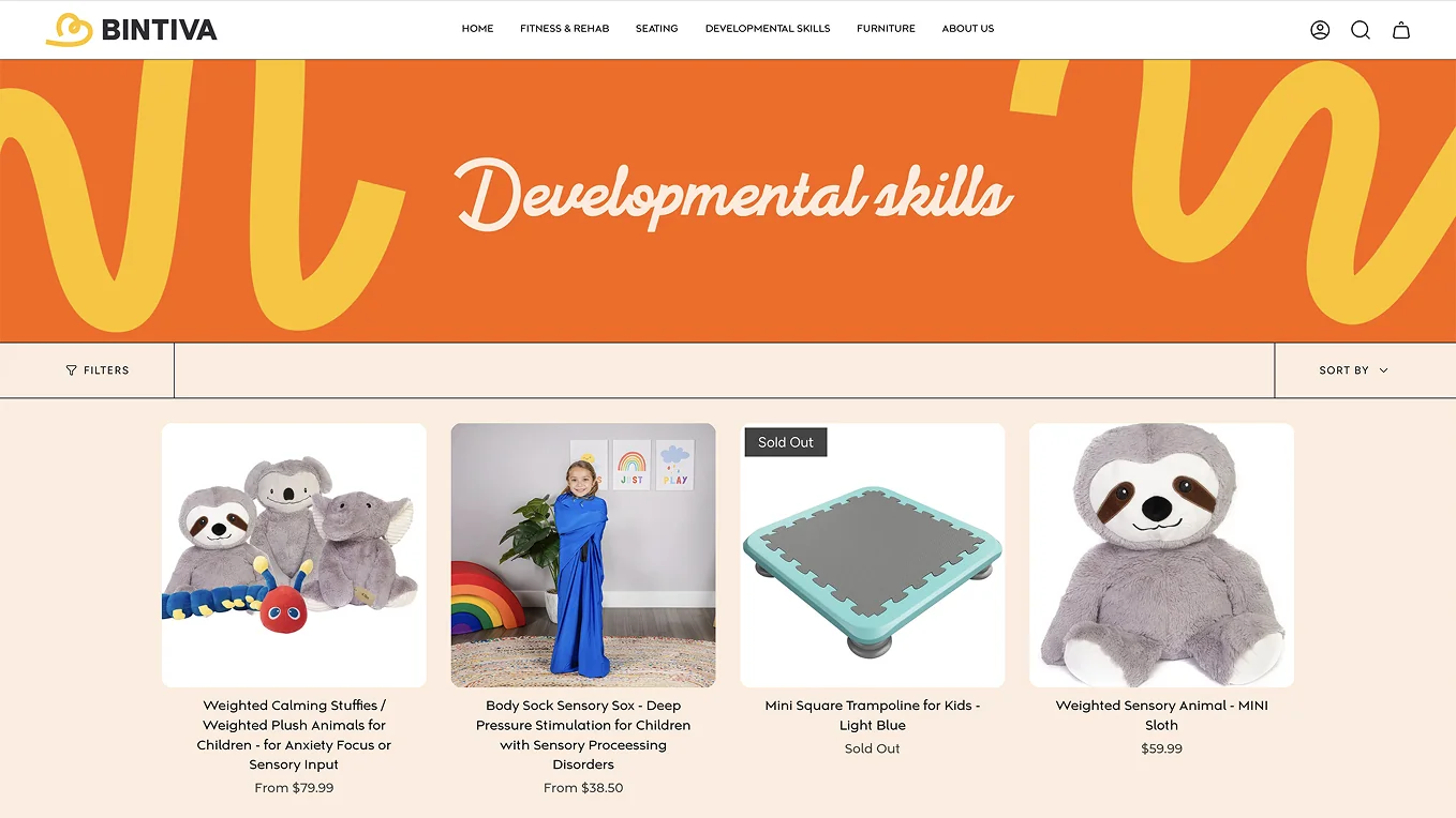
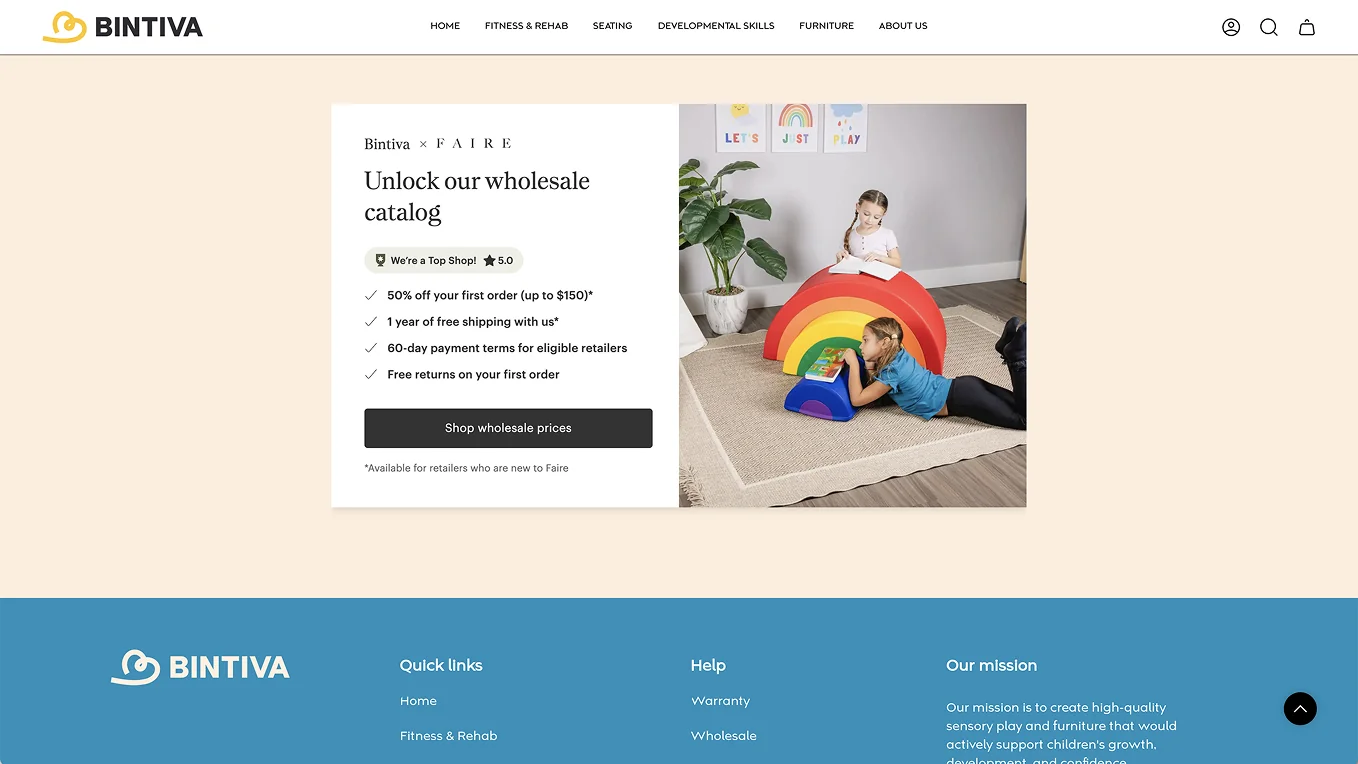
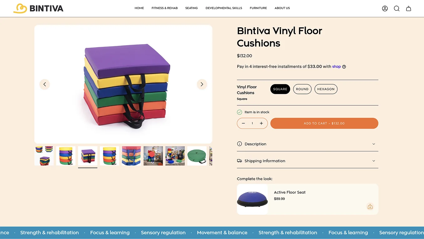
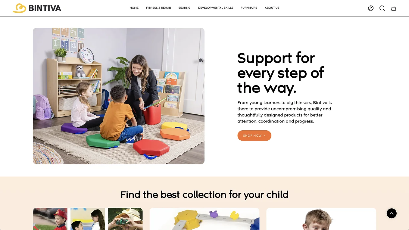
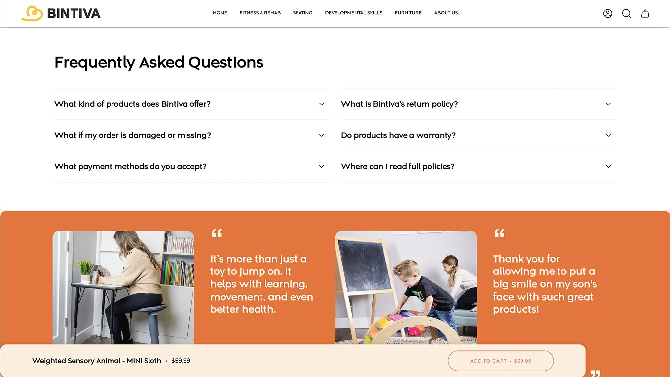
Then we dove deep into strategic design, crafting every visual to evoke motion, growth, and energy. A simple, bold logotype was built around an iconic heart-shaped B icon, its angle and formation clearly evoking movement. Custom illustrations brought childlike joy into every touchpoint, and typography and motion work carried that upbeat spirit throughout.
“Then we dove deep into strategic design, crafting every visual to evoke motion, growth, and energy.”

The Result
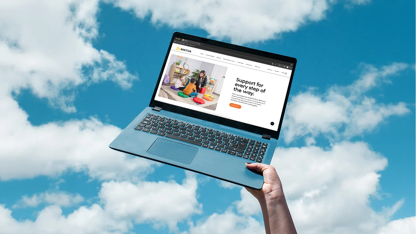
Since rebranding and launching their new website, Bintiva has expanded its regional footprint and begun gaining national recognition.
They recently celebrated the major milestone of signing a retail deal with Costco.