zoomdoc
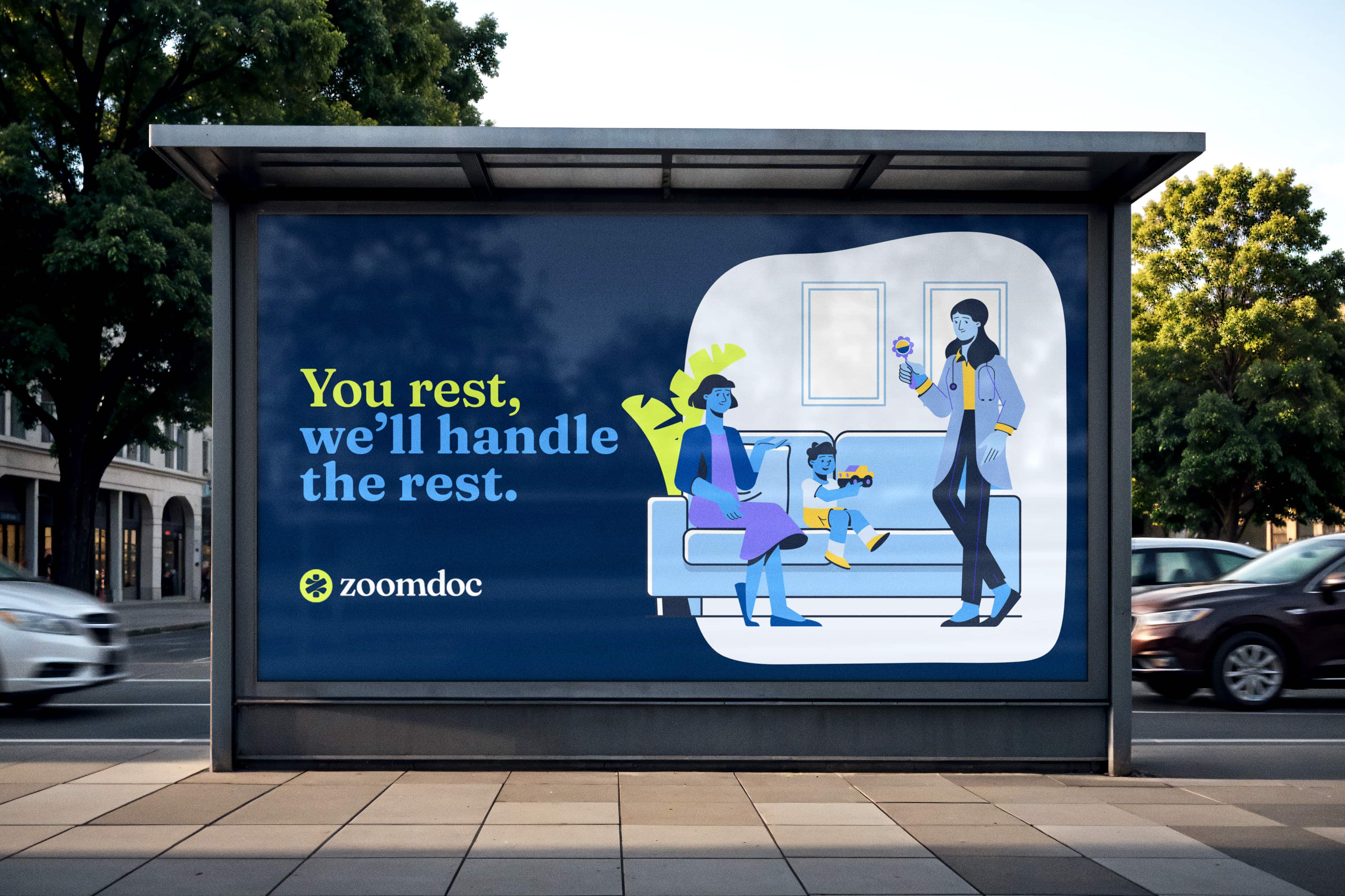
You rest, we'll do the rest.
Client:
Joe Gold
Project type:

Project Scope
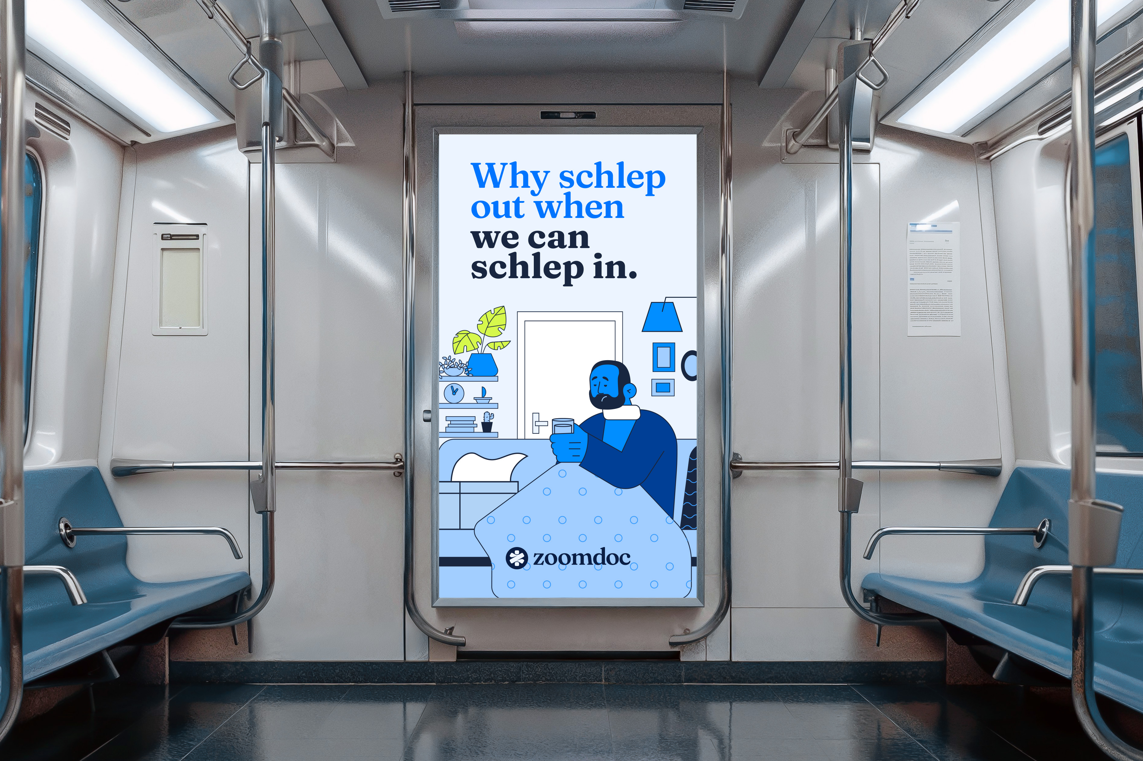
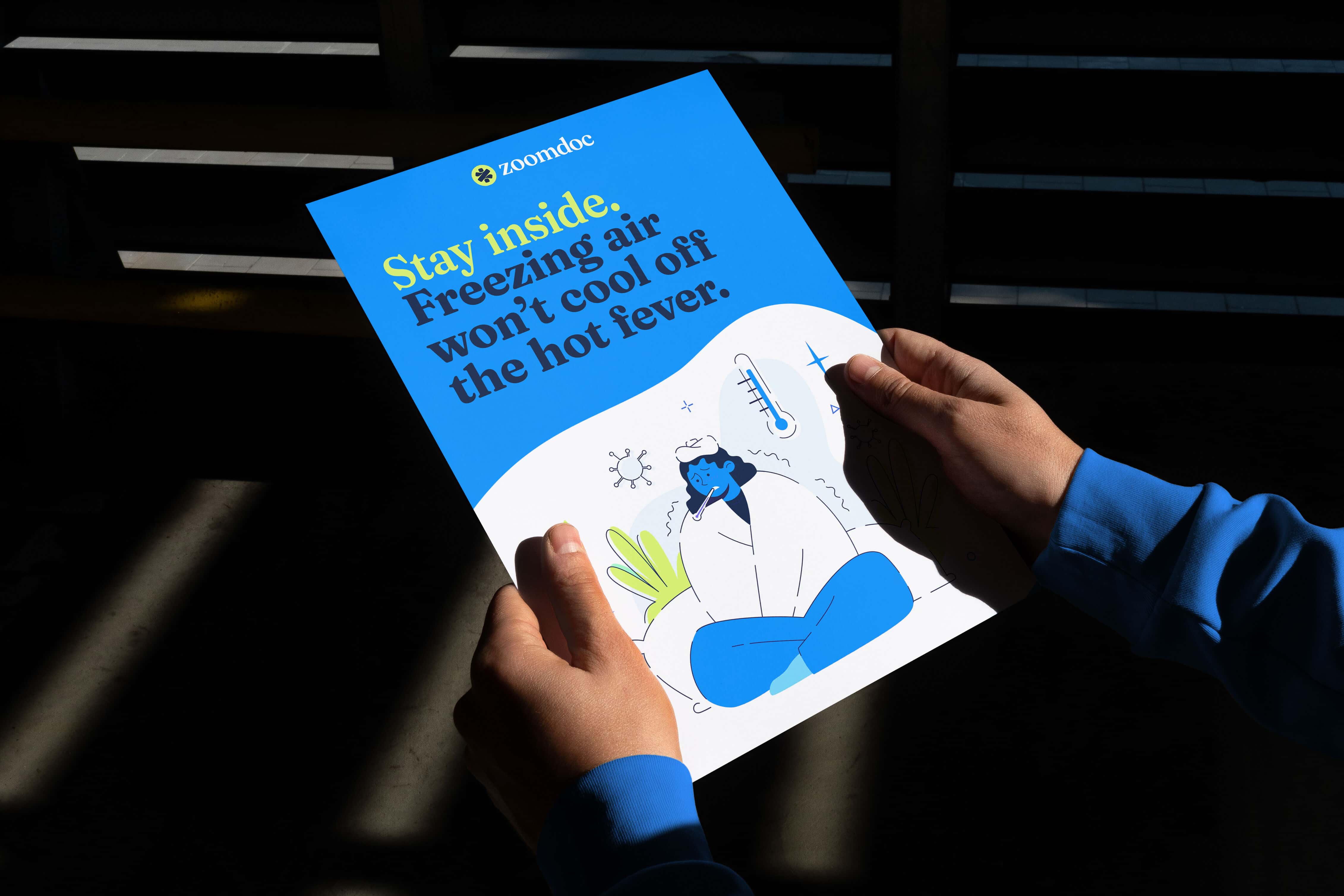
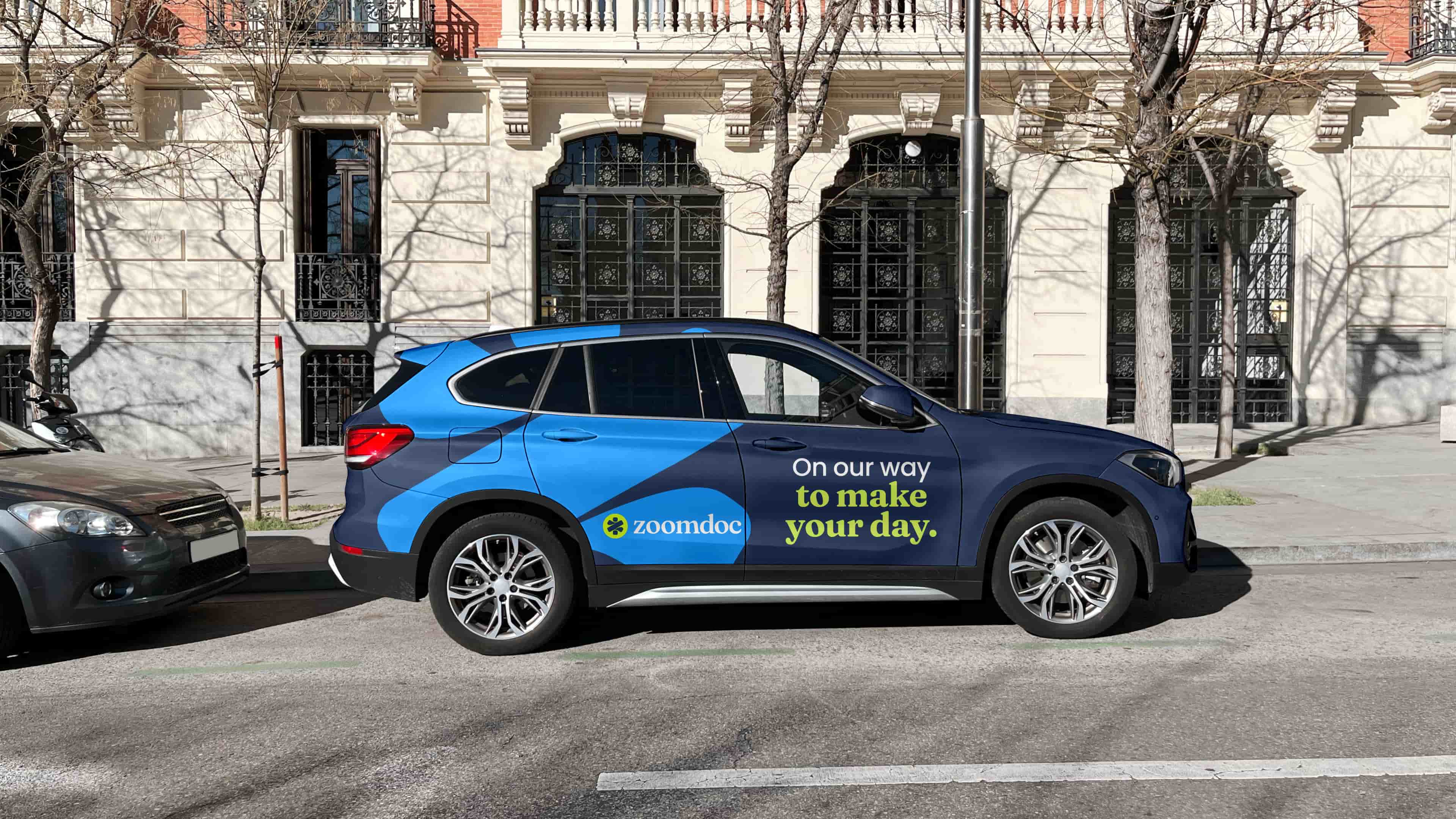
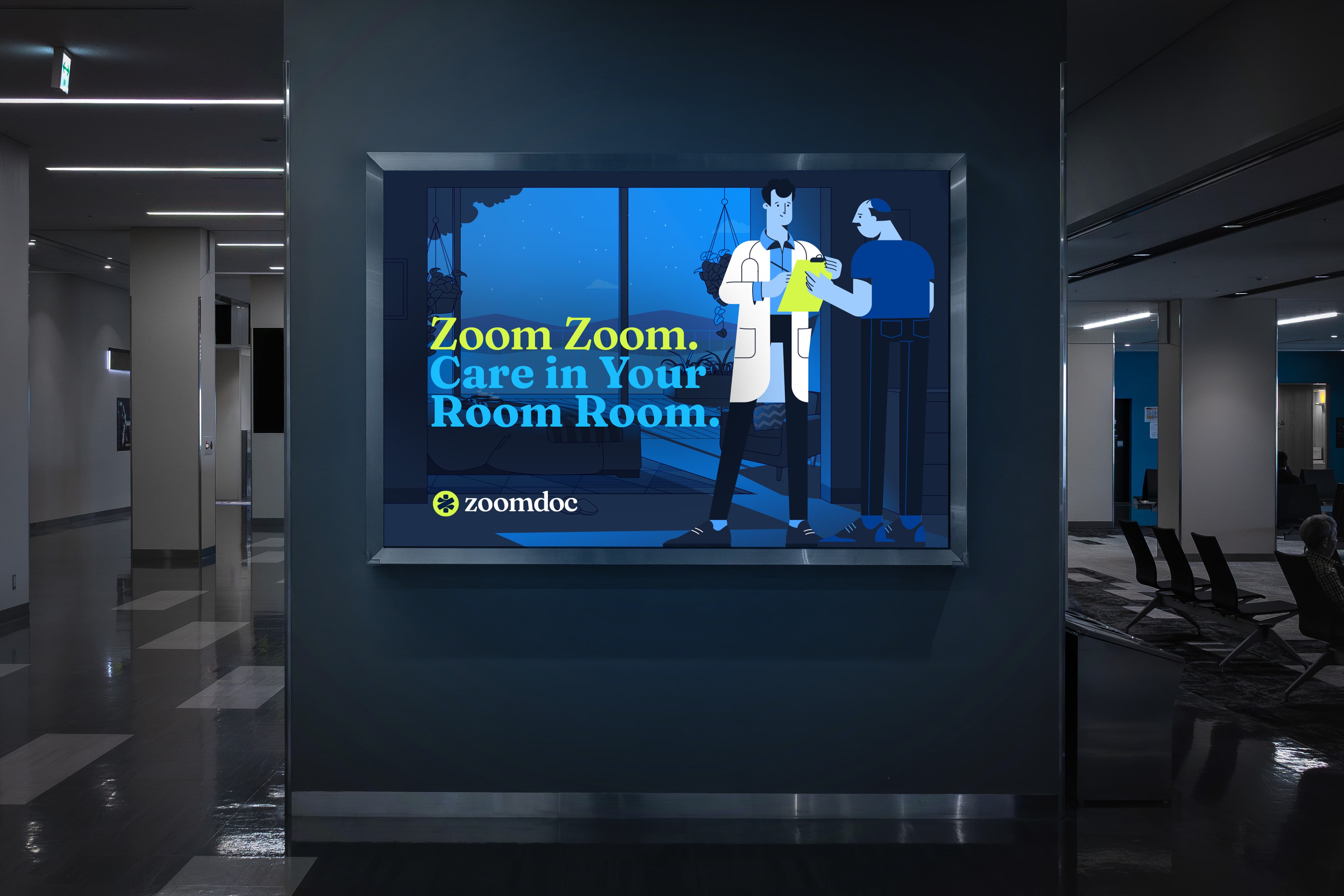
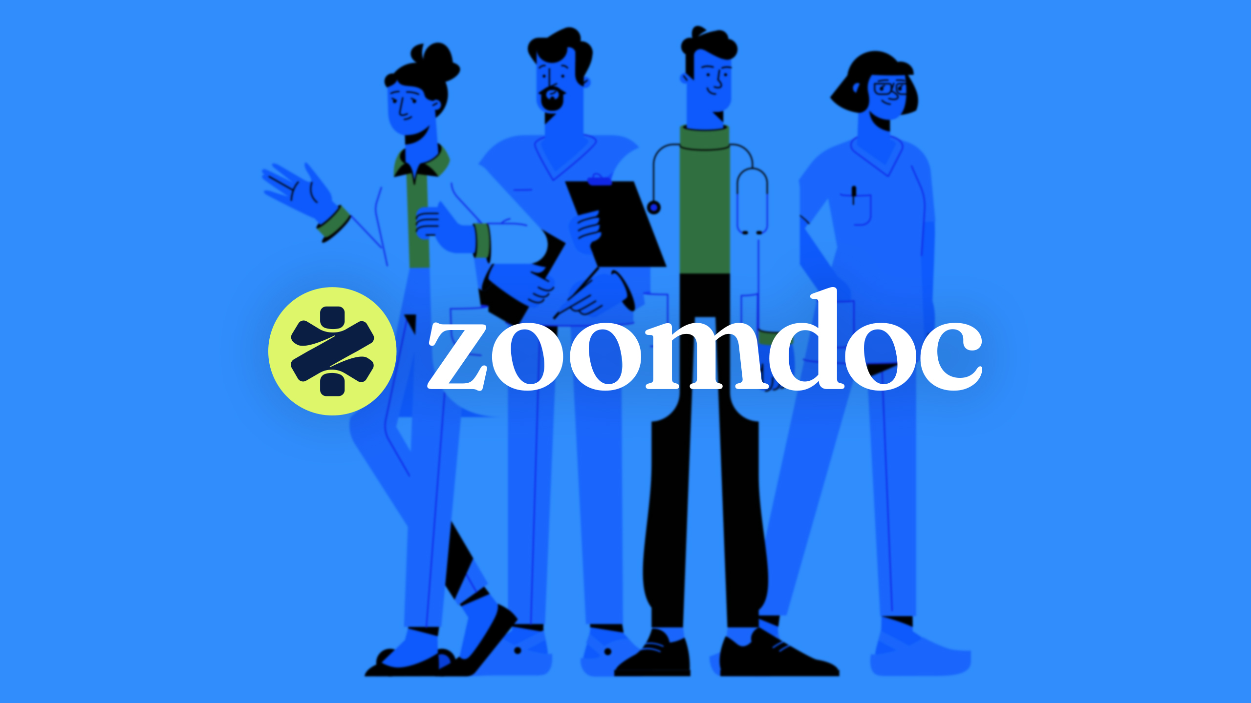
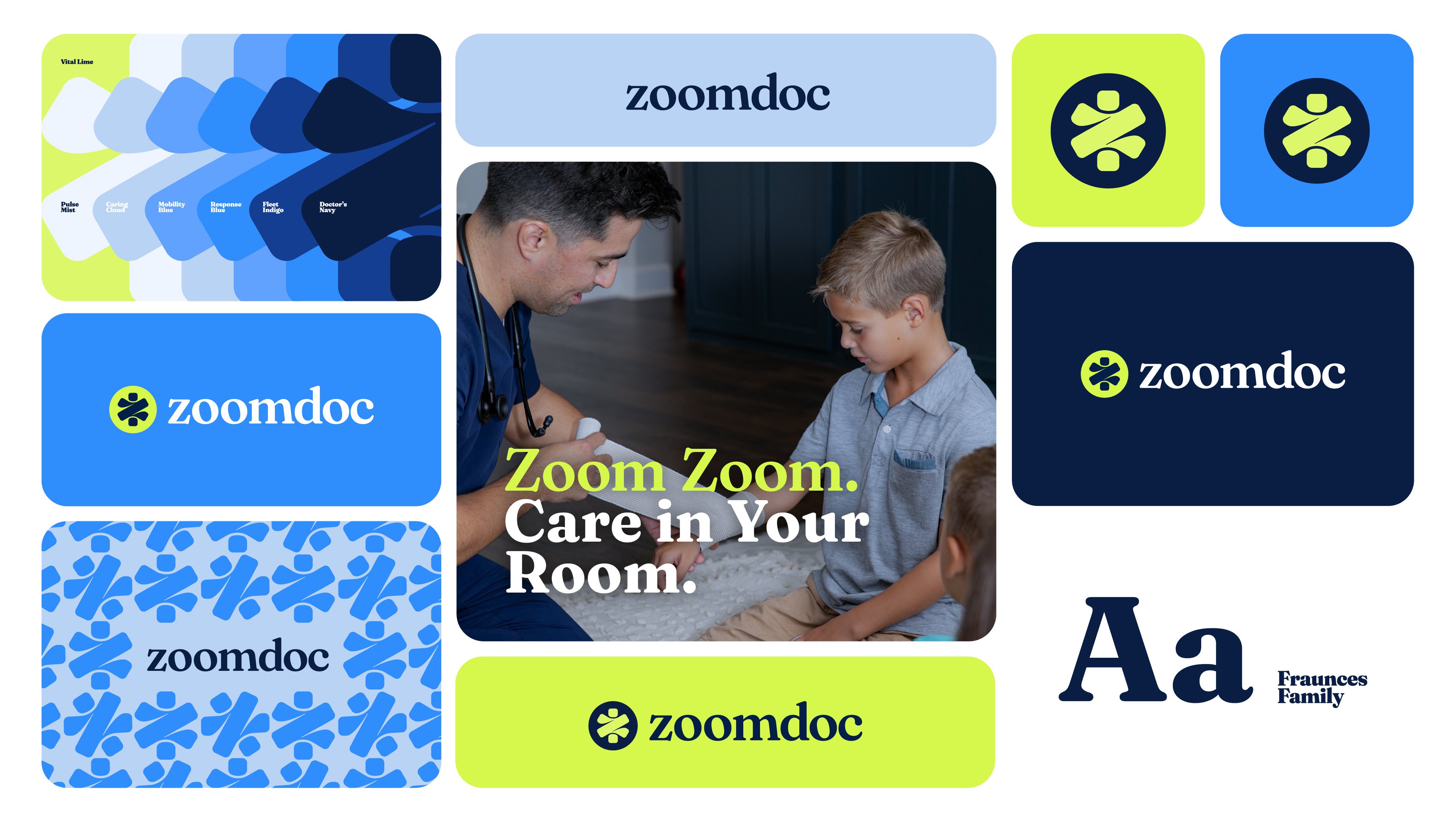
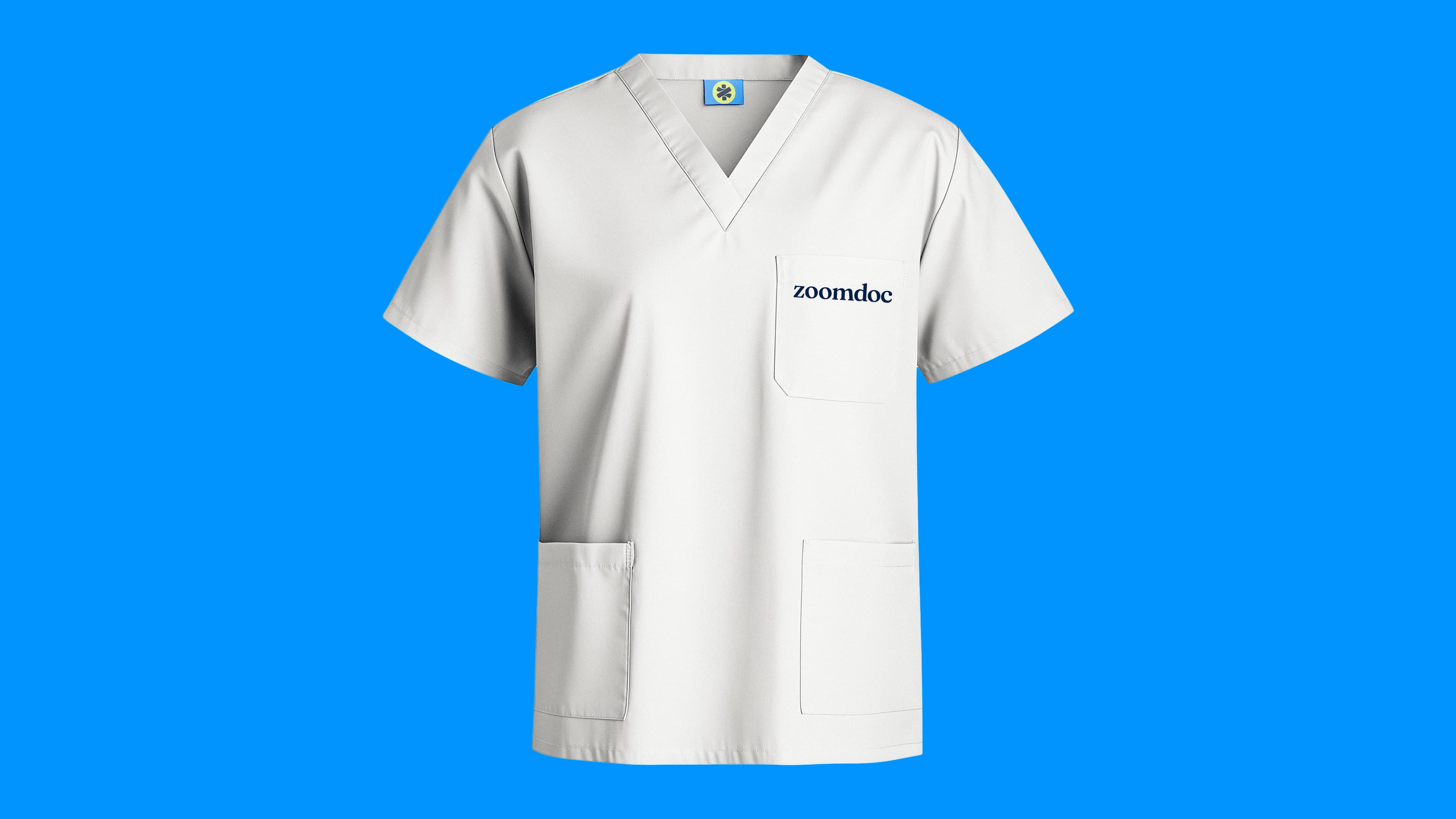
With ambitions to take their mobile urgent care brand national and in a rapidly evolving mobile healthcare landscape, zoomdoc needed an Inc. 500-level look from day one. Enter day3. While early industry players focused on convenience, we positioned zoomdoc around trustworthy care, speed, and reliability. The icon combined three elements: the Rod of Asclepius medical symbol, the letter “Z,” and a lightning bolt, making it instantly 'ownable' and highly recognizable. A bold yellow in the color palette brought energy and disruption, while a modern blue grounded the brand, giving consumers the sense that zoomdoc had been a trusted presence for years.
Brand Colors
.jpeg)