The Problem
Medstock had a razor-sharp business model with a no-brainer value proposition: moving millions in near-expiration medical inventory from hospitals to facilities that could actually use it, saving hospitals tens of thousands in disposal costs.
But when the comapny reached out to new hospitals, the response rate didn't match the strength of their offer.
Their brand and website weren undercutting their credibility -- and pushing decision-makers away
The Challenge
Build a professional, clinically-inclined brand and web presence that hospitals could immediately respect and feel confident engaging with.
A brand presence that would make hospital officials see Medstock as a partner.









The Magic
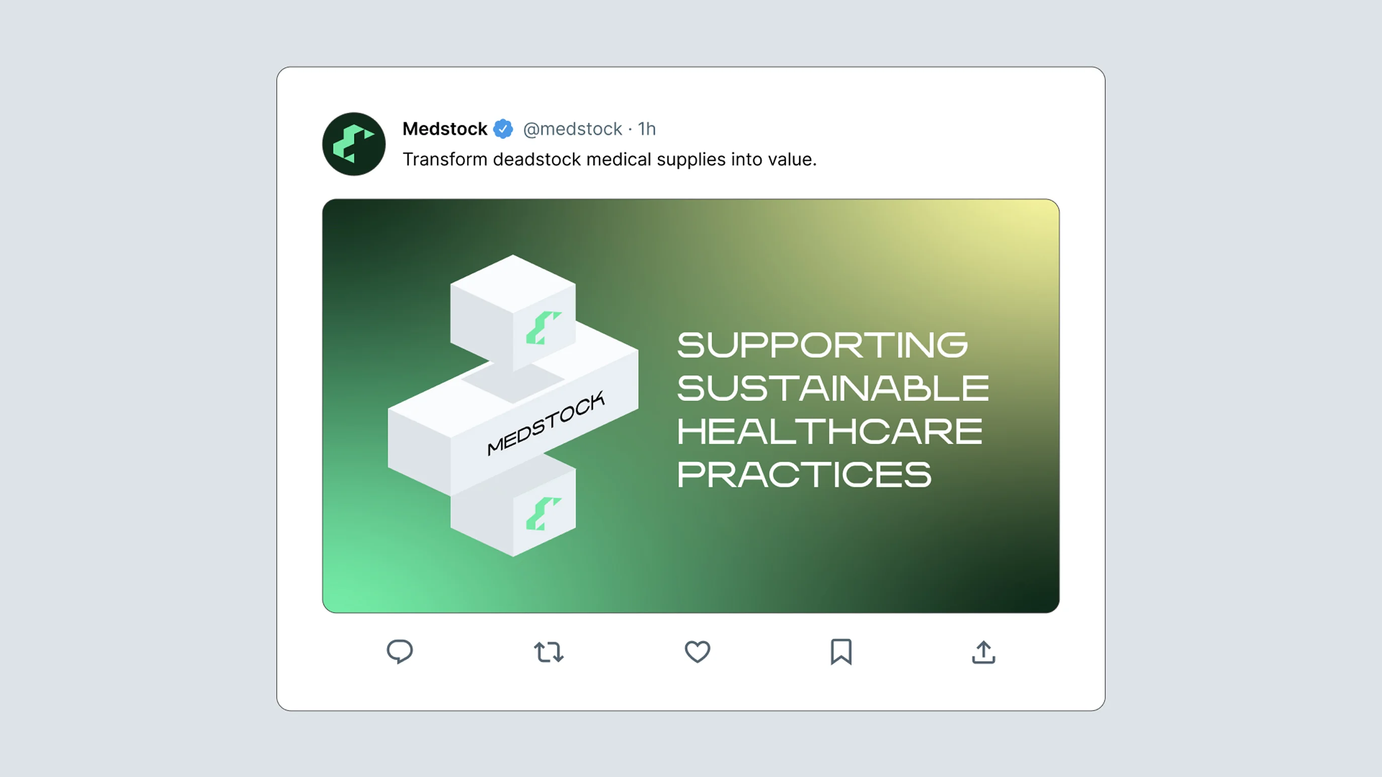
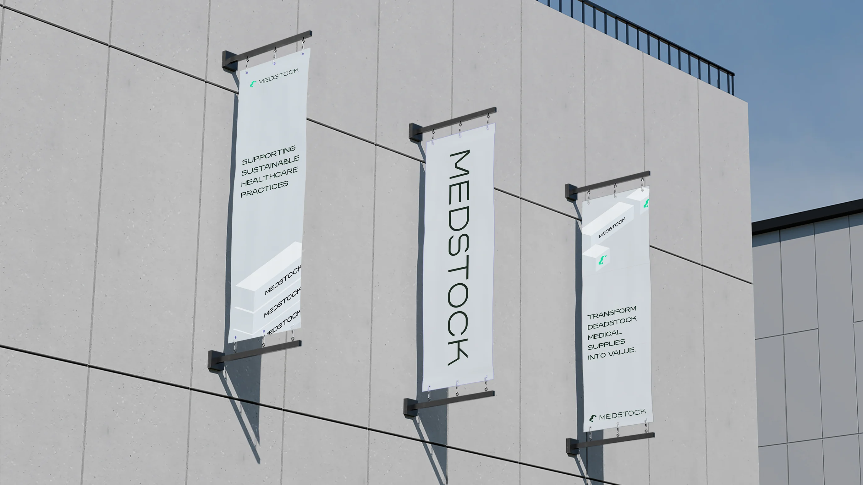
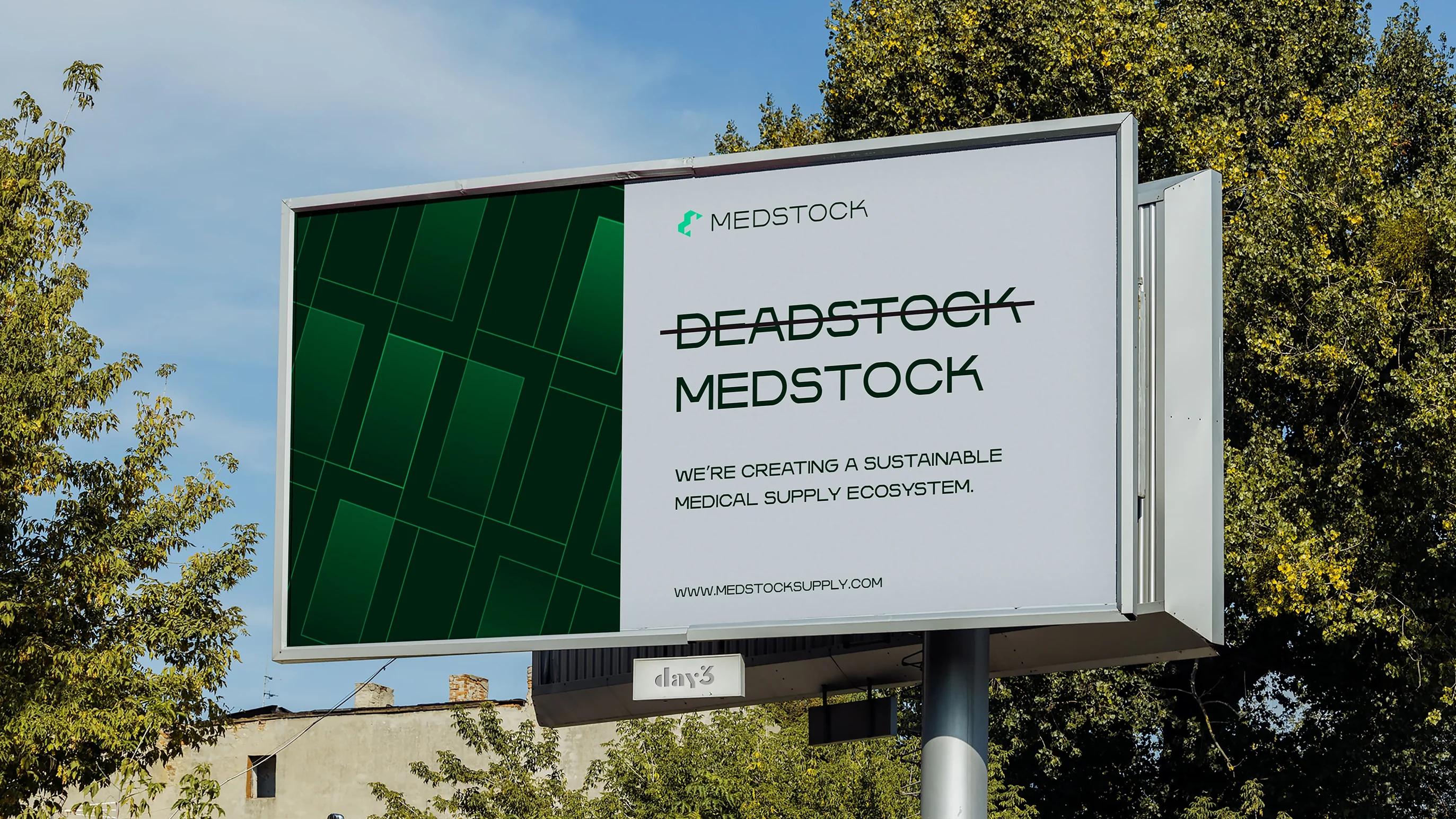
First, we created messaging that strategically positioned Medstock not as a reseller but as a partner in sustainable healthcare.
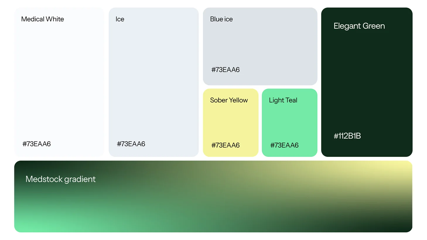
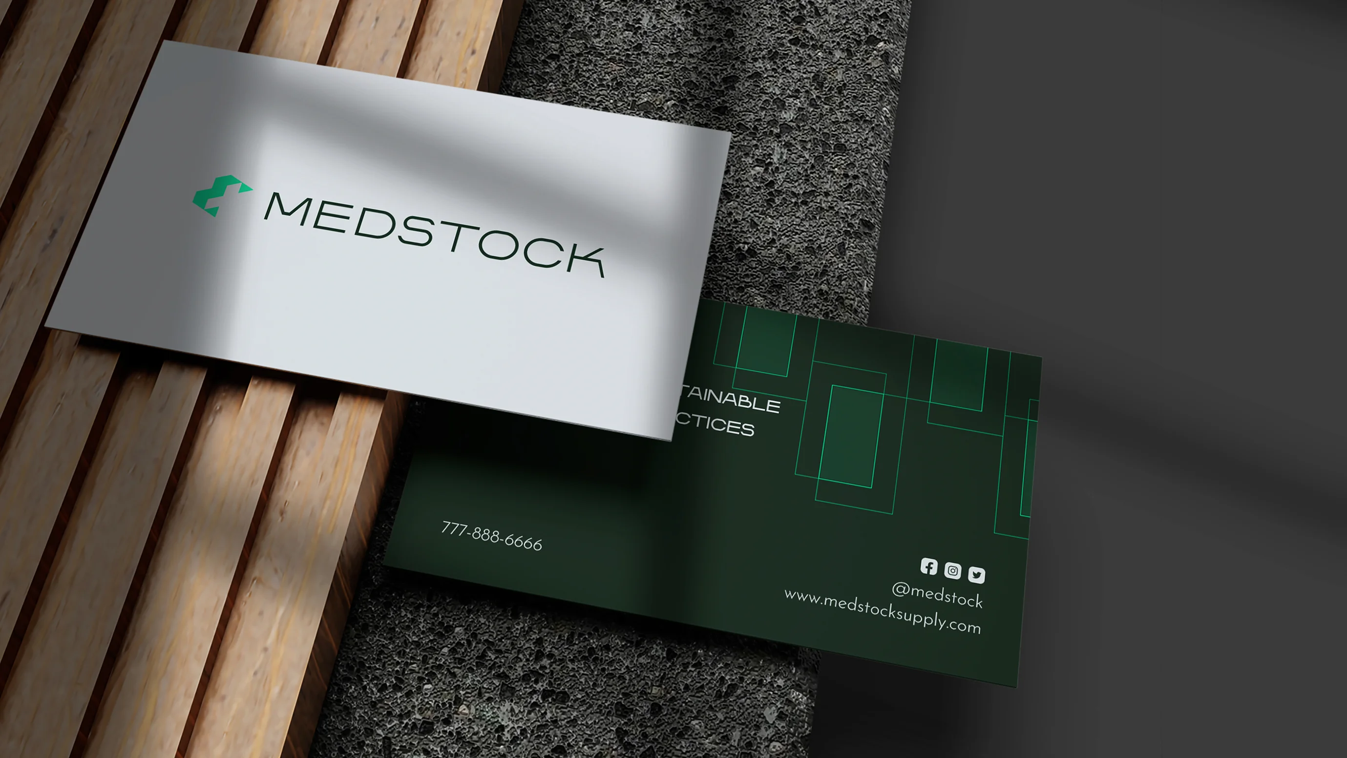
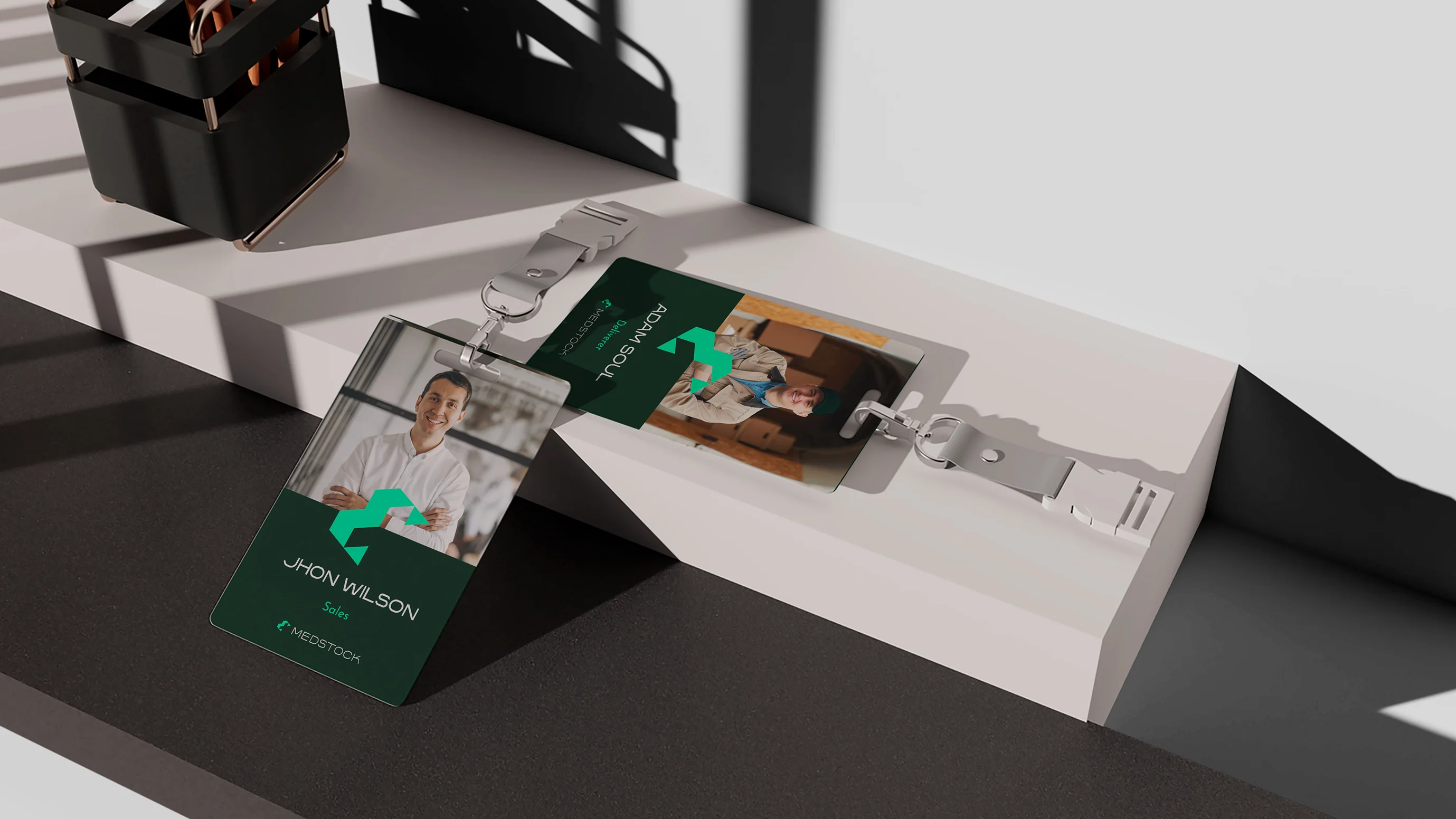
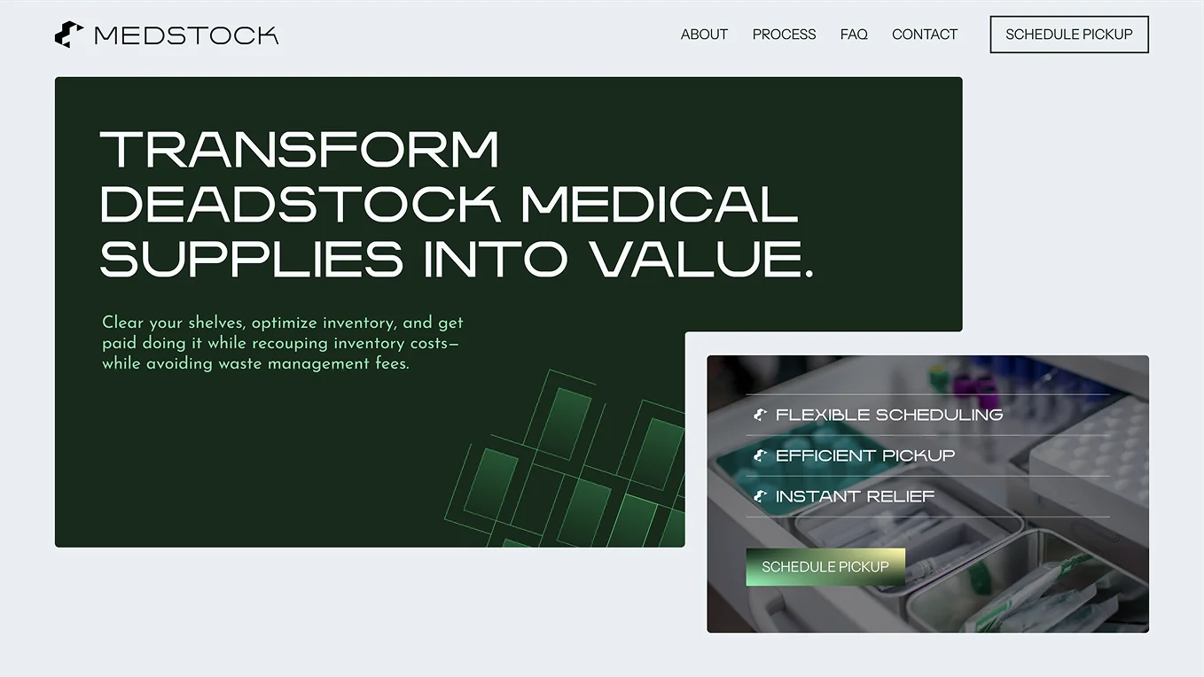
Then came a visual identity that speaks directly to the medical world: scientific typography, a gradient palette reminiscent of the labs whose supplies they buy, and gridded patterns that convey coordinated, systematic operations.
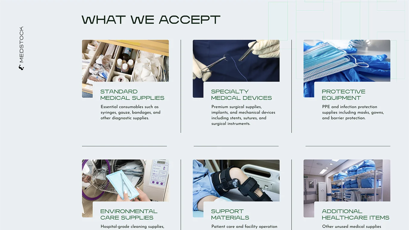
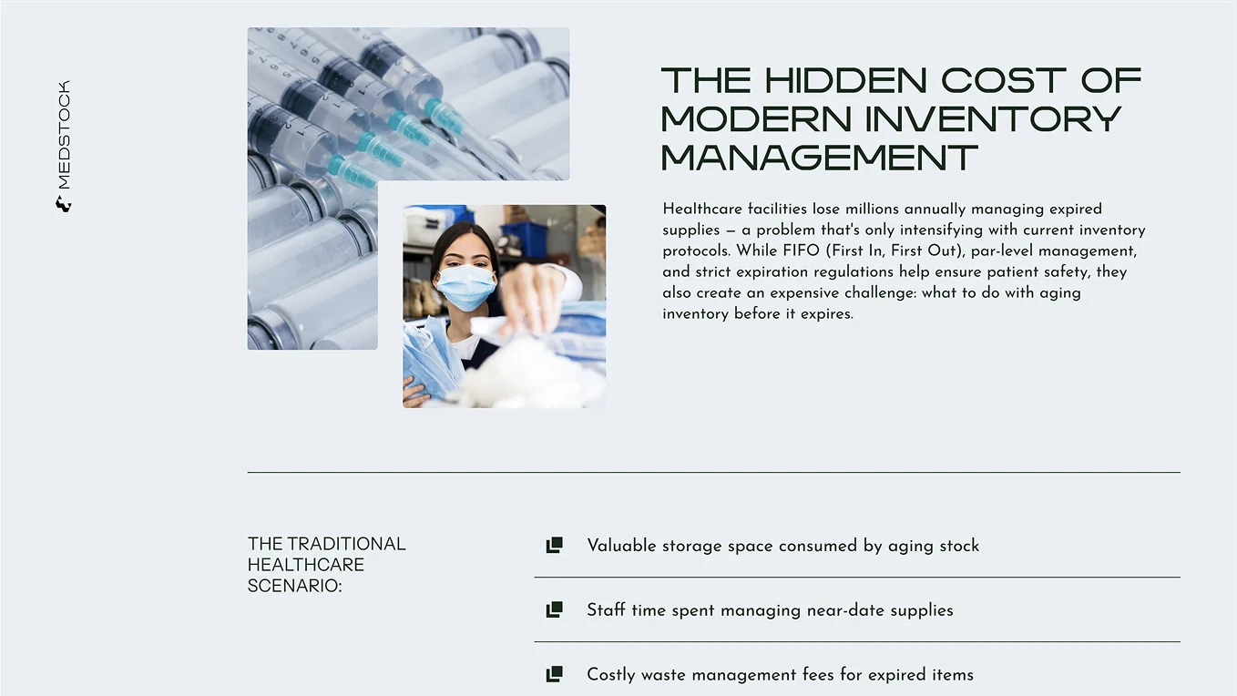
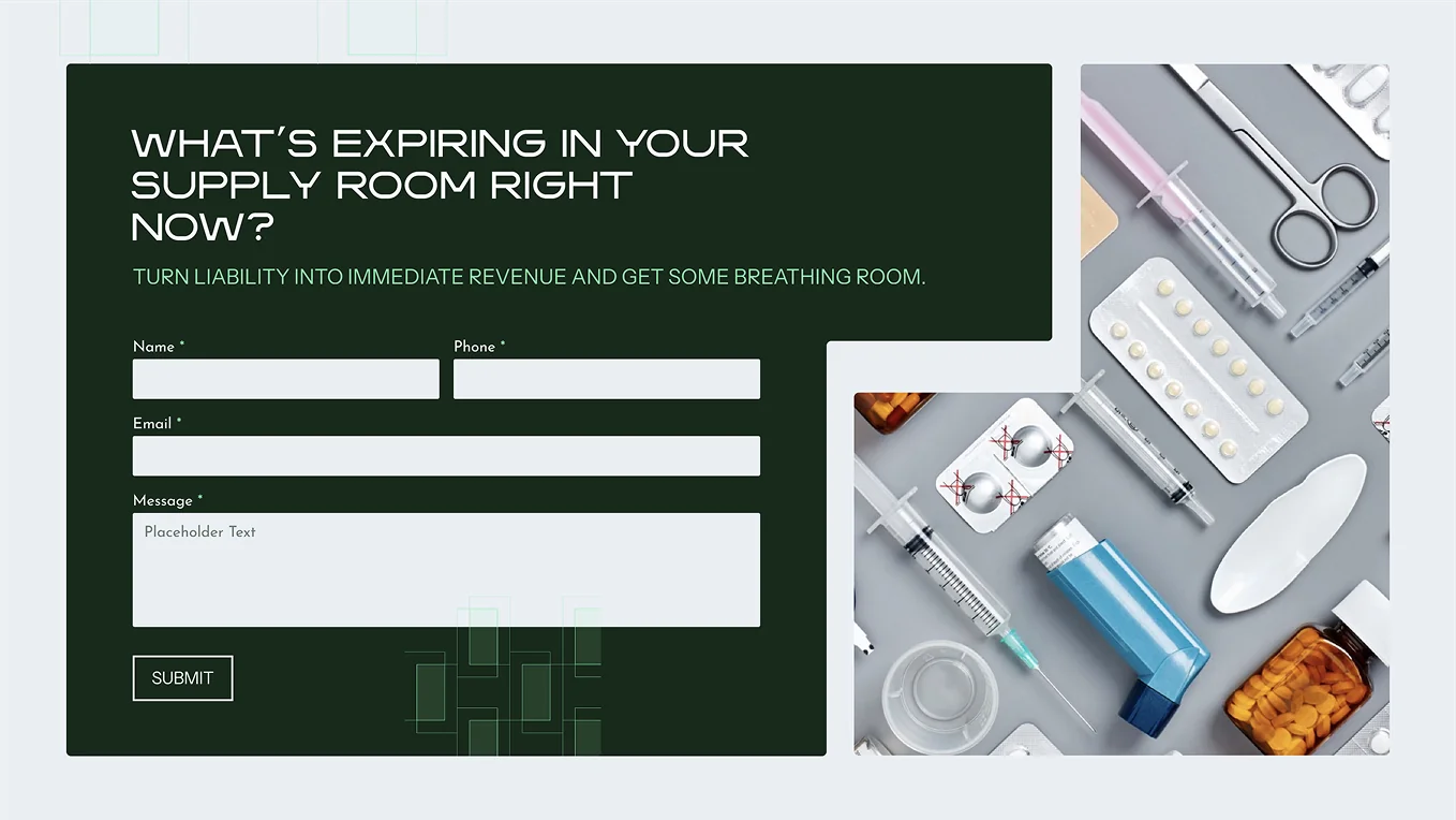
Then, a sleek website implemented the brand in a clean, conversion-friendly format.















The Result
Hospitals were looking twice and loving what they saw. Several months later, growth is still accelerating.
Within three months, their outreach response rate increased by 200%.